Quote:
Originally Posted by pilsenarch

OK, I know that I will be absolutely pilloried for the following opinion, but here it goes:
I've been waiting until this project was substantially finished and I had a chance to walk through it to solidify my observations. The overall massing and the structural solution to the unique restraints of the site are certainly to be commended - even if it's not a totally novel solution, at least in this location it is directly a result of the site limitations.
Having said that, almost every design decision beyond the basic massing I would argue was wrongheaded.
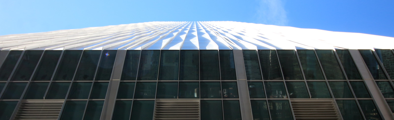
Where to start? The lack of clarity regarding the fenestration - blurring rather than enhancing the shifting forms of the tower (check out earlier renderings vs what was built); the 'waves' appearing to be nothing more than a crowd pleaser and is a design theme that does not appear anywhere else in the vocabulary; the detailing of the glass enclosure of the lobby asks us to pretend to perceive it as if it wasn't there at all - forgiving them some awkward structural detailing while missing an opportunity to develop the architectural language so the lobby enclosure could reference something else in the project or 'transform' itself as it transitions into the west elevation of the tower; and many other awkward 'where the hell did that come from?' detailing: the chamfered corners and chamfered 'arches' of the stone at the elevator cores; the louver detail at the underside cantilevered portion of the tower - particularly on the open river side; the somewhat formal 'bow' at the river walk positioned at the center of the tower...
I guess all of my criticism is pointing to one of the most problematic things about this design: The tower itself is totally symmetrical about the N/S axis (meaning the east and west are mirror images of each other) making no gesture or vocabulary evolution of the tower itself to acknowledge that the space below the tower is totally open to the east and the Chicago River, but to the west is the grand lobby of the project, while appearing to be below grade when you are standing in it. This is a design opportunity and I guess you could say they addressed it somewhat successfully with the LED installation, but I still think it was a larger missed opportunity to develop the glass lobby enclosure with more of a presence. Not by necessarily de-emphasizing the awesome cantilever, but by acknowledging that the lobby really does not have any views to the west (except of the neighboring residential lofts) and is indeed 'sunken' so it already loses that totally 'open' feeling. I think the lobby side of the tower could have been enhanced by being more a part of or an evolution of the tower vocabulary (what if the 'waves' continued down to the lobby, became more 3-dimensional and formed a visually lightweight structural screen). Also, the same could be said about the identical detailing of the lighted louvers - somewhat successful on the lobby side and in the core - not so much on the river side. And where did this detail come from anyway? Why don't we see it reappear anywhere else in the project? Why couldn't we see similar detailing at the top, lit at night? What are the themes and where is the rigor?
The whole project looks to me like it is trying really hard to appear hip, utilizing the 'latest' in architectural details, but instead reads as an old whore drowning in too much random costume jewelry...
 |
I guess I'll take the bait then, this is a perfect example of why architectural elites don't have any alignment with popular opinion. I can agree with you on the removal of the variable shades of glass being dropped from the design, but I've come to appreciate the fluid nature of the design from a distance. Some times of the day it appears totally flat, mirror like and all relief disappears. Other times of the day, as Harry points out, the texture of the facade comes out full force. Perhaps it would have been nice to have the stripe massing of the sides more emphasized at a distance with some variation of glass color, but the end result has been pretty mesmorizing as well.
As far as the "waves" go, does that have to appear anywhere else? Since when do we do themed buildings? It's not enough for you that 75% of the exterior is clad in that "theme"?
Your comments about the lobby glass are downright perplexing. Why should they have some sort of theme to a space that they are trying to make feel as if it is totally indistinguishable from the outside? Why the hell would they do anything other than make it disappear to the best of their ability? The biggest "theme" of this project is it's structural acrobatics, why they hell would they do anything to distract from that in the grand entrance to the structure? Why does it matter if there are Western views from the lobby? That doesn't change the fact that there are train lines running beneath it.
You really can't see where the chamfering comes from? It's not like the entire base of the tower is in effect 'chamfered' or anything. How strange it is to echo 45 degree angles when the entire base is a giant 45 degree angle. You complain that there are no design themes in the detailing and then ask "where the hell did that come from" in regards to possibly the most obvious design theme in the whole structure.
Same goes for the louvers comment. Why should they replicate that design element elsewhere? What other inward sloping 45degree facade sections are there? There is, in fact, a section of louvered facade on the Mechanical floors on the West facade of the building, but why would they put it elsewhere? This building is all about the structure, why would they just toss louvers on spaces that don't require them? The base and the mid rise mech floors house the majority of the mechanical equipment that can't just vent to open air on the roof. It would be rediculous to just slap louvers on other parts of this design.
Then there's the "bow" comment. Do you really not get this? Have you actually gone there in person and stood on it? You first feel like you are hovering over the river and then look up to see this looming over you:
harry c
And this is where architectural acedemics lose the attention of the general public. Sure that little bump out isn't aesthetically perfect or a great contribution to the formal design of the plaza, but it's there for a reason. It's there for that stunning way of experiencing the structural insanity of the design. So what if there are no other "bows" elsewhere in the project?
Then there is this:
Quote:
|
I guess all of my criticism is pointing to one of the most problematic things about this design: The tower itself is totally symmetrical about the N/S axis (meaning the east and west are mirror images of each other) making no gesture or vocabulary evolution of the tower itself to acknowledge that the space below the tower is totally open to the east and the Chicago River,
|
Where you are just incorrect. The tower is not symmetrical on the N/S axis. That's just false. The crown cuts away on the NE and SE corner and does not on the West elevations:

150nriverside.com
So first of all, your comment is just incorrect, the building does cut away more on the East facade than the West "acknolwedging that the space below the tower is totally open to the East and the River". Have you even looked at this tower? But I digress, I would argue again that it doesn't even matter anyhow. Who cares if the top of the building references the river at the base? So what if they went with a totally semetrical tower? This tower is highly visible from the N and S. Shouldn't the most visible elevation be emphasized? Shouldn't symmetry from those directions override some arbitrary desire to reference the location of the river at it's base?
And again, your comments about the views from the lobby are just nutty. Since when do we design lobbies based upon how far you can see in X direction. As you already admit, they placed the small parking component and lobby art in that direction since there really isn't anything to see. I just don't see why the lobby glass should also reflect that fact when really all it is doing is allowing in the light and views of the open sky made possible by the angle of the base.