Quote:
Originally Posted by blenfest

The spire to me takes away from the organic eroding rock look but in any case the height is maxed out.
We are choosing glass carefully and haven't made a final selection but it will be a lighter blue to possibly a cobalt blue and may be mirrored. We are being very careful that it will not come across as dark or gray. The clouds are a rendered reflection and are not in the glass. We are also looking into lighting options similar to Cira Center's type but it's expensive. In all likelihood there will be some sort of changeable color lighting at least in the top third...
|
Just wanted to say "thank you" again for bringing such a cool project to this important location and for sharing info with us here along the way. Cira-esque exterior lighting would look fantastic, would seem right for the W brand, and would probably help connect the tower more to the Avenue of the Arts with its vibrant lighting schemes. But cost restraints are understandable.
What if, rather than simply putting it on the upper third of the building, you were to set the LEDs on just the extruded/inset "blocks" of the façade? That would bring (a very narrow strip of) the lighting scheme much closer to the streetscape on the 15th St side of the north & south elevations, and it would create a really striking visual as it expands eastward in chunks as it rises to the crown.
It would also keep the tower's unique form visible at night by demarking the façade's intricacies. And if one of the lighting settings were a downward "chase" pattern, you could create a pretty awesome waterfall effect. That sort of LED coverage would probably be more than 1/3 of the façade, though probably still less than 1/2. But the payback might be worth it.
Quote:
Originally Posted by Pennsgrant
The original glass looks great but Just to be different here's an inversion with a golden hue which would give this tower a very earthy organic feel,and a touch of splash. It would also be quite the contrast to Center City's standard blue/grey look...
|
Ordinarily, I think golden/yellow glass is a bit Vegas tacky, but your visual actually looks pretty good! And if you feel like the blue glass thing is a bit overdone in Philly, I can see your point. However, in this case, I like the idea of a lighter blue glass; with this tower sitting just east of the Market West skyscraper cluster (where most of the blue glass exists) and having - apart from the almost black RatR - older, brown/tan highrises huddling around and continuing eastward from there, I think the blue would help to visually expand the Market West skyscraper district towards Market East.
Quote:
Originally Posted by Eigenwelt
Really love this new redesign, though like I said in the main thread I personally hate giant corporate logos on buildings.
Anyway, here is a quick cut and paste sketch I did of what this might look like from Dilworth Plaza. The angles on the images lined up pretty well, so the height should be close to correct.
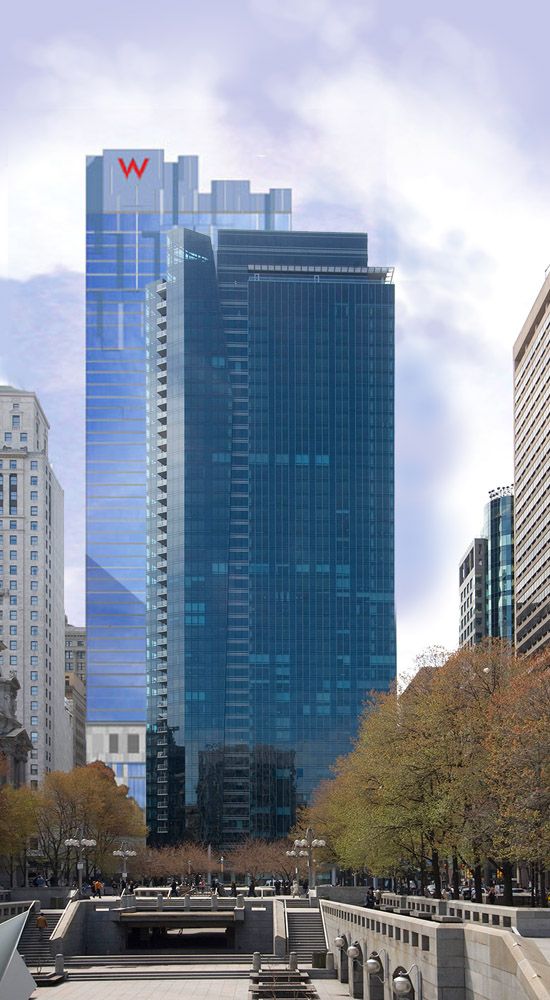 |
(Re-posting the image in case newcomers don't page back.) That may be a quick cut and paste, but it doesn't look like it - nice work!
I'm of two minds when it comes to corporate logos on buildings; on the one hand, I like the cleaner look Philly's skyline has since there are very few visible logos. On the other hand, I don't think Philly lights its skyline as well as it could at night, and if the building owners aren't going to pay for good architectural lighting, at least the logos help to show that something's up there. And it's a way to announce the city as a place where corporations want to do business. At least, that's what I tell myself


 Prev
Prev


 Well, anyway, here is the link below, enjoy!


 Linear Mode
