HomeDiagramsDatabaseMapsForum About
     

Go Back   SkyscraperPage Forum > Discussion Forums > Buildings & Architecture


Reply

 
Thread Tools Display Modes
     
     
  #21  
Old Posted Dec 28, 2011, 4:24 AM
WilliamTheArtist's Avatar
WilliamTheArtist WilliamTheArtist is offline
Registered User
 
Join Date: Apr 2007
Location: Tulsa Oklahoma
Posts: 800
Its not the ornamentation that makes a building pedestrian friendly or interesting imo, its in good part about whether or not it has pedestrian friendly "fenestrations", windows and doors. Walking past large windows that showcase interesting (or could we say "ornate") window displays and or interiors is just as enjoyable as seeing ornate stonework. Also having plenty of doors and such so that the building is permeable, having people going in and out, is important. Other tricks that buildings can do to make a street pedestrian friendly is to have loggias and awnings, "inset" entrances, and be connected to one another on occasion on the inside. Classical pedestrian friendly buildings had these features and there is absolutely nothing that should keep contemporary buildings from having them either. A simple rectangular, brushed steel and tinted glass, contemporary styled awning for instance, can add interest to the building while also providing shade on hot days along with a little protection from the rain and snow,,, just like awnings of old. One of the things I noticed when I was in Paris was how so many of the buildings, especially ones along some steets with lots of shops, had loggias wrapped around them protecting you from the rain and providing shade. You don't have to be a building covered in ornate stone or terra cotta to have that wonderful feature (which btw helps the urban shopping area compete a little in comfort with the suburban mall). Also, there are some great streets, or should I say blocks, here in downtown Tulsa that have both old and new buldings connected to each other on the inside. I can walk from one building with its restaurants, shopping, galleries, offices, etc. to the next, and then to the next, and then the next, then pop outside, run across the street, then go back inside and go through several more buildings. These things are very helpful in climates like ours that get very hot, and very cold. Not every building or block has to have all these features, but the more the merrier for it helps keep the buildings and businesses busy even in nasty weather, and thus helps the street be even busier all year round.

Now if you have a modern building that has few entrances, few windows at street level, no awnings or loggias or covered entrances, is large and takes up a lot of a block, you have several of those along a block or street, and yes we all know those buildings,,, you kill the street.
__________________
Tulsa
Reply With Quote
     
     
  #22  
Old Posted Dec 28, 2011, 4:37 AM
Roadcruiser1's Avatar
Roadcruiser1 Roadcruiser1 is offline
Registered User
 
Join Date: Jun 2010
Location: New York City
Posts: 2,107
Quote:
Originally Posted by WilliamTheArtist View Post
Its not the ornamentation that makes a building pedestrian friendly or interesting imo, its in good part about whether or not it has pedestrian friendly "fenestrations", windows and doors. Walking past large windows that showcase interesting (or could we say "ornate") window displays and or interiors is just as enjoyable as seeing ornate stonework. Also having plenty of doors and such so that the building is permeable, having people going in and out, is important. Other tricks that buildings can do to make a street pedestrian friendly is to have loggias and awnings, "inset" entrances, and be connected to one another on occasion on the inside. Classical pedestrian friendly buildings had these features and there is absolutely nothing that should keep contemporary buildings from having them either. A simple rectangular, brushed steel and tinted glass, contemporary styled awning for instance, can add interest to the building while also providing shade on hot days along with a little protection from the rain and snow,,, just like awnings of old. One of the things I noticed when I was in Paris was how so many of the buildings, especially ones along some streets with lots of shops, had loggias wrapped around them protecting you from the rain and providing shade. You don't have to be a building covered in ornate stone or terra cotta to have that wonderful feature (which btw helps the urban shopping area compete a little in comfort with the suburban mall). Also, there are some great streets, or should I say blocks, here in downtown Tulsa that have both old and new buildings connected to each other on the inside. I can walk from one building with its restaurants, shopping, galleries, offices, etc. to the next, and then to the next, and then the next, then pop outside, run across the street, then go back inside and go through several more buildings. These things are very helpful in climates like ours that get very hot, and very cold. Not every building or block has to have all these features, but the more the merrier for it helps keep the buildings and businesses busy even in nasty weather, and thus helps the street be even busier all year round.

Now if you have a modern building that has few entrances, few windows at street level, no awnings or loggias or covered entrances, is large and takes up a lot of a block, you have several of those along a block or street, and yes we all know those buildings,,, you kill the street.
I agree with you there. It isn't class that makes the building, but the way it's displayed. An example would be the facade of the building. A building doesn't need setbacks to be attractive. A nice facade would do. An example of a tall building with a bad facade would 432 Park. It would be a nice building if it didn't have that grid like facade covering it, and if it didn't reveal empty walls which it sadly does, but a good building design like One57 would be extremely attractive even from street level due to the facade. All of this has to do with the outside of the building. Even unique buildings work like Two World Trade Center with it's nice looking roof, or Three World Trade Center with it's interesting boxes, setbacks, and the unique facade. You can even use size as I have pointed out with the Twin Towers. You just need to capture people in some way.
Reply With Quote
     
     
  #23  
Old Posted Dec 28, 2011, 9:18 AM
Ch.G, Ch.G's Avatar
Ch.G, Ch.G Ch.G, Ch.G is offline
Registered User
 
Join Date: Jul 2007
Posts: 3,138
Quote:
Originally Posted by ardecila View Post
^^ If you like St. Priscilla, you should see St. Procopius out in Lisle... It's in the suburbs but awesome as hell. It's an abbey as well as a church, so there's a whole complex of modernism. It's really more of a rural, self-sustaining type of community than a suburban one, despite being hemmed in by subdivisions.
I had no idea that place existed. It's really great. Thanks for the link.

Quote:
Originally Posted by CGII View Post
'Modernism' as a building style really died in the mid 70s, and to summate the whole of architectural theory and practice since than as such is disingenuous.
Word'. As a general rule, when discussing the Architecture of Today, best to refer to it as "contemporary" rather than "modern" which is too often conflated with Modernism.
Reply With Quote
     
     
  #24  
Old Posted Dec 28, 2011, 9:19 AM
Ch.G, Ch.G's Avatar
Ch.G, Ch.G Ch.G, Ch.G is offline
Registered User
 
Join Date: Jul 2007
Posts: 3,138
40 Bond Street by Herzeog & de Meuron


source


source


source
Reply With Quote
     
     
  #25  
Old Posted Dec 28, 2011, 3:01 PM
Nowhereman1280 Nowhereman1280 is offline
BANNED
 
Join Date: Sep 2006
Location: Pungent Onion, Illinois
Posts: 8,492
^^^ You see, I think that's the opposite of the direction one should go to engage a pedestrian. While that is "ornate" it certainly is not engaging because the ornament is basically a fence that makes the pedestrian feel removed from the design. Just look at the buildings on either side where they open up to and greet the street compared the white picket fence of squiggly shit that forms a wall right up against the sidewalk. The entrance is also far too narrow and poorly defined.

Quote:
Originally Posted by Roadcruiser1 View Post
Well you see it doesn't have to be classical to capture the eye of pedestrians. An example would be the original World Trade Center. Not classical by any means, but it was so big and bold that anyone walking around would be shocked, and stunned by the size of those two towers. I mean it wasn't pretty, but it was so big it just captured people even from down below. It doesn't have to be classical, but it can also be sort of bold.
You have to be joking. The World Trade Center was one of the most anti pedestrian designs ever conceived. Giant bleak behemoths rising above a massive, barren, treeless, wind whipped plaza surrounded by a wall of lowrises perched on top of a huge fortress-like base accessible only through a limited number of 2 story flights of stairs, build on a super-block that eliminated multiple streets from the grid. That's really funny. The WTC was literally the opposite of pedestrian-friendly design.

That's not to say the complex was ugly or wasn't an interesting design, but "pedestrian friendly" is one thing it definitely was not.
Reply With Quote
     
     
  #26  
Old Posted Dec 28, 2011, 9:13 PM
urbanlife's Avatar
urbanlife urbanlife is offline
A before E
 
Join Date: Aug 2001
Location: Milwaukie, Oregon
Posts: 11,786
I am a huge fan of Herzog & de Meuron's work. Though I can't say I have seen that building before or know anything about it...but I like it nonetheless.
Reply With Quote
     
     
  #27  
Old Posted Dec 29, 2011, 2:47 PM
Nowhereman1280 Nowhereman1280 is offline
BANNED
 
Join Date: Sep 2006
Location: Pungent Onion, Illinois
Posts: 8,492
Quote:
Originally Posted by urbanlife View Post
I am a huge fan of Herzog & de Meuron's work. Though I can't say I have seen that building before or know anything about it...but I like it nonetheless.
I like it too, but that's not my point. My point is that it does exactly the opposite of what we are looking for. It does not welcome the pedestrian in, but rather says "fuck you, stay on the other side of this gnarly fence" to every passer by. That's all I'm saying.
Reply With Quote
     
     
  #28  
Old Posted Dec 29, 2011, 10:16 PM
ardecila's Avatar
ardecila ardecila is offline
TL;DR
 
Join Date: Jun 2006
Location: the city o'wind
Posts: 16,384
There are different ways to engage with pedestrian traffic.

One of my favorite ways is the "palazzo bench" - in the days before elaborate security procedures in government/office buildings, Italian merchants and officials used to conduct business on a bench along the base of a building. If you notice, this facade is very opaque, but it is still engaging and not off-putting.

http://maps.google.com/maps?q=siena,...264.72,,0,-4.5
__________________
la forme d'une ville change plus vite, hélas! que le coeur d'un mortel...
Reply With Quote
     
     
  #29  
Old Posted Dec 29, 2011, 10:31 PM
Nowhereman1280 Nowhereman1280 is offline
BANNED
 
Join Date: Sep 2006
Location: Pungent Onion, Illinois
Posts: 8,492
Quote:
Originally Posted by ardecila View Post
There are different ways to engage with pedestrian traffic.
And building forboding fences and semi-hidden narrow doorways is not one of them.

Also that street you posted is mighty bleak and not something I would exactly call engaging. In the past perhaps it played it's role, but it's clearly not designed to function in modern society.
Reply With Quote
     
     
  #30  
Old Posted Dec 29, 2011, 10:48 PM
Rizzo Rizzo is offline
Registered User
 
Join Date: Jun 2004
Location: Chicago
Posts: 7,285
Quote:
Originally Posted by WilliamTheArtist View Post
Its not the ornamentation that makes a building pedestrian friendly or interesting imo, its in good part about whether or not it has pedestrian friendly "fenestrations", windows and doors. Walking past large windows that showcase interesting (or could we say "ornate") window displays and or interiors is just as enjoyable as seeing ornate stonework. Also having plenty of doors and such so that the building is permeable, having people going in and out, is important. Other tricks that buildings can do to make a street pedestrian friendly is to have loggias and awnings, "inset" entrances, and be connected to one another on occasion on the inside. Classical pedestrian friendly buildings had these features and there is absolutely nothing that should keep contemporary buildings from having them either. A simple rectangular, brushed steel and tinted glass, contemporary styled awning for instance, can add interest to the building while also providing shade on hot days along with a little protection from the rain and snow,,, just like awnings of old. One of the things I noticed when I was in Paris was how so many of the buildings, especially ones along some steets with lots of shops, had loggias wrapped around them protecting you from the rain and providing shade. You don't have to be a building covered in ornate stone or terra cotta to have that wonderful feature (which btw helps the urban shopping area compete a little in comfort with the suburban mall). Also, there are some great streets, or should I say blocks, here in downtown Tulsa that have both old and new buldings connected to each other on the inside. I can walk from one building with its restaurants, shopping, galleries, offices, etc. to the next, and then to the next, and then the next, then pop outside, run across the street, then go back inside and go through several more buildings. These things are very helpful in climates like ours that get very hot, and very cold. Not every building or block has to have all these features, but the more the merrier for it helps keep the buildings and businesses busy even in nasty weather, and thus helps the street be even busier all year round.

Now if you have a modern building that has few entrances, few windows at street level, no awnings or loggias or covered entrances, is large and takes up a lot of a block, you have several of those along a block or street, and yes we all know those buildings,,, you kill the street.
Good post, and I tend to bring up the terms fine grain and coarse grain here frequently. The large unfriendly beasts of a building you mention would be coarse grain, though just because a building takes up a whole block doesn't mean it can't be fine grain.

As you mention, fenestration or even something as simple as a return, alcove, or change in material can assist in breaking up a large facade.

Here's a post where I went into some detail on my thoughts regarding a new development in Chicago. The image in the post I think is good design in the way it introduces various materials, openings, and several entry points at street level
http://forum.skyscraperpage.com/show...ostcount=14242

On the other hand in the link below, you'll see a building that has some good urban qualities of zero setback, the plinth/canopy offering cover is nice, as well as practically 100% transparency.....but it's unfortunately an entire city block of the same thing. While it may differ in style, the idea of a continuous horizontal facade is not all that much different than that of strip malls. Therefore, it's very coarse grain and risky in the sense of promoting a pedestrian environment.

http://maps.google.com/maps?q=chicag...34.23,,0,-5.96

Below is a great video that touches on architecture and how it can influence pedestrian environments
http://www.youtube.com/watch?v=VsrqBHEOT0k
Reply With Quote
     
     
  #31  
Old Posted Dec 30, 2011, 7:02 AM
ardecila's Avatar
ardecila ardecila is offline
TL;DR
 
Join Date: Jun 2006
Location: the city o'wind
Posts: 16,384
Quote:
Originally Posted by Nowhereman1280 View Post
And building forboding fences and semi-hidden narrow doorways is not one of them.

Also that street you posted is mighty bleak and not something I would exactly call engaging. In the past perhaps it played it's role, but it's clearly not designed to function in modern society.
I guess you didn't pan over and see the three retail businesses across the street? Or the crowds of pedestrians that are comfortably walking around? Transparency in a facade is over-rated. Obviously you want to see into a retail business if there is a retail business, but having 100% transparent, retail-lined facades at street-level is an impossible goal. It's far better to focus on attractive, tactile materials and human scale, both in terms of the features of the building but also in its relationship to the street.

That's why I don't know what you mean by "not suited to modern society". A modern city offers plenty of instances where retail-lined facades are impractical, either because parking is required or because the ground floor has service spaces inside or because the building is an auto body, car wash, or light industrial. The blankness and deadness of the facades that are typically designed for these situations is a key reason for the anemic and lifeless quality of our streets.

European cities, especially the more ancient ones, offer plenty of time-tested examples for how to deal with this type of situation. The bench I posted provides an alternative to retail, a different way to activate the facade of a building that requires only 18" of depth and can be used regardless of what is going on inside the building behind. Other facades on that street are also fairly opaque at street-level but have strong, simple composition and small-scale elements that humans can relate to.

Quote:
Originally Posted by Hayward View Post
On the other hand in the link below, you'll see a building that has some good urban qualities of zero setback, the plinth/canopy offering cover is nice, as well as practically 100% transparency.....but it's unfortunately an entire city block of the same thing. While it may differ in style, the idea of a continuous horizontal facade is not all that much different than that of strip malls. Therefore, it's very coarse grain and risky in the sense of promoting a pedestrian environment.

http://maps.google.com/maps?q=chicag...34.23,,0,-5.96
Good point. The modernist tendency is to invest a lot of time and effort developing a system/set of rules, and then extending that system across the site. While one segment may be great in isolation, it can become stifling and monotonous when repeated en masse - especially if the elements aren't particularly human-scaled in the first place.
__________________
la forme d'une ville change plus vite, hélas! que le coeur d'un mortel...

Last edited by ardecila; Dec 30, 2011 at 7:21 AM.
Reply With Quote
     
     
  #32  
Old Posted Dec 31, 2011, 1:12 PM
Ch.G, Ch.G's Avatar
Ch.G, Ch.G Ch.G, Ch.G is offline
Registered User
 
Join Date: Jul 2007
Posts: 3,138
Quote:
Originally Posted by Nowhereman1280 View Post
^^^ You see, I think that's the opposite of the direction one should go to engage a pedestrian. While that is "ornate" it certainly is not engaging because the ornament is basically a fence that makes the pedestrian feel removed from the design. Just look at the buildings on either side where they open up to and greet the street compared the white picket fence of squiggly shit that forms a wall right up against the sidewalk.
Not only could you argue that the gate itself is "engaging" (really, I'm not sure how you could argue otherwise), the 'perforations' allow you to quite easily peer inside. IIRC, the physical separation is necessary (I believe they're townhouses). And when it is, a giant pane of glass (still a wall, mind you) is not the only or necessarily the best solution.

Quote:
Originally Posted by ardecila View Post
Good point. The modernist tendency is to invest a lot of time and effort developing a system/set of rules, and then extending that system across the site. While one segment may be great in isolation, it can become stifling and monotonous when repeated en masse - especially if the elements aren't particularly human-scaled in the first place.
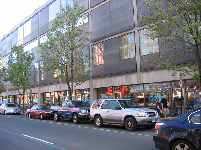
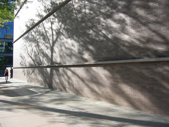
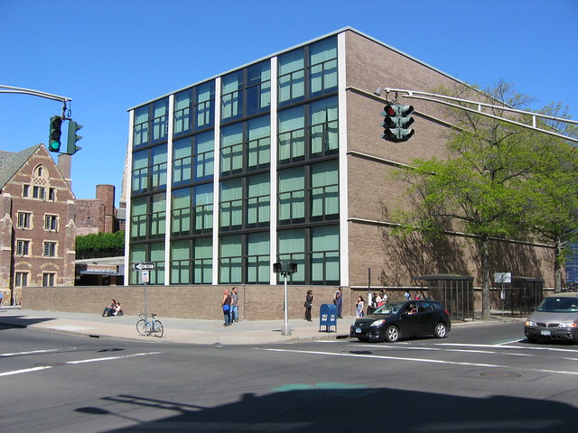
Kahn's Yale Center for British Art balances these issues quite well, I think: an institutional building (museum, library, archives, conservation labs, reading rooms) requiring a careful handling of natural light, but it's built to the lot lines in a very urban setting (I don't think you can emphasize enough what a rarity this was for similar buildings from this period) with first floor retail wherever it fronts a street. The monotony seems like it could be problematic but it never is, maybe in part because walking alongside it leads you either to or away from the dramatic recessed entrance to the museum.

It's hard to quickly find pictures that do it justice, and I'm a little hesitant to post what I've got lest someone who isn't familiar with it gets the wrong impression, but here are a few:

entrance

source

in front of entrance, looking out

source

looking in

source

Chapel Street façade

source


source

Froyo World along (aptly named) High Street at night

sourcehttps://lh4.googleusercontent.com/-F...IuM/11%2B-%2B1

In his addition to the Yale University Art Gallery (literally right across the street and designed much earlier during his career), Kahn took a much, uh, different approach:

source

Although it's beautiful from other angles...

source

...especially at night (check out the BAC on the right):

source
Reply With Quote
     
     
  #33  
Old Posted Dec 31, 2011, 5:41 PM
SLO's Avatar
SLO SLO is offline
REAL Kiwi!
 
Join Date: Jan 2007
Location: California & Texas
Posts: 17,202
Modernism often times takes in to context only its site and ignores the city around them. Creating monuments or sculptural pieces can be iconic, but that dont relate well to pedestrians.
__________________
I'm throwing my arms around Paris.
Reply With Quote
     
     
  #34  
Old Posted Dec 31, 2011, 5:53 PM
CGII's Avatar
CGII CGII is offline
illwaukee/crooklyn
 
Join Date: Sep 2002
Location: rome
Posts: 8,518
Quote:
Originally Posted by Ch.G, Ch.G View Post
In his addition to the Yale University Art Gallery (literally right across the street and designed much earlier during his career), Kahn took a much, uh, different approach:

source
I am so glad you brought up Kahn here, a really useful footnote in the discussion. But I think you may be giving the Art Gallery too little credit. Yes, it does have a blank wall facing the street, but you managed to show a picture which keeps the most important aspect of this building's street presence out of frame:


panoramio.com

Kahn envisioned the mass of the Art Gallery as a formal continuation of the old buidling (at right) and the entrance as a niche carved out from the streetwall. That Kahn was acknowledging the classical building it was an addition to and even to bring his building to the street was really revolutionary for the time period it was being built. Kahn had a Beaux Arts education and it really showed in the way he challenged high Modernism.

I should also agree with your warning that to anyone not personally familiar with Kahn's work the beauty of it may not be apparent. The graphic image quality that Kahn's work tends to show is that of overwhelming coldness and overbearing geometric rationality, but in truth Kahn was one of the biggest critics of Modernism and automobile culture in his generation. All of his buildings were designed with great aggression towards auto use, he even envisioned various plans for Philadelphia where visitors to Center City would be forced to park their cars in massive garages at the city limits and then walk everywhere else in pedestrian only streets.
__________________
disregard women. acquire finances.
Reply With Quote
     
     
  #35  
Old Posted Dec 31, 2011, 7:12 PM
Ch.G, Ch.G's Avatar
Ch.G, Ch.G Ch.G, Ch.G is offline
Registered User
 
Join Date: Jul 2007
Posts: 3,138
Quote:
Originally Posted by CGII View Post
Kahn envisioned the mass of the Art Gallery as a formal continuation of the old buidling (at right) and the entrance as a niche carved out from the streetwall. That Kahn was acknowledging the classical building it was an addition to and even to bring his building to the street was really revolutionary for the time period it was being built. Kahn had a Beaux Arts education and it really showed in the way he challenged high Modernism.

I should also agree with your warning that to anyone not personally familiar with Kahn's work the beauty of it may not be apparent. The graphic image quality that Kahn's work tends to show is that of overwhelming coldness and overbearing geometric rationality, but in truth Kahn was one of the biggest critics of Modernism and automobile culture in his generation. All of his buildings were designed with great aggression towards auto use, he even envisioned various plans for Philadelphia where visitors to Center City would be forced to park their cars in massive garages at the city limits and then walk everywhere else in pedestrian only streets.
Oh, I definitely agree; I didn't mean to sound put-off by the YUAG addition. There's also a perimeter around it paved in stone with a slight incline that literally lifts you up a few inches above the actual sidewalk. (You can make it out in the photos.) It brings you close enough to the top of the wall around the sculpture garden (also visible) that you feel like you could almost peak in if you raised yourself on your tiptoes.

Still, it's a more severe approach than the one he used at the BAC, and I could understand if people found it a little cold. There's a university bus stop in front of the sculpture garden wall (against which you can see two people sitting in one of the photos), and waiting or walking there during the day you feel particularly exposed. (There aren't any trees, benches or shelters on that side.)
Reply With Quote
     
     
  #36  
Old Posted Jan 1, 2012, 6:13 PM
Tom Servo's Avatar
Tom Servo Tom Servo is offline
BANNED
 
Join Date: Nov 2006
Location: Chicago
Posts: 3,647
Quote:
Originally Posted by Nowhereman1280 View Post
^^^ You see, I think that's the opposite of the direction one should go to engage a pedestrian. While that is "ornate" it certainly is not engaging because the ornament is basically a fence that makes the pedestrian feel removed from the design. Just look at the buildings on either side where they open up to and greet the street compared the white picket fence of squiggly shit that forms a wall right up against the sidewalk. The entrance is also far too narrow and poorly defined.
40 Bond is an 'ulta' luxury residential building... I'm not sure an inviting or well defined entrance is necessary. and while the aluminum fence creates an important separation between building and sidewalk, it is playful and has a neat artistic quality that is certainly engaging. (supposedly inspired by graffiti)

more to the point, 40 Bond is kind of bad example in this discussion because it's a private residential building... they're allowed to be isolated and closed off
Reply With Quote
     
     
  #37  
Old Posted Jan 1, 2012, 8:05 PM
mhays mhays is offline
Never Dell
 
Join Date: Jul 2001
Posts: 19,804
My god, that Kahn stuff is horrific.
Reply With Quote
     
     
  #38  
Old Posted Jan 1, 2012, 10:55 PM
CGII's Avatar
CGII CGII is offline
illwaukee/crooklyn
 
Join Date: Sep 2002
Location: rome
Posts: 8,518
Quote:
Originally Posted by mhays View Post
My god, that Kahn stuff is horrific.
One really needs to be a personal witness to his work, he was a master of understatement where necessary.


archdaily.net


wikitravel.org
__________________
disregard women. acquire finances.
Reply With Quote
     
     
  #39  
Old Posted Jan 3, 2012, 3:51 PM
Nowhereman1280 Nowhereman1280 is offline
BANNED
 
Join Date: Sep 2006
Location: Pungent Onion, Illinois
Posts: 8,492
^^^ Kahn was one of the best, it's a shame when people can't see through the trauma they've been subjected to by other, more unsavory, architects of his day and lump him in with them.

Quote:
Originally Posted by Tom Servo View Post
40 Bond is an 'ulta' luxury residential building... I'm not sure an inviting or well defined entrance is necessary. and while the aluminum fence creates an important separation between building and sidewalk, it is playful and has a neat artistic quality that is certainly engaging. (supposedly inspired by graffiti)

more to the point, 40 Bond is kind of bad example in this discussion because it's a private residential building... they're allowed to be isolated and closed off
Well with past architectural styles being a "private residential building" wouldn't be an excuse to cut oneself from a street that is otherwise lined with retail. Cities in the past were build in a modular fashion where all the buildings fit together like pieces in a puzzle where everyone put the same functions next to the same functions so you wouldn't have a townhome next to a commercial storefront or a blank wall against a street. 40 Bond does just that, every other building on the street (many of which I'm sure are full of luxury flats as well) have open retail spaces along their base. So why does it make sense to break up that run of open retail spaces with a giant aluminium fence for a few hundred feet? How is that pedestrian oriented in any way? That's about as pedestrian oriented as just building a McDonalds there with a drive thru. Sure you'd have curb cuts then, but at least the McDonalds would be set up in such a way that would attempt to draw pedestrians in from the street, not fence them off of the property.
Reply With Quote
     
     
  #40  
Old Posted Jan 4, 2012, 10:04 AM
ardecila's Avatar
ardecila ardecila is offline
TL;DR
 
Join Date: Jun 2006
Location: the city o'wind
Posts: 16,384
Quote:
Originally Posted by Nowhereman1280 View Post
Cities in the past were build in a modular fashion where all the buildings fit together like pieces in a puzzle where everyone put the same functions next to the same functions so you wouldn't have a townhome next to a commercial storefront or a blank wall against a street.
I don't know what "past" you're talking about. Cities have been a crazy patchwork quilt of different uses ever since humans first decided that living in trees kinda sucked. Hell, go to Pompei and you can see the ruins of leather tanneries a few doors down from the ruins of insanely luxurious villas.

It's only since the Industrial Revolution that we had uses so noxious that they needed to be shoved away from the places where people lived and socialized.

But even that idea took a long time to catch hold, and so the oldest parts of American cities like Chicago, Philly and New York were chock-a-block with many different types of uses on a given stretch of street. Now we're trying to revive these areas, but the mid-century exodus killed the diversity of uses by driving everything away, and now rigid zoning codes prevent that diversity from being established again. Those zoning codes try to collect all types of use into huge, single-purpose districts. It's an approach that's given us crappy results in the suburbs, so why is it a good approach to dense, pedestrian, urban neighborhoods?

That's why we seem to recoil at blank walls; it's not that blank walls are bad, but that our cities are full of huge blocks of everything. Huge, block-after-block retail streets with no other uses, huge apartment buildings, and huge blank walls. A huge blank wall is awful, but blank walls interspersed with other more activated types of edge are pretty pleasant. One huge auto body in the middle of a block with lots of cars coming and going is a pain for pedestrians. Three small/tiny auto bodies on a block, mingled with shops and residential entrances, is probably better and less disruptive to the pedestrian experience despite having a greater number of curb cuts.
__________________
la forme d'une ville change plus vite, hélas! que le coeur d'un mortel...
Reply With Quote
     
     
This discussion thread continues

Use the page links to the lower-right to go to the next page for additional posts
 
 
Reply

Go Back   SkyscraperPage Forum > Discussion Forums > Buildings & Architecture
Forum Jump


Forum Jump


All times are GMT. The time now is 11:53 PM.

     
SkyscraperPage.com - Archive - Privacy Statement - Top

Powered by vBulletin® Version 3.8.7
Copyright ©2000 - 2024, vBulletin Solutions, Inc.