 Posted Sep 12, 2007, 7:34 PM
|
|
Registered User
|
|
Join Date: Apr 2005
Location: ZooMASS
Posts: 28
|
|
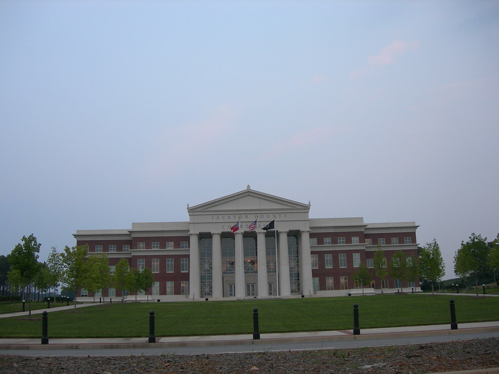
The first one is pretty lame, as in indicative of trying to do too much with too little. The wings appear to be out of proportion with the portico due to the sparse and light detailing of the windows, compared to the massive columns. The structure doesn't feel to be tied together very well. Can't really tell if the curtainwall behind the columns is intergrated with anything like pilasters. If its blank glass, The facade would appear to very little connection to the interior layout with pasted on look.
The second one looks much nicer partially because of the more intimate scale, the more detailed ionic elements and the depth created by more visual activity going on at the front of the walls with the defined arches and pilasters ties the "layers" of the facade together. The cast concrete window pediments on the wings kind of look akward when paired with the really stripped down decorative brickwork, it'd look better with a more pronounced cornice or with a balustrade with more contrast to the brick.

|


 Linear Mode
