"Plus the added feature--assuming it's still a go--of the tri-colored apex.
Gold on one side, silver on the other and all black in the middle." - Prezrezc
that's so funny, Prezrezc . . we've been tricked . .
often "more is actually more" . . But I think what you're talking about here,
is called "gilding the lilly" . . Early on, I used to rail on this site,
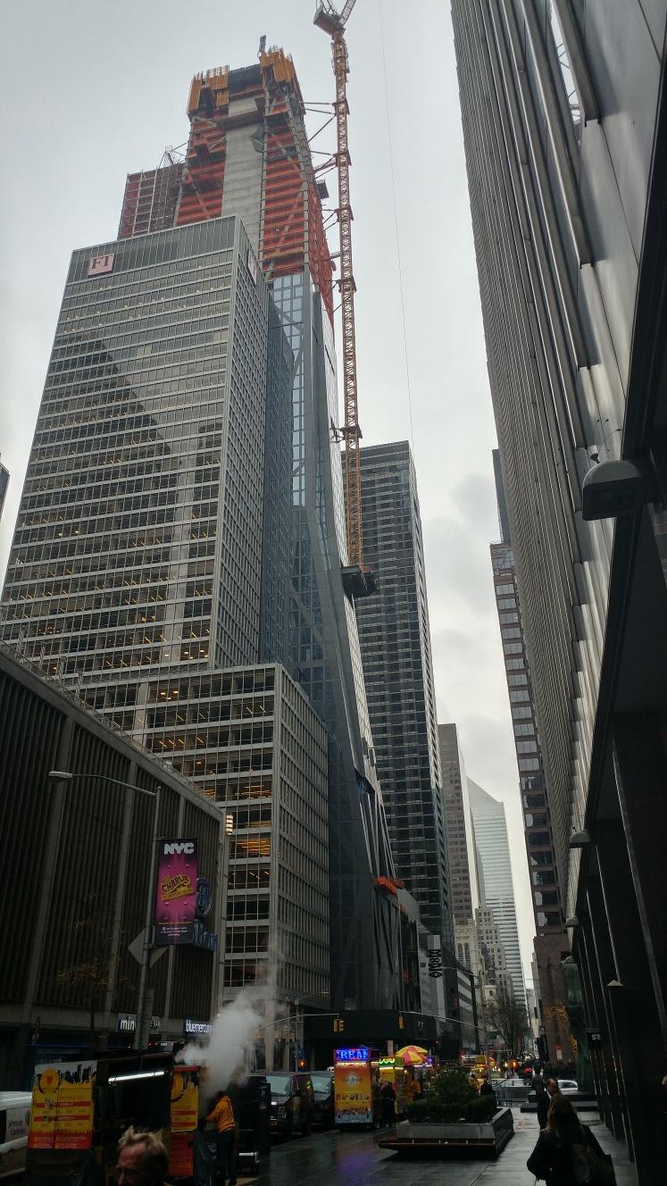
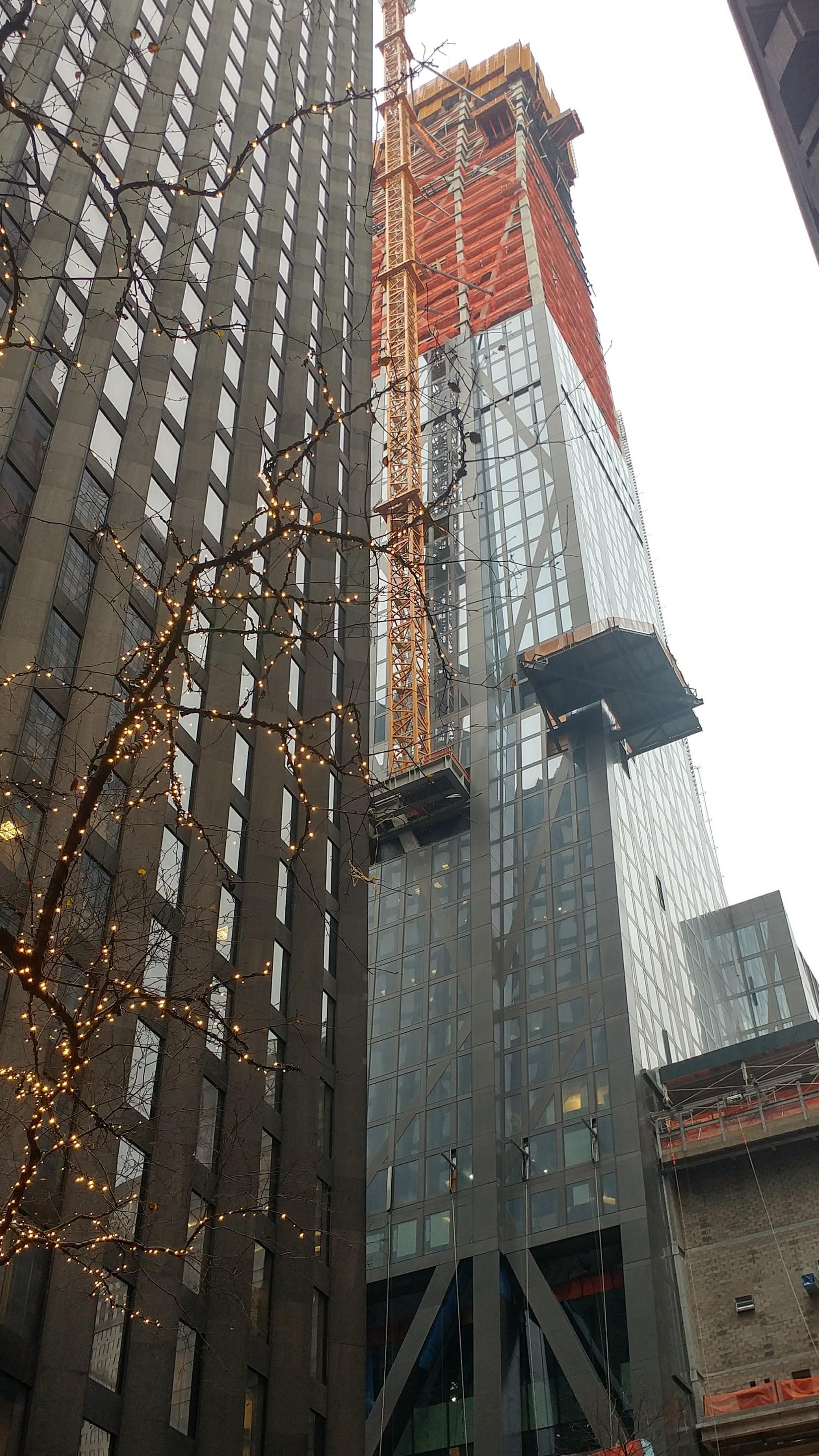
about misleading aspects of tower renderings . . These building pictures,
are the only way we get to see the great building, before it materializes . .
So I fulminated earlier on this thread, about the annoying coloration gimmick
used in renderings for this tower's crown . . whistling in the wind, as usual . .
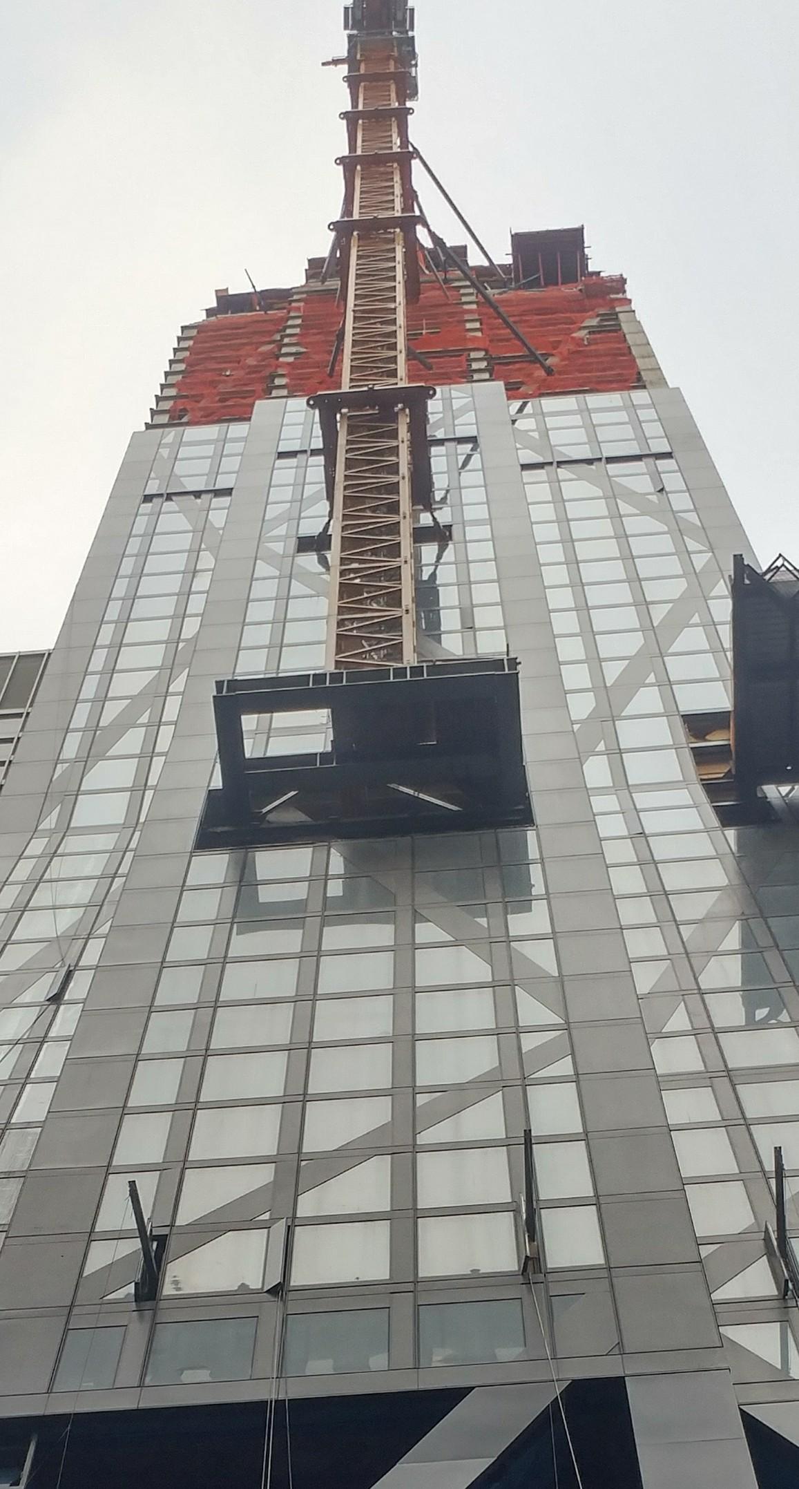
It was only a subtle tweak he made . .
but the renderer needlessly over-romanticized Verre's severe crown,
by depicting it as a softer "tri-colored apex" at sunset . .
It looked "too-pretty" and confused the sharper perspective . .
When I carefully studied the renderings, that color distortion, seemed to
punch-down the visual clarity of the wonderful crown architecture . .
The distinctive rigorous form that I wanted to savor . .
should've been boldly punched up . .
The top of the building, in the otherwise hyper-realistic illustrations,
implausibly and sentimentally reflected an incongruent colored light,
divorced from dramatic skies around it . .
No atmospheric condition, no matter how peripherally daylight
could ever facilitate such illumination of towering structure . .
But marketing people, must've gotten enamored by this cutesy portrayal . .
Identical faux-coloring was used, even on some of Verre's non-sunset pics . .
I'm all for artistic license . . but I found this peculiar deception, vexing . .
it was like slathering a real beauty, in pancake makeup . .
__________________
artSpook
|


 Prev
Prev


 .............it is awesome though.


 Linear Mode
