Quote:
Originally Posted by pico44

Translation:
"I have very poor, non-discriminating taste. An architect really can't dumb down a design enough for me. In fact, the only time I don't like a skyscraper is when it challenges my preconceived notions of what a tower ought to be. I react to being challenged by relating the disturbing object to things that I hate, regardless of how idiotic these similes and adjectives are. And oh yeah, the fact that it isn't in Chicago doesn't help."
|
I really liked the renderings, so I was perfectly fine with the design concept of NYTT. The problem was the executiuon.
Facade: Interesting concept using the ceramic rods to conserve energy. The problem is that the color choice was rather unfortunate as it makes the building look very dull and drab. Also, the window pattern as it looks against the facade makes the building look prision or parking garage like, with windows that are vertically small and horizontally continous.
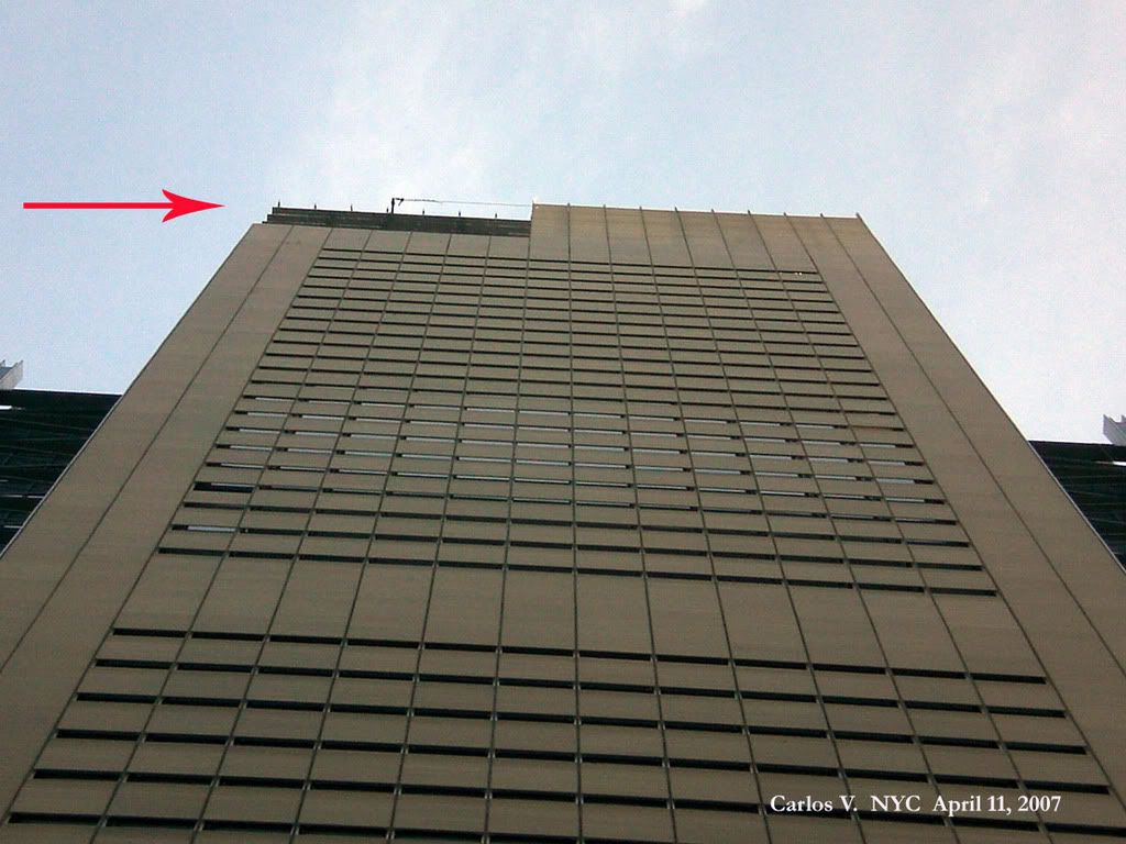
Crown: Instead of having a nice gradual decrease of ceramic rod density from the bottom to the top of the crown, the rods on the crown just seem to disappear altogether. This acts to emphasize the vertical and horizontal supports of the crown, the thickness of which makes it look like some type of exoskeleton support structure, and therefore a perpetually under construction or unfinished look.
Spire: Well, it looks like a flagpole to me, and I just don't find that appealing. Also, I don't like that ring about 1/3 of the way up.
Positives: Internal stairs along facade. Exposed angular cross-braced structural support. It's in New York and not Chicago


 Prev
Prev


 Great post!!!!!


 wow.
wow.

 Linear Mode
