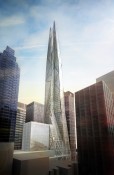
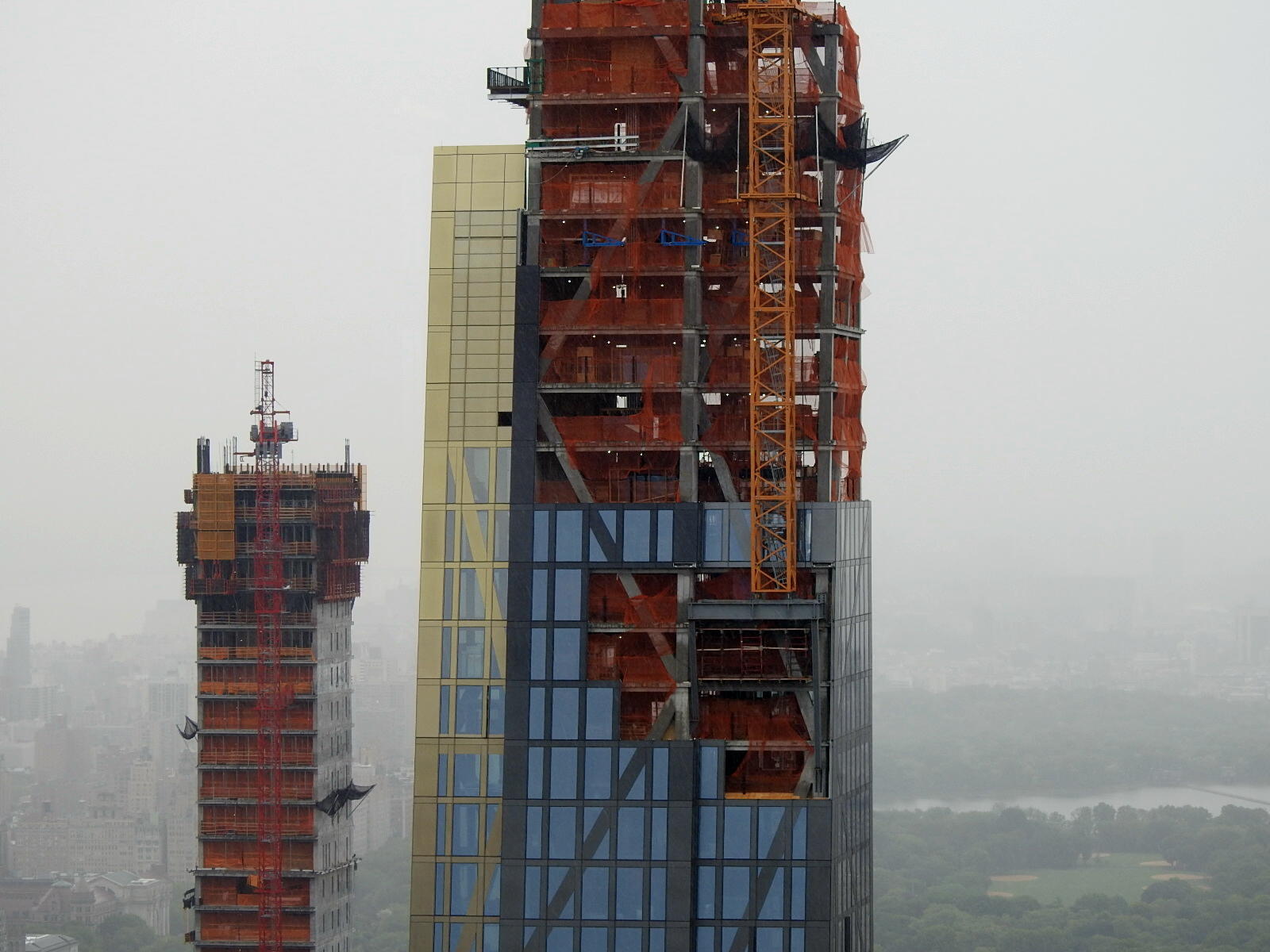
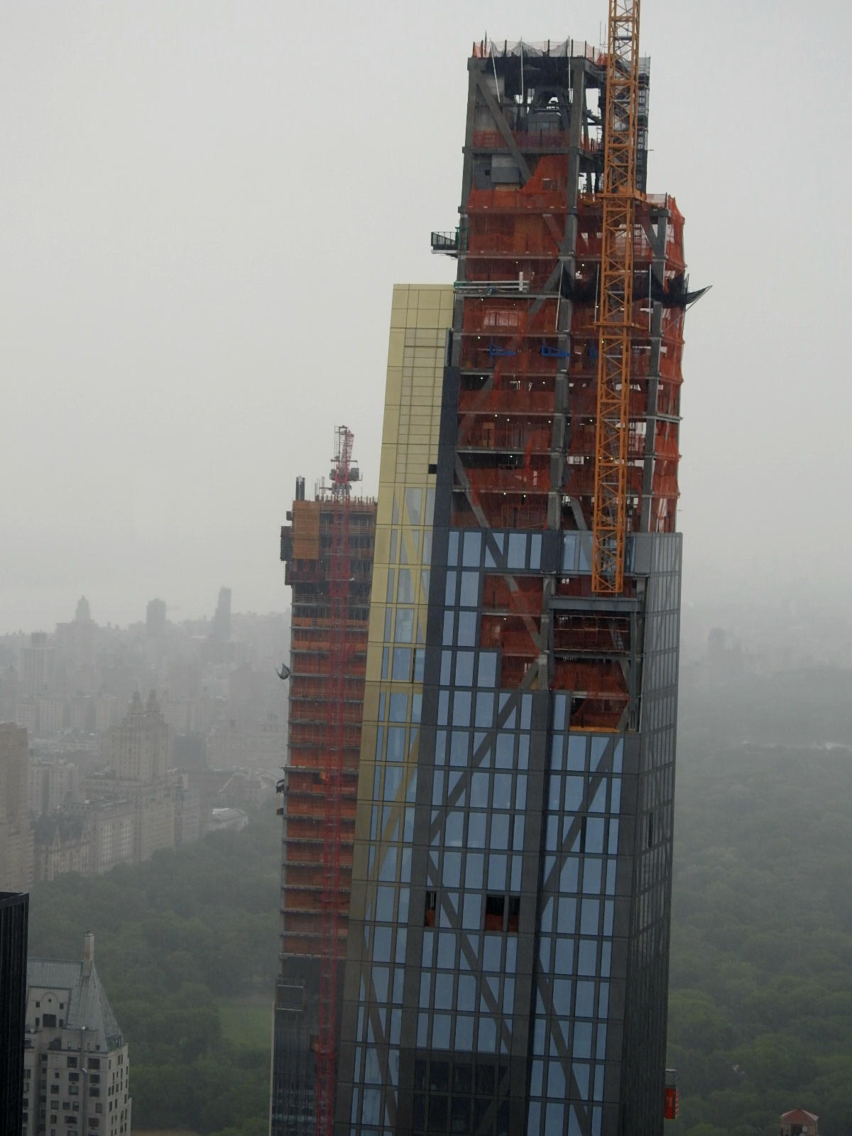
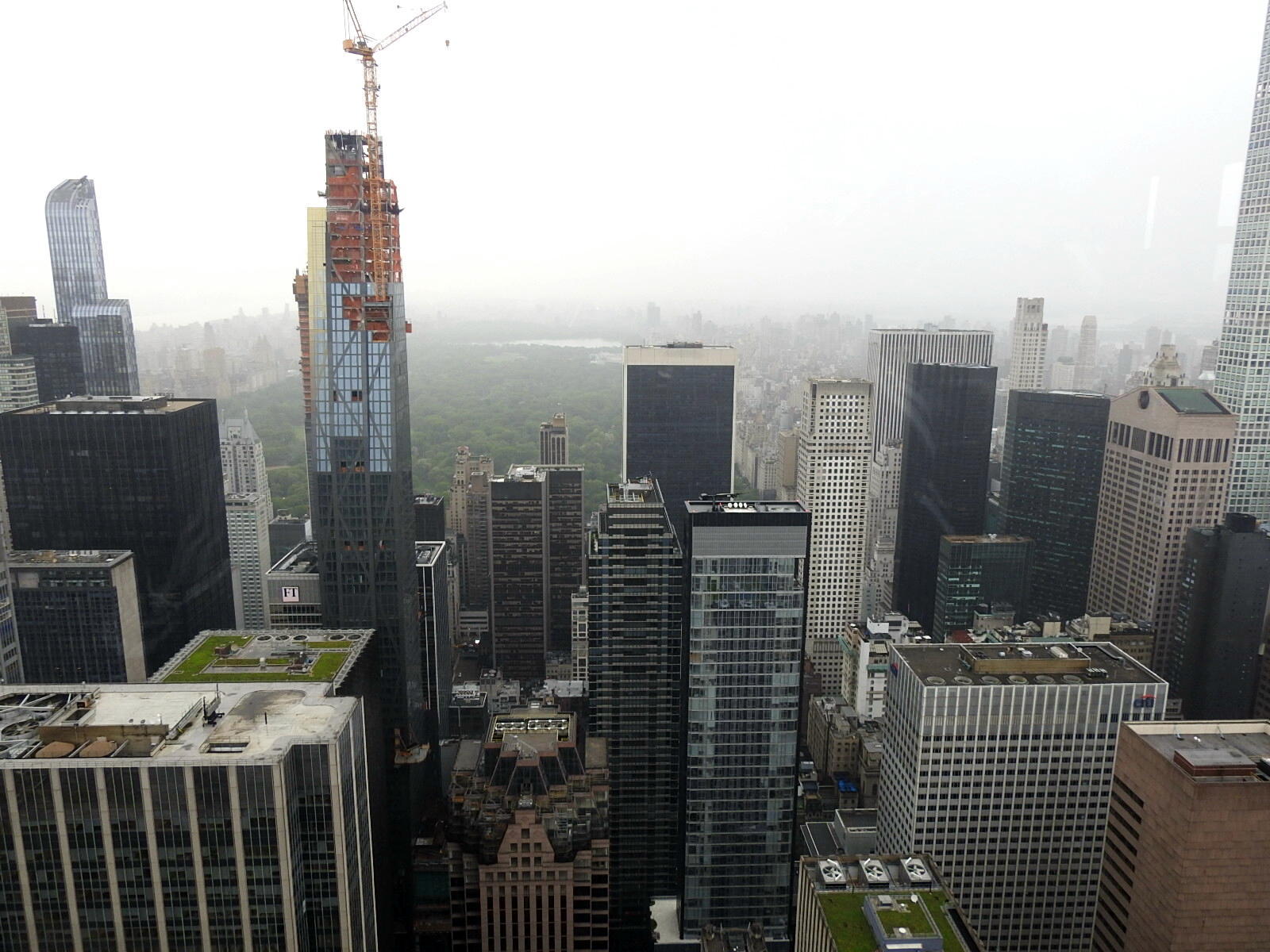
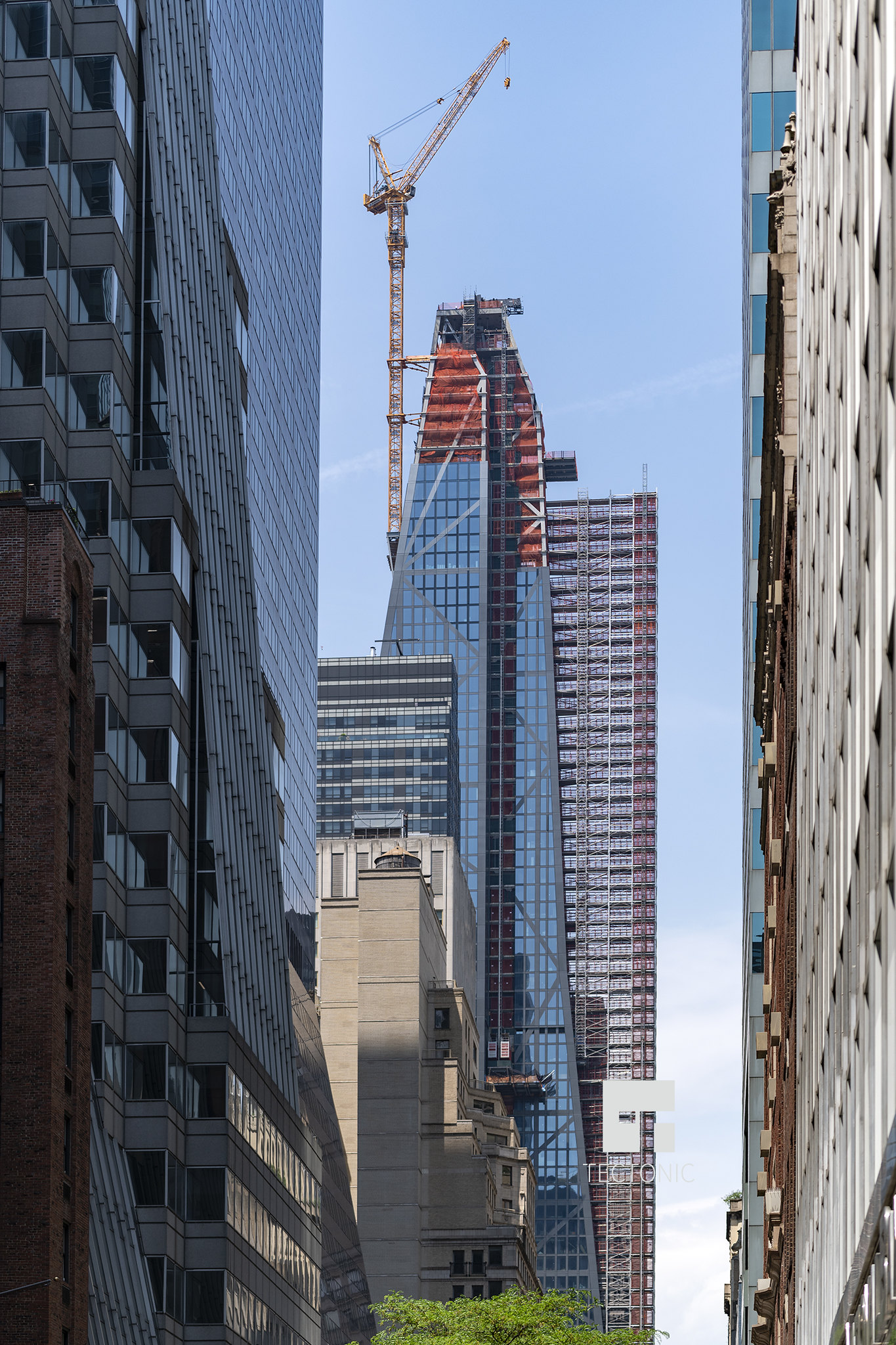
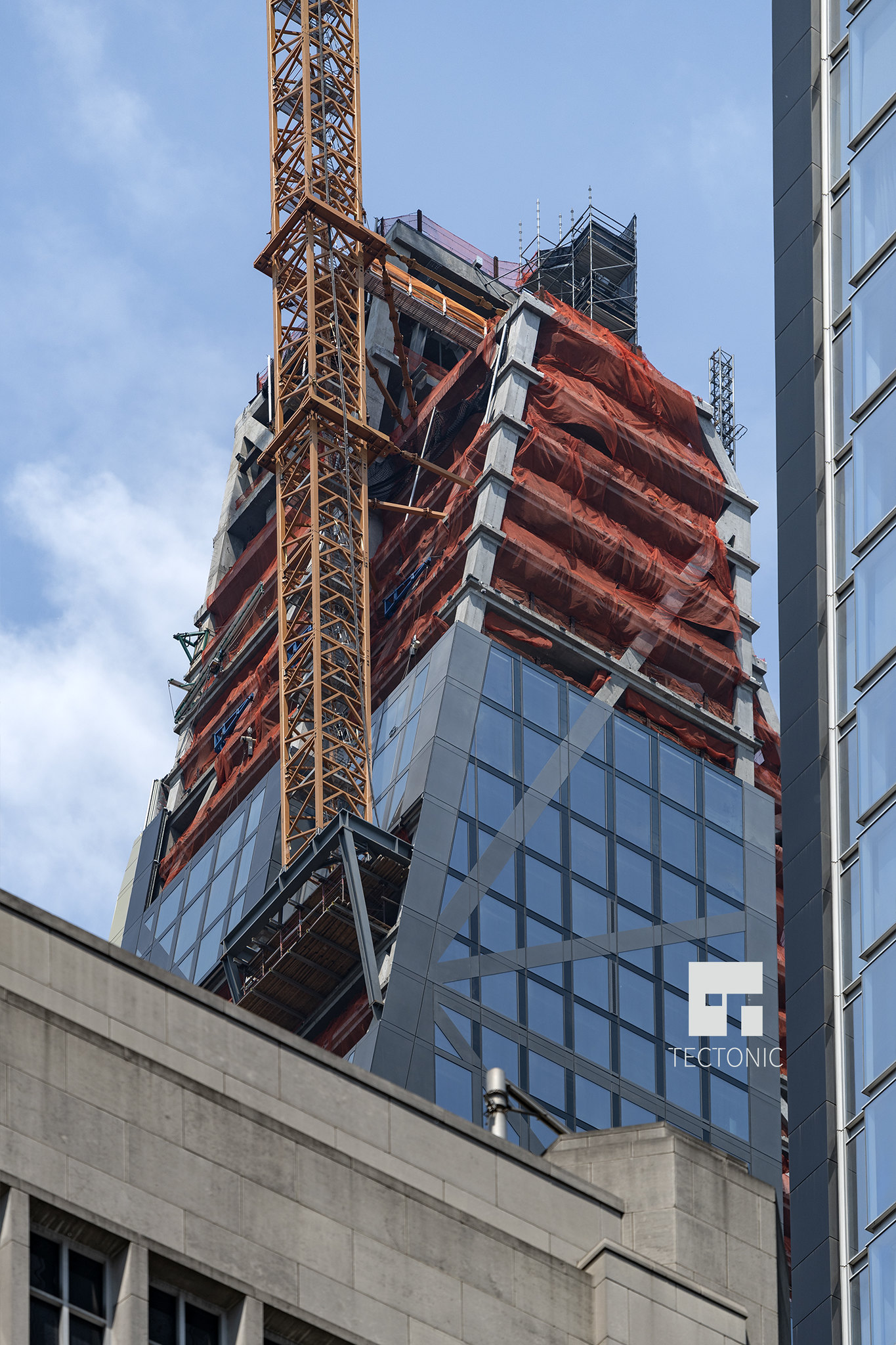
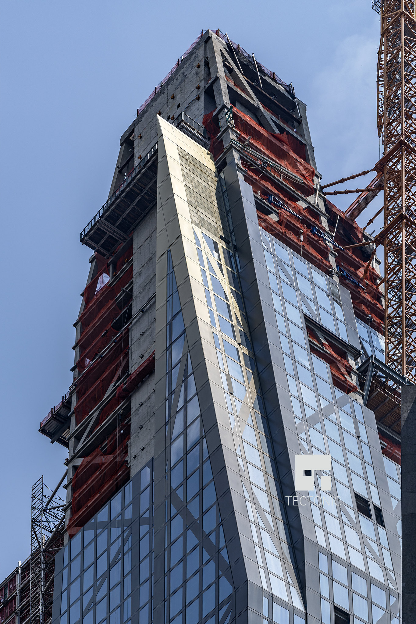
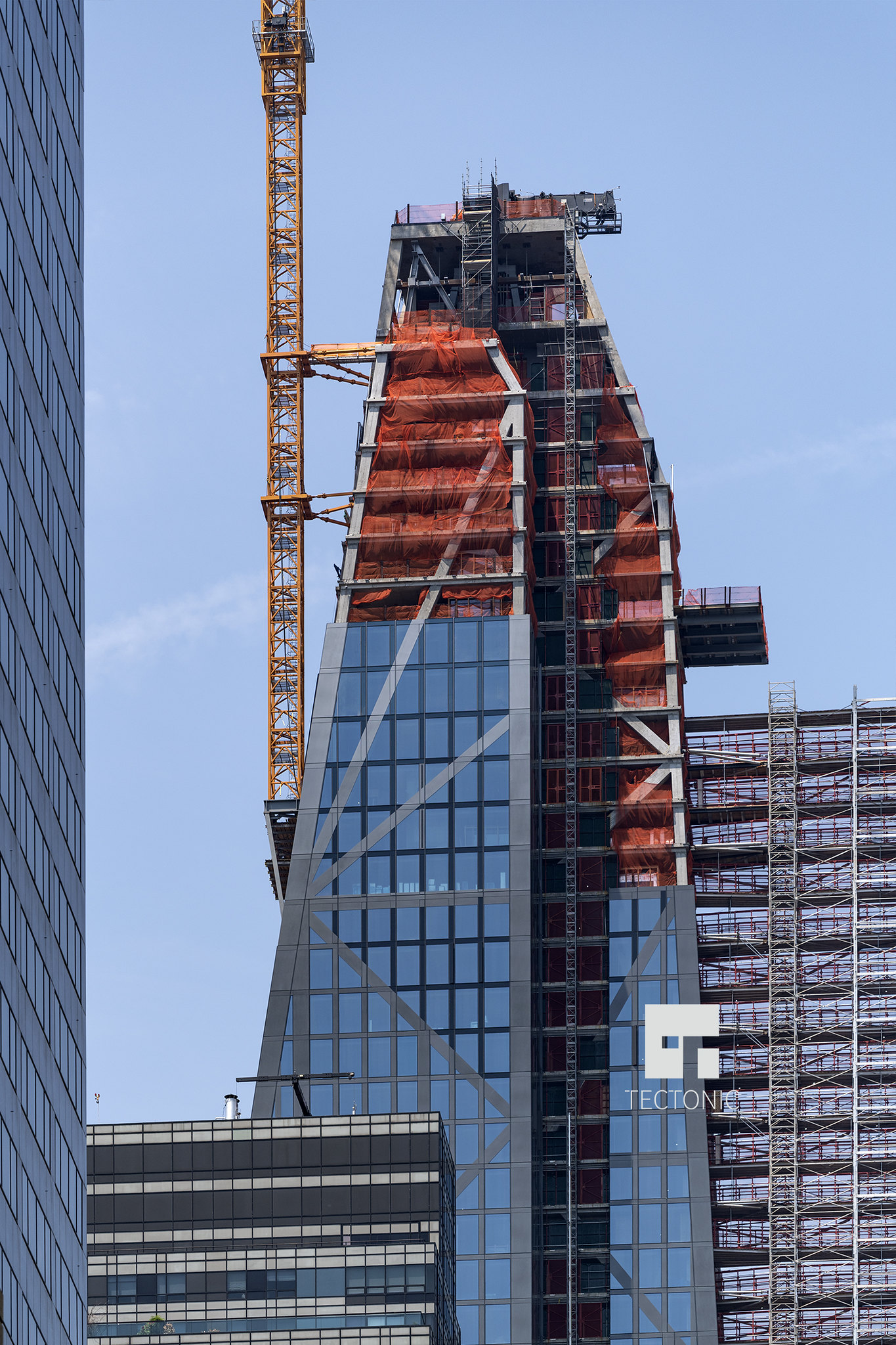
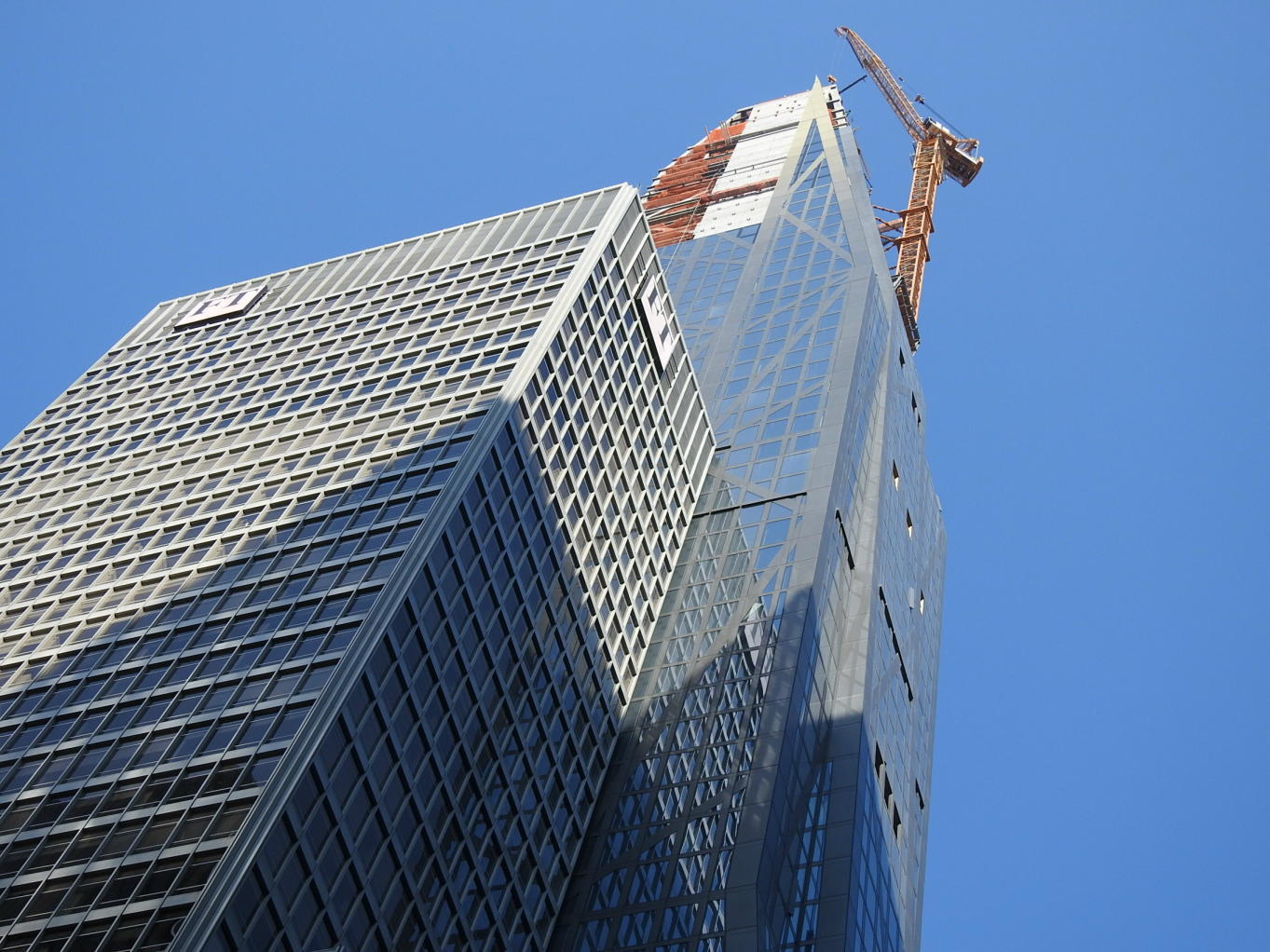
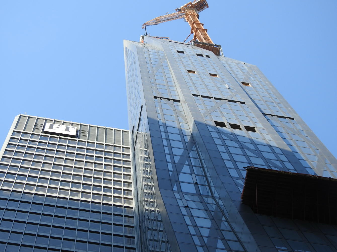
"The multi colored facade tops are a good thing.
the gold/silver areas the tower could look a bit dark and foreboding . . "
-aquablue
OMG they did it . . some of you foretold of this development . .
but I couldn't believe they'd do it . . not with this sublime building . .
Imagine if they colorized Big John in Chicago . .
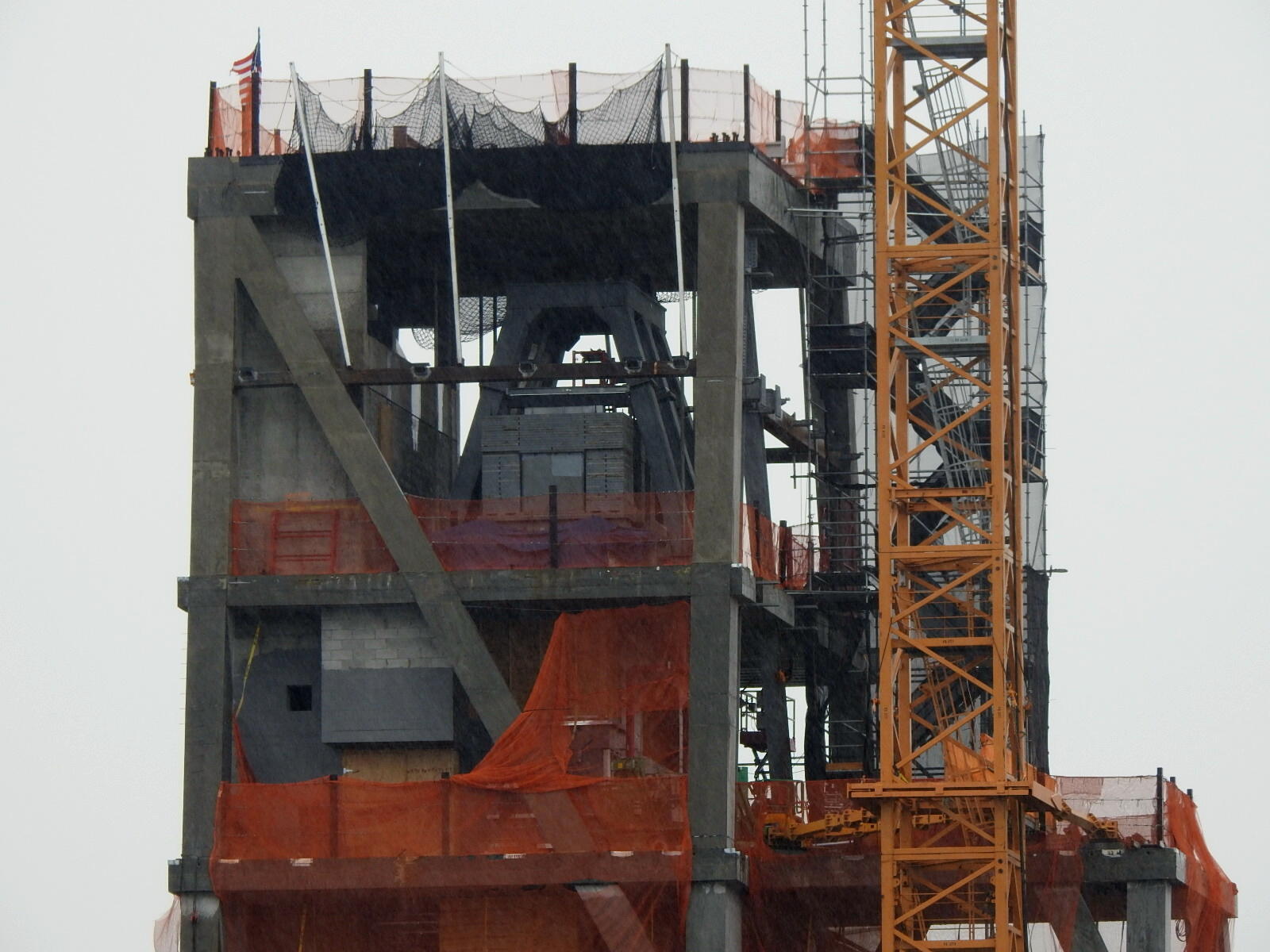
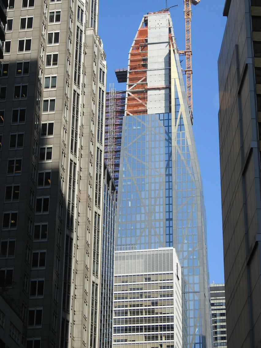
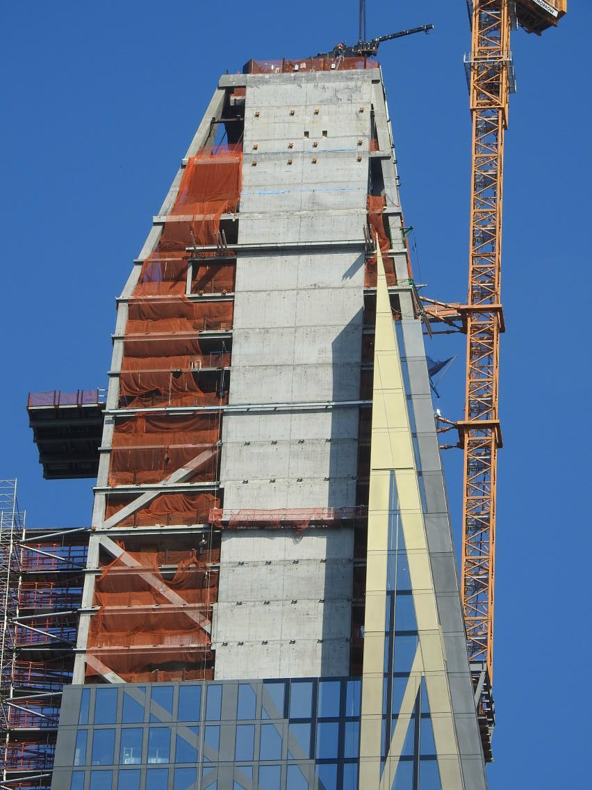
I loved the sharp, stark, foreboding, modernistic form of the shapely crown,
as I imagined it would be . . but didn't they just have to frickin' gild the lily . .
I mean 99.99999% of folks aren't even gonna notice . . but . .
the multi-coloration makes Verre's gorgeous culmination
of sculptural crown forms, look cheap, tacky, sentimental, plastic, . .
Worst of all, the faux highlights will negate the effects
of actual beautiful light on the elegant architecture . .
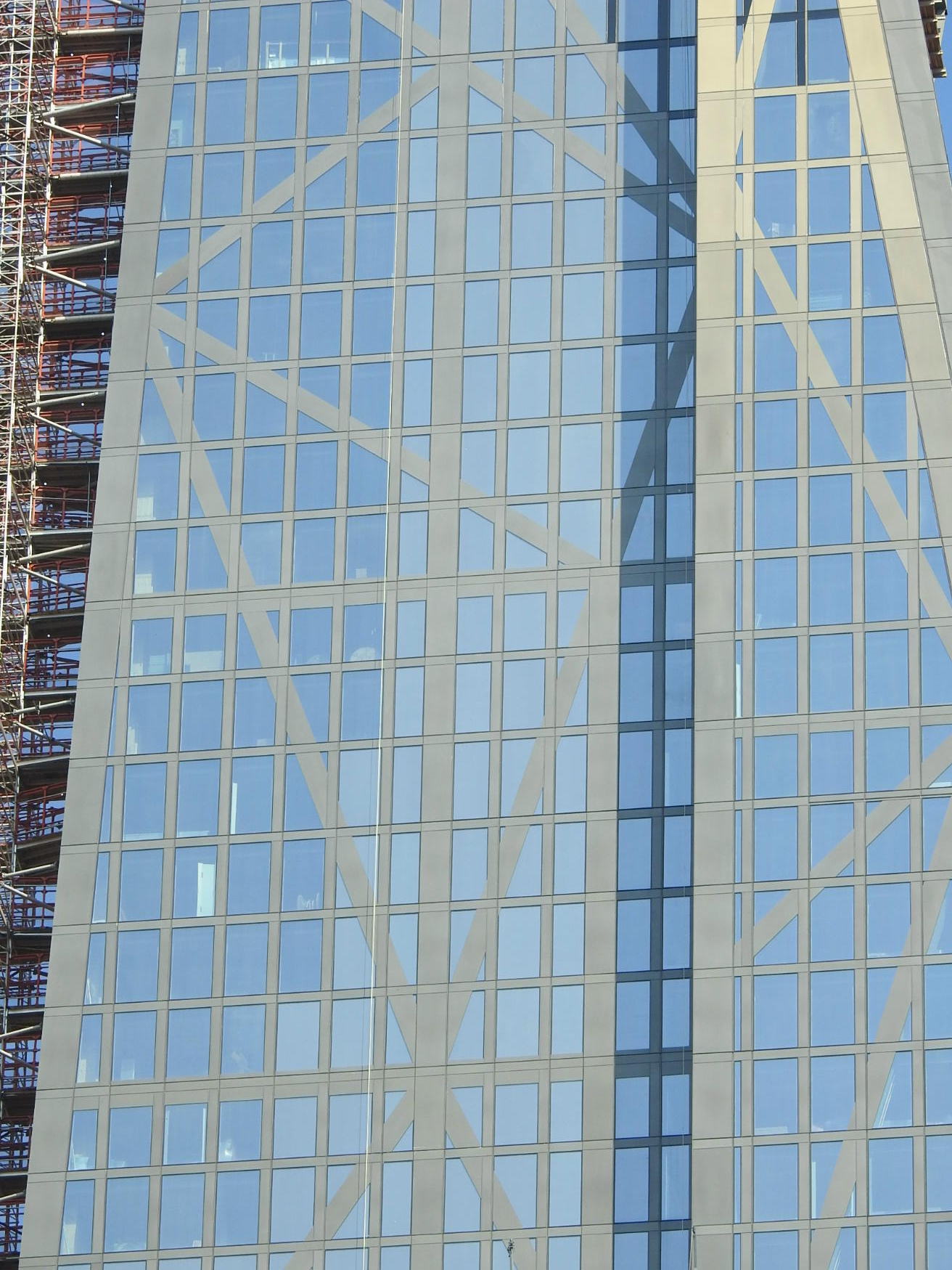
Natural light articulates and accentuates the handsome physical forms
that are actually there . . in the stone cliff, the steel bracing,
in the curvature of glass . .
Under most lighting conditions, Verre's powerful angular crown forms,
will be visually "de-accentuated" by this gratuitous gilding . .
Contradicting the light in the atmosphere, the fake sentimentalized tints
will mask the authentic drama of this building's signature crown . .
No doubt there will be the occasional atmospheric condition
under which these gildings will somehow sharpen the look . .
but most of the time, this dignified crown will probably just look oddly blurry . .
and a bit times square . .
hope I'm wrong . .
__________________
artSpook
|


 Prev
Prev


bloomberg.jpg)


 )
)


 Linear Mode
