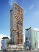
I actually quite like the small changes that have been made to the office component of the building. I think the two large Vs are great and don't mind that the angles are different than those in the north facing podium. The open plaza and wood and glass canopy looks pretty neat, definitely different, but I hate the HIDEOUS native art (hopefully that changes). I'd much prefer giant animals (such as the sparrows at the Olympic Village), perhaps ones based off of their marketing campaigns. My guess is the giant butterflies are projections? Pretty neat too.
I'm not too big of a fan of the Richards/Robson residential facade
unless those brown vertical columns are something akin to what Henriquez did on Woodwards, then I will reserve judgement until the project is complete.
I think protruding boxes are a little played out already, but having trees in them is a little different, so that is kinda neat. Would be nice if the office tower was a little taller, but that could be said for many buildings. The small changes from the first render we say are good though and this will be a massive improvement on what is currently on the site.
edit: Would have been nice if they took that "V" detail and ran with it more and did something similar to the Hearst Building in NYC
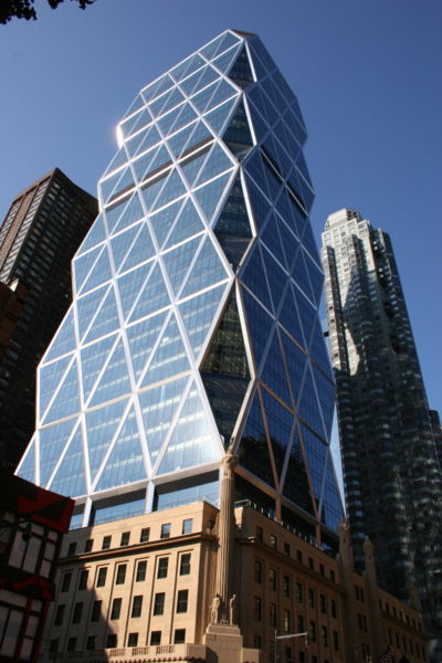 http://www.nyc-architecture.com/MID/Hearstowernyc.jpg
 http://www.sustainableisgood.com/pho...rst_atrium.jpg


 Prev
Prev


 Linear Mode
