^
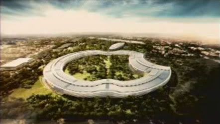
I don't find this very creative or creativity-inspiring. On the interior, the view from every single fucking window will be the same (other than the foliage). How horribly monotonous. From the exterior, pretty much the same story. Creative types need variety, nooks, crannies, different environments for different moods, etc.; those things foster innovation.
On the functionality front, I don't know why offices (opposite one another) must needlessly be separated so far apart by a courtyard. An energy-efficient design would not needlessly add massive distance between co-workers.
On the image front, I think there will inevitably be detractors one day calling it a death star or something, especially, say, when Apple mis-steps or, say, gets too powerful in the music industry, etc.
So this strikes me as one of the stupidest designs ever for an office building. Do we know that this massing was the idea of Apple/Jobs and not Foster/the architect?
There are plenty of "insanely great" architects and designs out there that they could have chosen. Just one random example of interesting massing/layout just waiting to be built in California is
www.big.dk/projects/ski (the main building, not the little ones), adapted in some way for office use.


 Prev
Prev


 Hybrid Mode