Quote:
Originally Posted by HaliStreaks

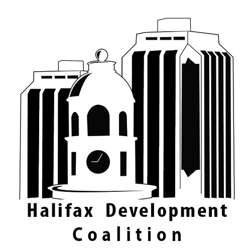
If that logo has to be shrunk down, the text in the corner might be too small to read... well, I suppose I could come up with a card design if we needed it.. lol..
|
Yep, I'd come up with a version that has the image scaled down the size of the text. That way the text will be readable if the logo ever has to be shrunk or placed alongside other logos. Right now the graphic elements are taking up about 70-90% of your bounding area depending on the version. Obviously this won't be a text-based logo with minimal graphics, but the idea is for the text to not be overpowered by the graphic.
Of course, it may be useful to have both; a 'stacked' version(above) and a horizontal version (with the image scaled to the text size).
Are you doing this in illustrator? You could add some subtle blues, greys and greens to reflect the colouring of purdy's and the town clock. It would be good to have a colour version too.
Anyway now I'm rambling. Those are just a few thoughts.


 Prev
Prev


 Linear Mode
