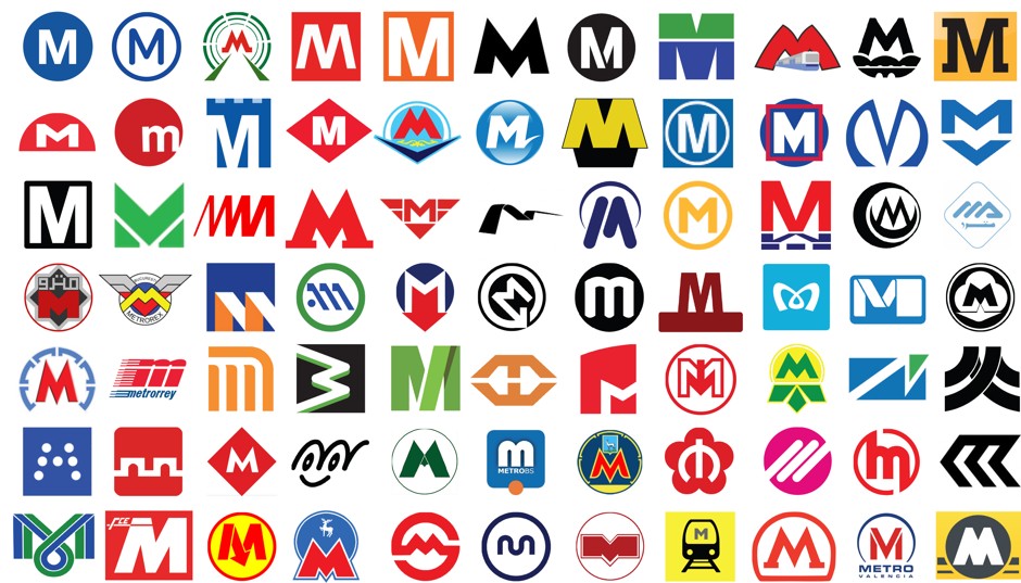
I find that Canada excels at transit logos for the most part, for their simplicity in some cases, and history in others. Here are 77 Metro logs from around the word, using the "M". A lot of them try way too hard.
TTC logo is great because of the history behind it (it’s the original logo from the 1920’s), but I find it isn’t as functional as Ottawa’s or Montreal’s.
Montreal probably has one of my favourite subway logos anywhere.
Montreal's is design excellence... love it 100%.
Also, that graphic above is interesting... I didn't appreciate how universal the 'M' is for subway systems.
Yeah, here the Toronto and Montreal subway and metro symbols, respectively, are standouts.
The Ottawa O got me thinking about this guy (don't you hate his scarf look?):
torontoist
Perhaps the biggest phony in Canada. Comes across as warm, down-to-earth, but is really nothing more cold-hearted bean counter born with a silver spoon up his rectum. Recall the bread-price fixing issue.
I hate his commercials with a flaming passion! Smarmy and wretched, does anyone like this guy?
usually with logos, "less is more" except as far as the Bay logo is concerned. I much prefer the new (or is it actually a revamped old) logo to the yellow ribbon version. It never looked like a "B" to me, and this bothered me greatly.
Look what they did to the nice streetwall in downtown Cobourg. I'm going to have to research this further but I'm assuming the building was originally 3 storey like the rest of the street.
Look what they did to the nice streetwall in downtown Cobourg. I'm going to have to research this further but I'm assuming the building was originally 3 storey like the rest of the street.
Look what they did to the nice streetwall in downtown Cobourg. I'm going to have to research this further but I'm assuming the building was originally 3 storey like the rest of the street.


 Prev
Prev


 Linear Mode
