Quote:
Originally Posted by Hayward

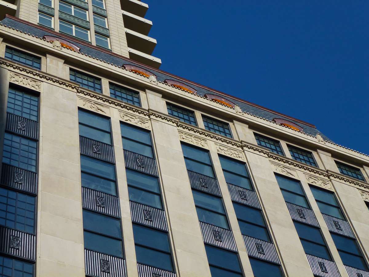
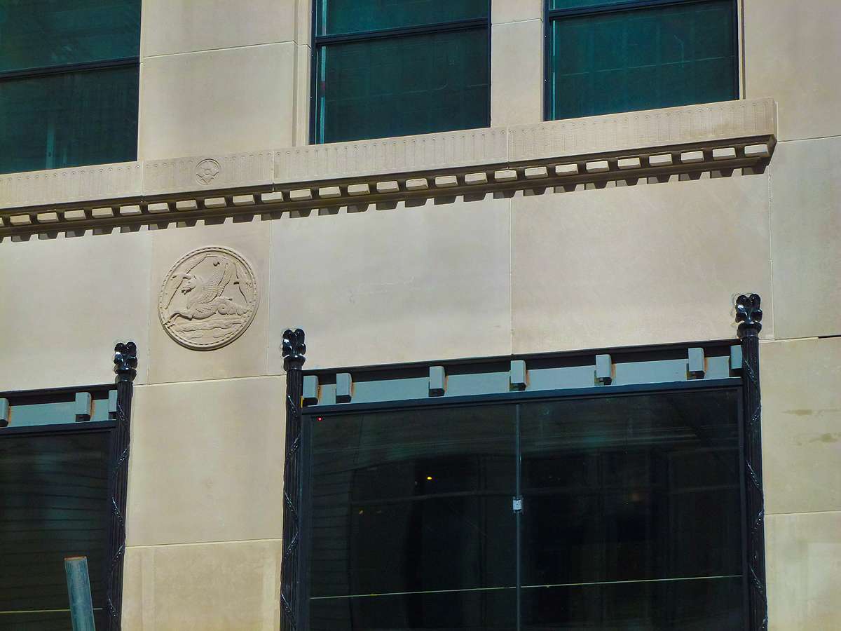
I guessed awhile back that LaGrange uses white framing so that the window mullions are legible. It seems like he's all about clarity of joints and lines with deliberate emphasis...whether it's with larger reveals or color. At ground level, joints become less pronounced and texture and detail are more prevalent. It's been this way on most of his buildings.
|
This especially bugs me. Is there really a historical precedent for bright white mullions/muntins? In Second Empire or Art Deco or whatever style LaGrange claims to derive his 'designs'? If not, it really shows you how undisciplined he is (compared to Stern of Beeby). And even if it is like you say—an artistic 'interpretation'—then it just shows how awful his original ideas are; they absolutely look like they're a bulk bargain buy from Home Depot.
I do agree with Mr. Servo, though, but only in comparison with his other skyscrapers. IMO, Elysian, Park Tower and Lincoln Park 2520 are much worse.


 Prev
Prev


 Linear Mode
