HomeDiagramsDatabaseMapsForum About
     

Go Back   SkyscraperPage Forum > Regional Sections > United States > Pacific West > Portland > Downtown & City of Portland


Reply

 
Thread Tools Display Modes
     
     
  #21  
Old Posted Mar 30, 2016, 11:41 PM
Sioux612's Avatar
Sioux612 Sioux612 is offline
Registered User
 
Join Date: May 2007
Posts: 539
The difference that height makes

Reply With Quote
     
     
  #22  
Old Posted Mar 31, 2016, 3:16 AM
Derek Derek is offline
Registered User
 
Join Date: Aug 2006
Location: Portland, OR
Posts: 9,546
Quote:
Originally Posted by 2oh1 View Post
I've never understood the argument that something is good because it isn't worse. The Flu isn't cancer, but does anybody like having the flu? A mugger isn't a murderer, but does anybody want to get mugged? This thing isn't a dreary slab, but not being dreary doesn't mean it's good design. This is another one where I hope a few rounds of design review will fix it. It looks like it was designed by committee.


Ruh roh.

To be clear, the design itself is pretty bad but I appreciate the color they've included. I'm excited to see this one mature.
__________________
Portlandia
Reply With Quote
     
     
  #23  
Old Posted Apr 4, 2016, 5:48 AM
maccoinnich maccoinnich is offline
Moderator
 
Join Date: Jan 2009
Location: Portland
Posts: 7,405
Staff memo [PDF] to the Design Commission.
__________________
"Maybe to an architect, they might look suspicious, but to me, they just look like rocks"

www.twitter.com/maccoinnich
Reply With Quote
     
     
  #24  
Old Posted Apr 13, 2016, 7:47 PM
maccoinnich maccoinnich is offline
Moderator
 
Join Date: Jan 2009
Location: Portland
Posts: 7,405
Images from DAR #1, and write up at Next Portland.


__________________
"Maybe to an architect, they might look suspicious, but to me, they just look like rocks"

www.twitter.com/maccoinnich
Reply With Quote
     
     
  #25  
Old Posted Apr 14, 2016, 1:17 AM
urbanlife's Avatar
urbanlife urbanlife is offline
A before E
 
Join Date: Aug 2001
Location: Milwaukie, Oregon
Posts: 11,784
I like the overall design depending on the material they choose to use.
Reply With Quote
     
     
  #26  
Old Posted Apr 14, 2016, 2:15 AM
2oh1's Avatar
2oh1 2oh1 is offline
9-7-2oh1-!
 
Join Date: May 2007
Location: downtown Portland
Posts: 2,486
I'm not sure. It looks like a jumbled mess created by too many ideas, as if it was designed by committee. And it's a cartoon rendering which certainly won't look like that when built. I think either the dark gray parts need to be white instead, or vice versa.
Reply With Quote
     
     
  #27  
Old Posted Apr 14, 2016, 7:10 PM
TowerPower TowerPower is offline
Registered User
 
Join Date: Jul 2006
Location: Portland, OR
Posts: 110
Hideous is the word I'd use.
__________________
Goodbye
Reply With Quote
     
     
  #28  
Old Posted Apr 14, 2016, 8:16 PM
Leo Leo is offline
Registered User
 
Join Date: Jan 2005
Posts: 389
So terrible ... It reminds me of what I used to build with Legos after I ran out of the right-colored blocks...
Reply With Quote
     
     
  #29  
Old Posted Apr 14, 2016, 10:29 PM
zilfondel zilfondel is offline
Submarine de Nucléar
 
Join Date: Mar 2006
Location: Missouri
Posts: 4,477
Quote:
Originally Posted by maccoinnich View Post
It looks like shipping crate-itecture. Without using actual crates.
Reply With Quote
     
     
  #30  
Old Posted Apr 14, 2016, 10:49 PM
innovativethinking innovativethinking is offline
BANNED
 
Join Date: Mar 2012
Posts: 591
It looks awesome and much better than the Yard
Reply With Quote
     
     
  #31  
Old Posted Apr 15, 2016, 12:26 AM
Derek Derek is offline
Registered User
 
Join Date: Aug 2006
Location: Portland, OR
Posts: 9,546
Quote:
Originally Posted by zilfondel View Post
It looks like shipping crate-itecture. Without using actual crates.
This is exactly what I was thinking. I love the concept and colors, but it needs to be refined.
__________________
Portlandia
Reply With Quote
     
     
  #32  
Old Posted Apr 15, 2016, 1:01 AM
2oh1's Avatar
2oh1 2oh1 is offline
9-7-2oh1-!
 
Join Date: May 2007
Location: downtown Portland
Posts: 2,486
The more I look at it, the more I think it's a mess.

There's no connection between the design of the ground floor and anything above it. The darker sections of the building are the parts that protrude, which makes them look hulking. It looks like there's no rhyme or reason for where and how the various colors are used. The orange, as used here, could be good, but the rest of the chaos makes it look gaudy. The interplay of the light and dark grays could be good, but the white sections make it look choppy or even scattered. The protruding sections could add visual interest, but instead they look hulking because they're dark resting on non-protruding white. The whole thing is a mess.

Hopefully it'll change significantly for the better before they break ground, because as it is... oof.
Reply With Quote
     
     
  #33  
Old Posted Apr 15, 2016, 1:13 AM
Derek Derek is offline
Registered User
 
Join Date: Aug 2006
Location: Portland, OR
Posts: 9,546
Quote:
Originally Posted by 2oh1 View Post
The more I look at it, the more I think it's a mess.

There's no connection between the design of the ground floor and anything above it. The darker sections of the building are the parts that protrude, which makes them look hulking. It looks like there's no rhyme or reason for where and how the various colors are used. The orange, as used here, could be good, but the rest of the chaos makes it look gaudy. The interplay of the light and dark grays could be good, but the white sections make it look choppy or even scattered. The protruding sections could add visual interest, but instead they look hulking because they're dark resting on non-protruding white. The whole thing is a mess.

Hopefully it'll change significantly for the better before they break ground, because as it is... oof.
I didn't even realize that was brick until you said something.


The top was too distracting...
__________________
Portlandia
Reply With Quote
     
     
  #34  
Old Posted Apr 26, 2016, 4:36 AM
maccoinnich maccoinnich is offline
Moderator
 
Join Date: Jan 2009
Location: Portland
Posts: 7,405
Summary memo [PDF].
__________________
"Maybe to an architect, they might look suspicious, but to me, they just look like rocks"

www.twitter.com/maccoinnich
Reply With Quote
     
     
  #35  
Old Posted May 16, 2016, 7:35 PM
maccoinnich maccoinnich is offline
Moderator
 
Join Date: Jan 2009
Location: Portland
Posts: 7,405
Memo [PDF] to the Design Commission for DAR #2.
__________________
"Maybe to an architect, they might look suspicious, but to me, they just look like rocks"

www.twitter.com/maccoinnich
Reply With Quote
     
     
  #36  
Old Posted May 31, 2016, 7:31 AM
maccoinnich maccoinnich is offline
Moderator
 
Join Date: Jan 2009
Location: Portland
Posts: 7,405


__________________
"Maybe to an architect, they might look suspicious, but to me, they just look like rocks"

www.twitter.com/maccoinnich
Reply With Quote
     
     
  #37  
Old Posted May 31, 2016, 6:48 PM
2oh1's Avatar
2oh1 2oh1 is offline
9-7-2oh1-!
 
Join Date: May 2007
Location: downtown Portland
Posts: 2,486
Clearly, somebody is married into the idea of using that bright orange. Oof.
Reply With Quote
     
     
  #38  
Old Posted Jun 1, 2016, 6:53 AM
cailes cailes is offline
Registered User
 
Join Date: Apr 2014
Location: Seattle
Posts: 314
You know, for the first time I feel like a rendering has captured how forlorn a neighborhood feels if you were to walk through it.

I mean, I look through it and the renderings actually show the desolation of that area.

That is about all I have to say....
Reply With Quote
     
     
  #39  
Old Posted Jun 1, 2016, 8:20 AM
bvpcvm bvpcvm is offline
Registered User
 
Join Date: Apr 2004
Location: Portland
Posts: 2,788
Don't care for this design but I'm glad to see some color here.
Reply With Quote
     
     
  #40  
Old Posted Jun 1, 2016, 8:58 PM
TowerPower TowerPower is offline
Registered User
 
Join Date: Jul 2006
Location: Portland, OR
Posts: 110
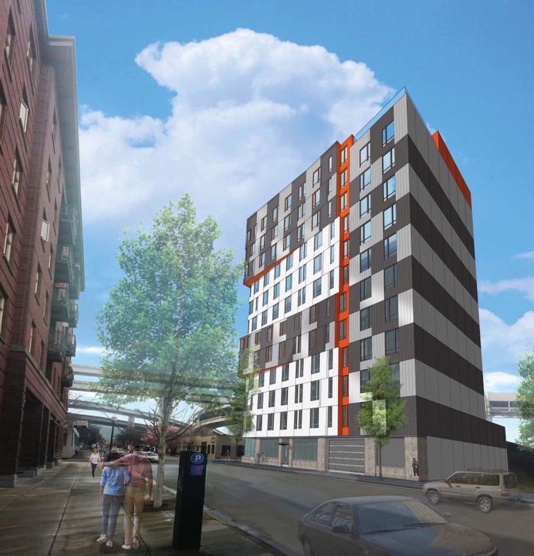
"Staff still considers that the multiple elements compete, the oversized oriels are too solid, the ground floor is too compressed, the materiality is too flat, and the solutions are graphic rather than architectural, and that the “different building and design elements” do not yet “achieve a coherent composition."

This proposal makes the Overton look like the Taj Mahal. Setting the bar at a new low.
__________________
Goodbye

Last edited by TowerPower; Jun 1, 2016 at 9:16 PM.
Reply With Quote
     
     
This discussion thread continues

Use the page links to the lower-right to go to the next page for additional posts
 
 
Reply

Go Back   SkyscraperPage Forum > Regional Sections > United States > Pacific West > Portland > Downtown & City of Portland
Forum Jump


Forum Jump


All times are GMT. The time now is 3:00 PM.

     
SkyscraperPage.com - Archive - Privacy Statement - Top

Powered by vBulletin® Version 3.8.7
Copyright ©2000 - 2024, vBulletin Solutions, Inc.