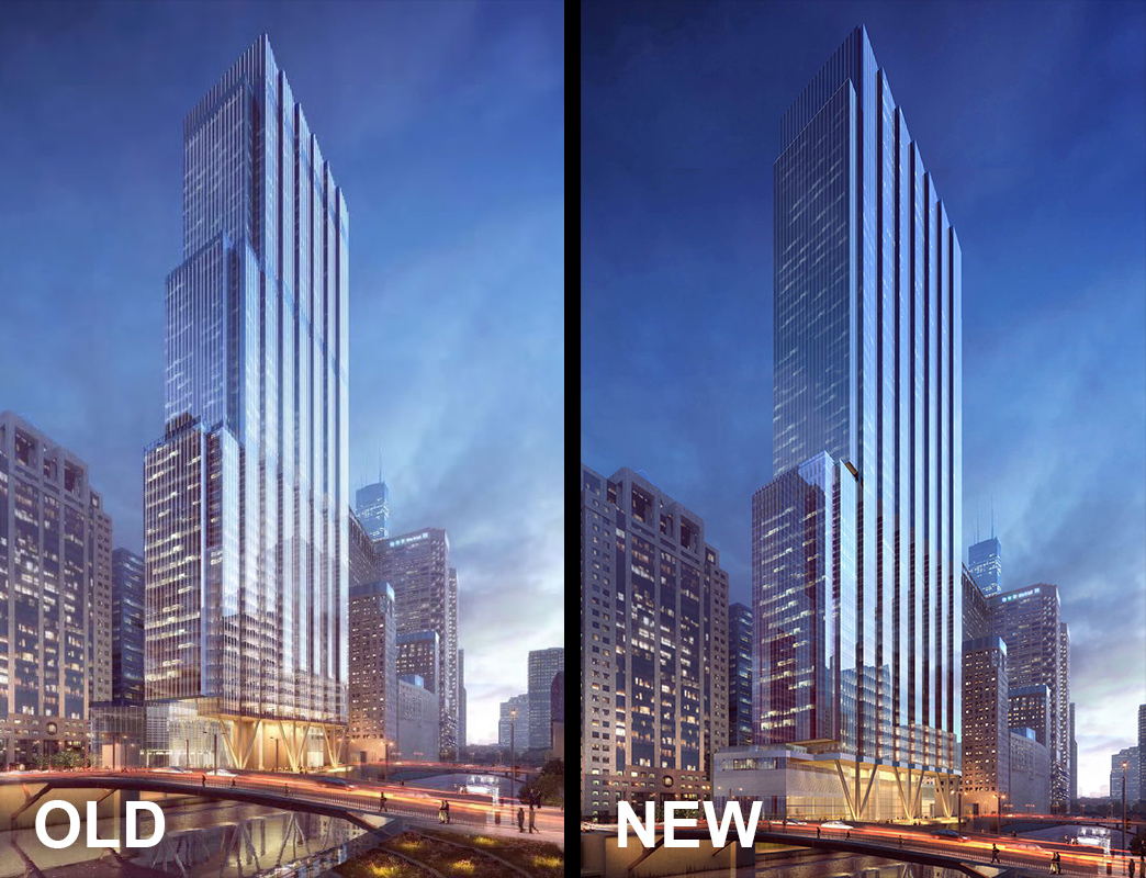
I was being a little facetious, but the logo clearly references the old tower's form pretty literally. I am sure the marketing team has some rationale as to why it still works though. (ie the literal setback count like you mentioned or perhaps the scalloped edges along the river)
It's hardly a travesty, but went from being a nice if simple mark to kind of arbitrary.


 Prev
Prev


 Linear Mode
