Quote:
Originally Posted by Biff

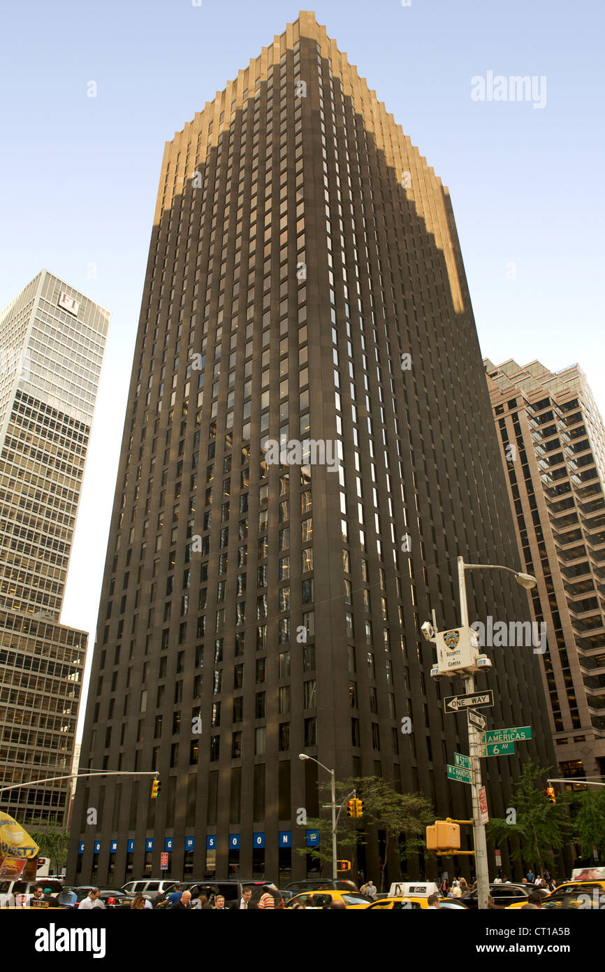
I wouldn't change the Richardson either. It is our first significant skyscraper (term used loosely for Winnipeg) and has aged rather well in my opinion. The fact that 360 Main has been redone has done a lot for sprucing up the corner.
|
It is our first skyscraper, but it isn't exactly heritage worthy, in my opinion.
Nothing against the Richardsons or any wealthy Manitobans, but I don't know why they're worshipped. Can't we just start making fun of them like the Aspers?
Quote:
Originally Posted by LilZebra
The problem with the Richardson IS the concrete.
And I'm not being negative or sarcastic... Richardson needs to be brighter, especially passing by on those long Winter nights.
|
Conrete is the problem. 220 Portage had a more elaborate redesign and re-skinning planned, but high costs due to concrete killed that plan.
And I agree on the darkness. I do however find it funny that people call 360 too dark (though I can understand THAT part) but ignore how dark and dreary (due to the matted colour) richardson is.
Quote:
Originally Posted by Hecate
The Richardson is a classic. It is simplistic, elegant, and stately in its design. To say it is an eyesore is nonsense. To reclad it in something like the above images would be a crime. The only thing this building desperately needs is better lighting, so it is more prominent at night and maybe a good pressure washing.
|
It's a carbon copy of the CBS building. Not sure if that's super classic.


 Prev
Prev


 Linear Mode
