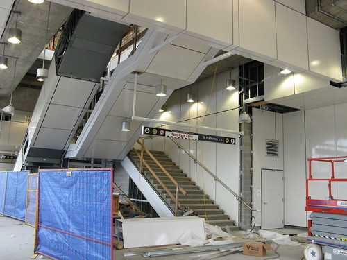
I am very disappointed in them using the old style tiling, they really should have used something better looking for the underside of the stairs and escalator. Why not glass for the escalator. and maybe even the stairs?
I think the white tiling looks better than it used to, it looks glossier and less textured. And the green pipes and metal mesh walls are gone from the scheme, which helps a lot and makes it look less 80's, more timeless. 1 down, 12 (?) to go.
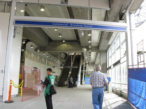
Did anyone else notice that the platform signs at Commercial and Broadway read Comm'l - Bdway? They have since been changed to "commercial and broadway". That was a waste of money and just bad judgement on whoever was in charge!
Lol.
Looks like either SMS text messaging slang or Engrish jargon.
I'm glad they upgraded the station, but doesn't anyone else think think the white baseboarding around the bottom of the glass barriers loos like crap?
Then again it's not finished yet.
Who the fuck though of that? I am totally in favor of giving mentally challenged people jobs, but common hire professional designers who understand way finding for something like this.
Yeah they actually were "Commercial-Broadway" before... What is with TransLink... it's not like the text doesn't fit or anything -__-"
The ones on the buses are stupid. You can't fit the entire stn name in one line, so you need two anyways. So why not display the entire stn name anyways.
Are we going to give all our stations texting friendly names?
Wfnt?
Brrd?
Grnvl?
Stdm?
It's like the official death of English.
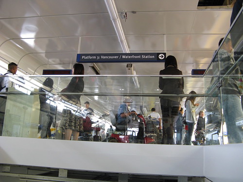
Does it say this AND Commercial-Broadway? or is the abbreviation the official name and people looking for Commercial are going to be as confused as fck!
Are we going to give all our stations texting friendly names?
WTFnt?
Brrd?
Grnvl?
Stdm?
It's like the official death of English.
Does it say this AND Commercial-Broadway? or is the abbreviation the official name and people looking for Commercial are going to be as confused as fck!


 Prev
Prev


 Linear Mode
