Quote:
Originally Posted by Elevator1

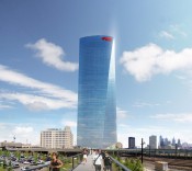
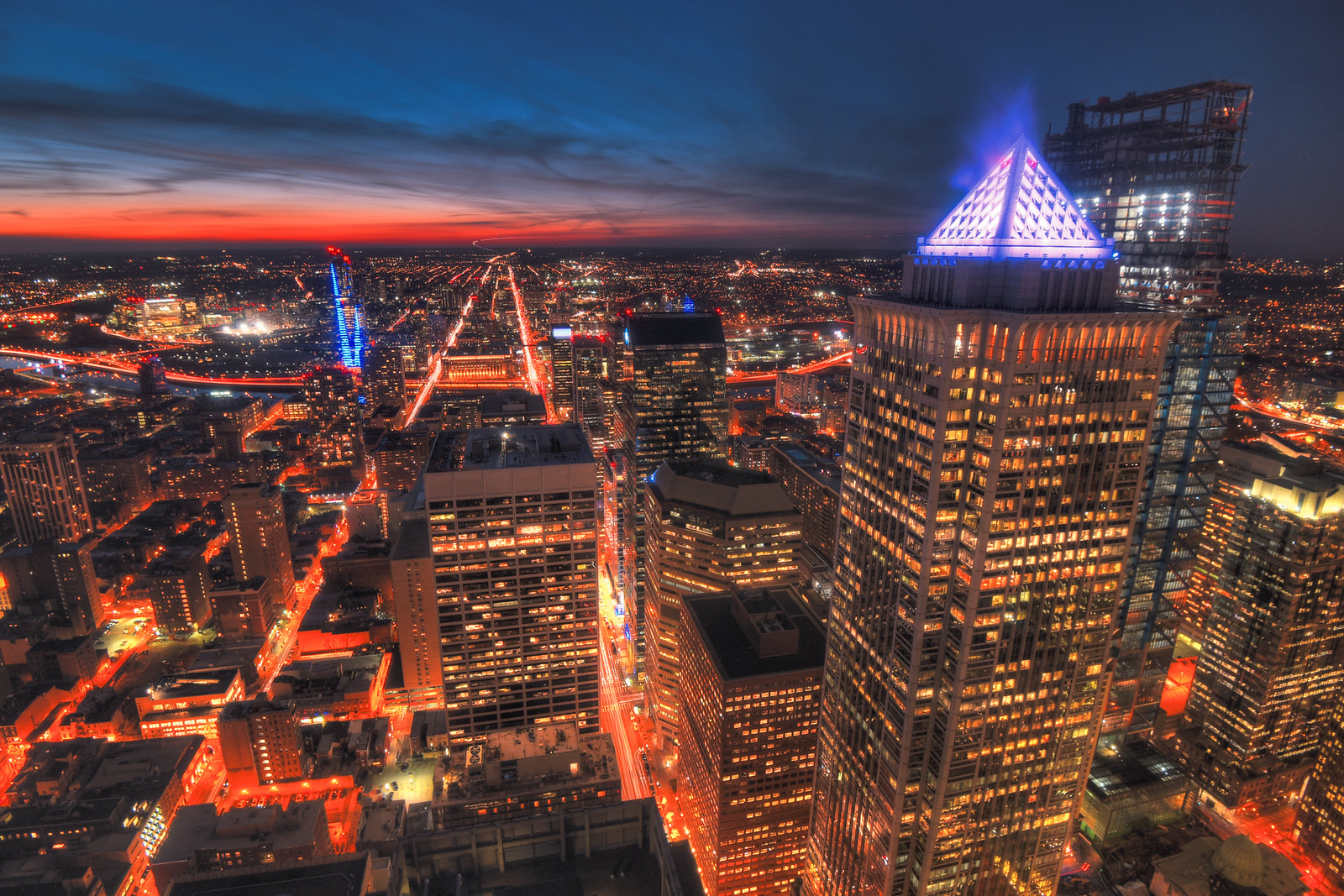
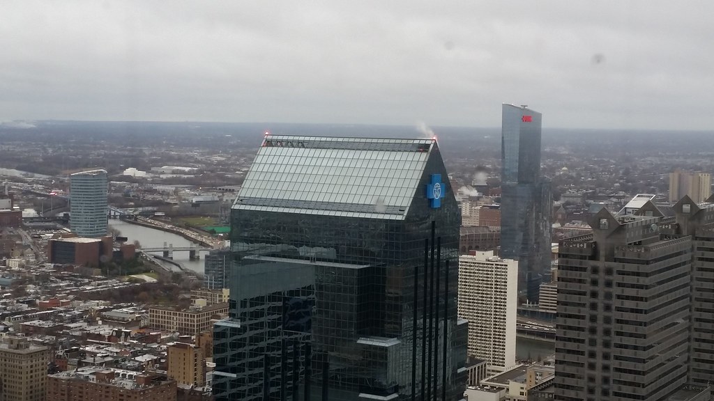
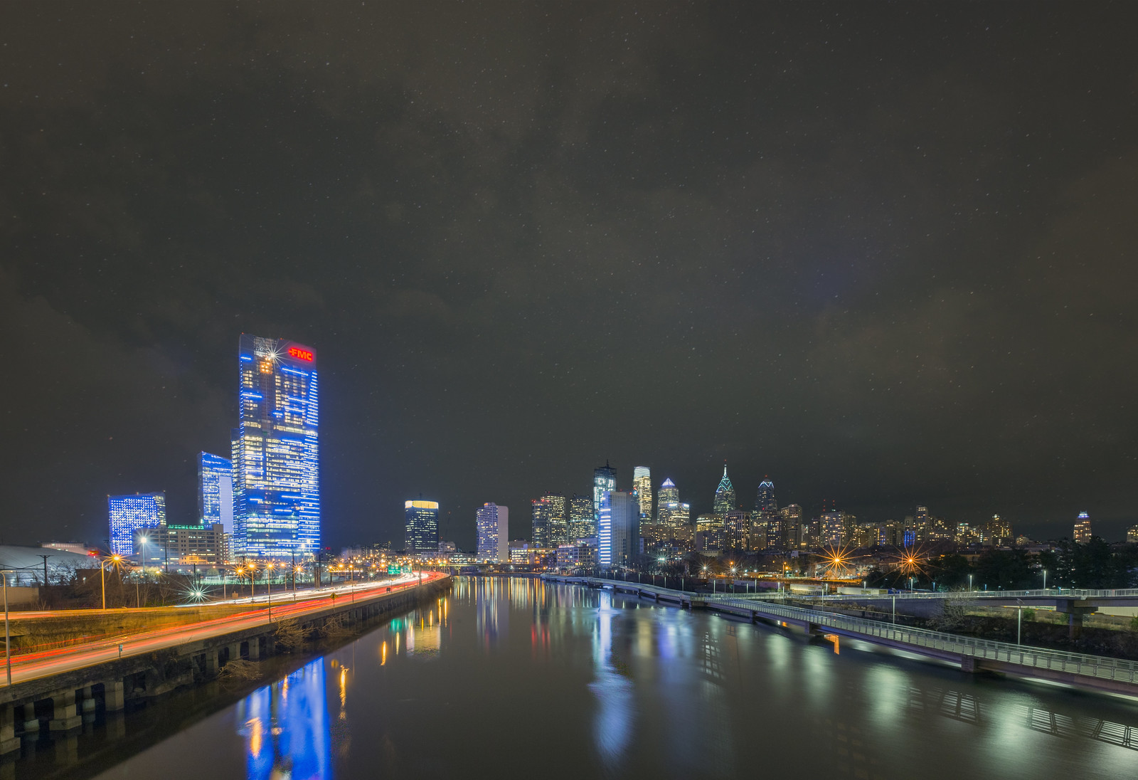
When the red logo first went up I thought it kind of ruined a soaring effect of the shape of the building. It put a lid on it saying this is the top. No soaring into the blue sky. Kind of fanciful but it was an immediate gut feeling. That being said, the bold red is an interesting contrast to the reflective blue. If you have to do the logo, I think they did it as well as possible.
|
This is exactly how I feel. It helps that it's a relatively small logo that you can't even read from far away or some angles. The red just works.
I'm kind of all or nothing when it comes to logos. I'd rather none, because I don't want every photograph I post essentially being an advertisement, however, whenver I go to Asia I just find all the logos and ads bring a certain "life" that isn't there otherwise. It's like a classy cocktail party vs a rager. There are pros and cons to each.


 Prev
Prev


 Linear Mode
