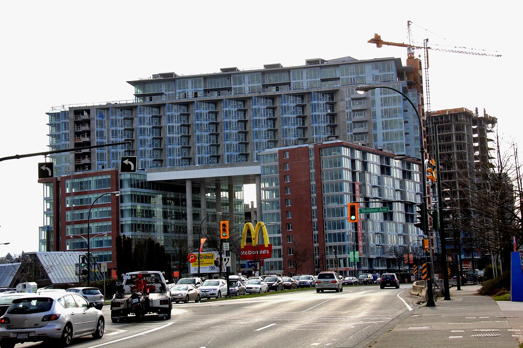
I hate everything about this building
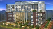
1. It's a poor-man's version of this one in Toronto:
 http://farm8.staticflickr.com/7334/1...59003bbc3b.jpg
The sad thing is that the units at Central are probably more expensive.
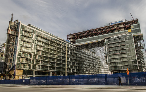
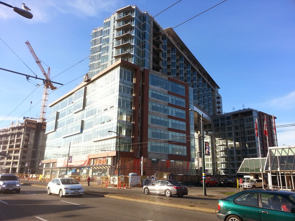
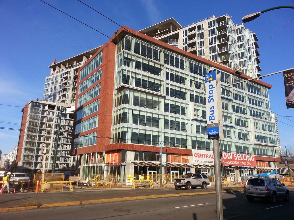
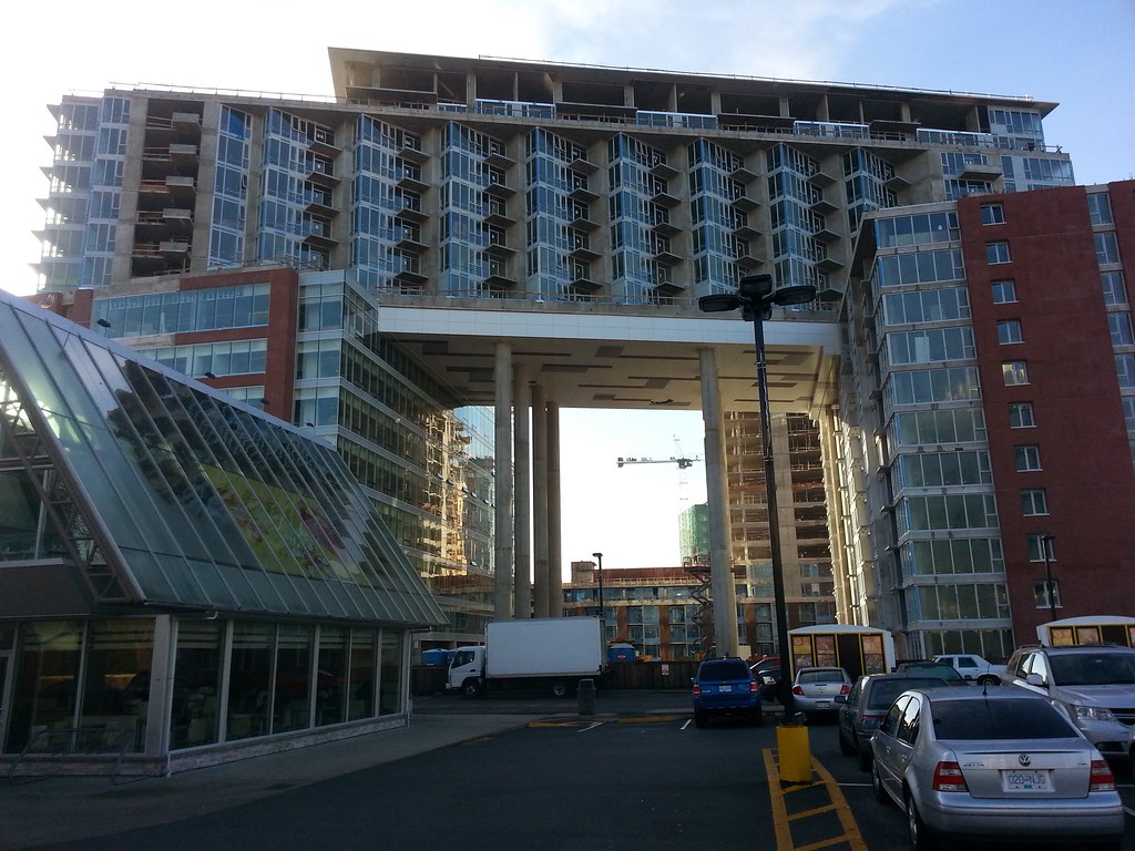
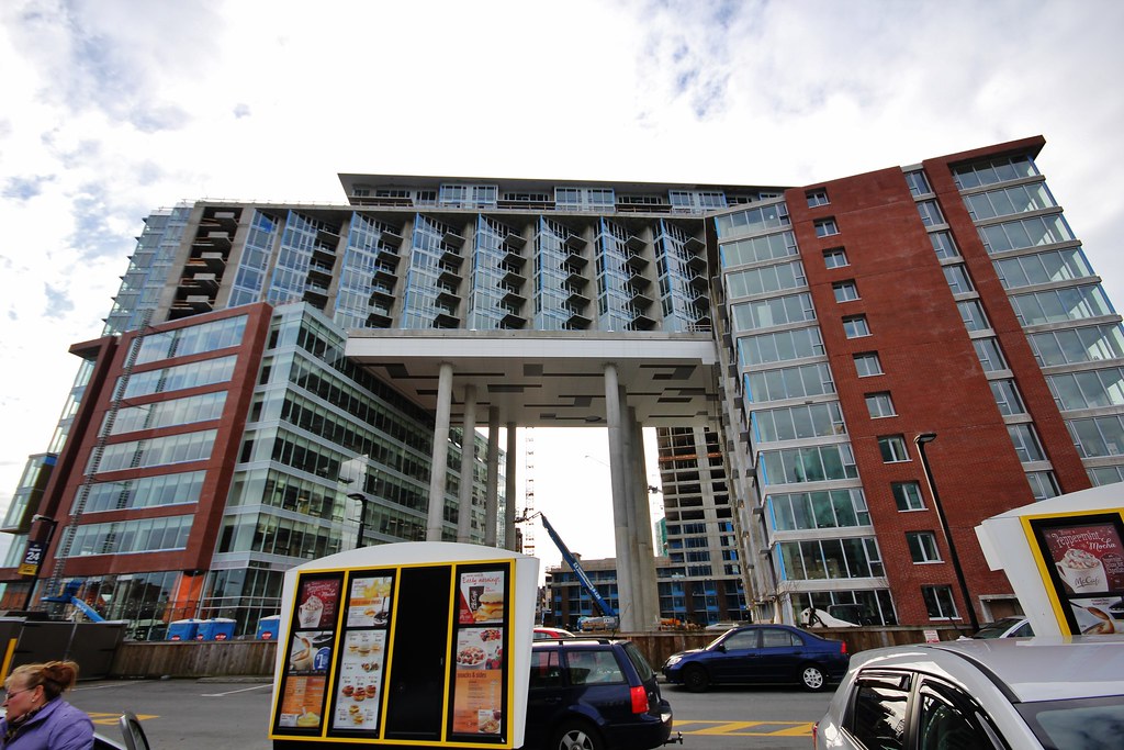
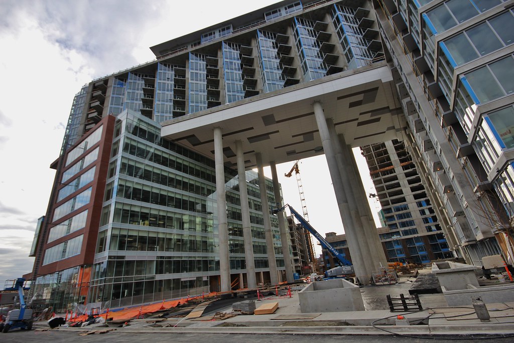
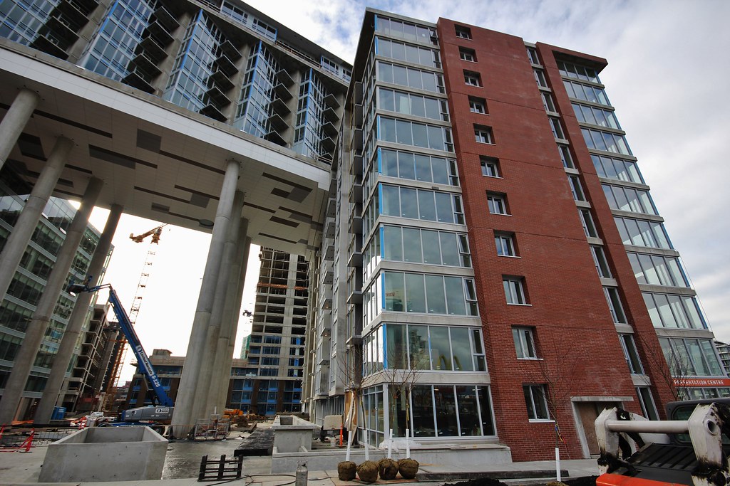
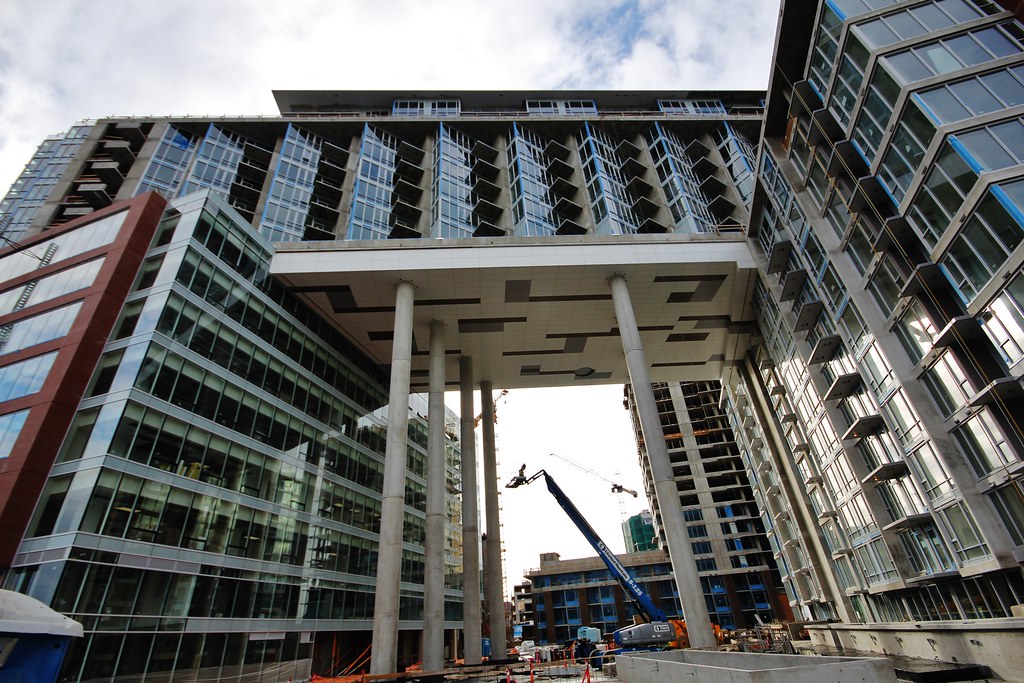
2. Ok, assuming that steel is so astronomically expensive on the west coast that a one-storey-thick slab of solid concrete is cheaper than a steel truss structure... why did they build it so wide (in plan) that it projects beyond the footprint of the apartments above it? The outermost columns look like they're outside the footprint of the structure above the slab. It could have been narrower (in plan) and functioned the same structurally. It could also have tapered towards the edge.
3. They ruined the bridge by watering it down with Vancouver-style setbacks, but DIDN'T do the same to the supporting towers, where it could actually have been useful for creating a reveal under the bridge so that you don't see the nasty intersection where the transfer slab hits the glazing.
4. The two rows of exposed columns supporting the bridge are spaced at half the width of the total span... which means they could have went with ONE row of exposed columns spanning to columns INSIDE the 2 buildings.
5. The original renders had OCAD-style sloping columns, which make sense in terms of using triangulation to laterally brace the thing. The vertical columns that they ended up with are way too tall and narrow to have any use for lateral support, which means they probably compensated by having more columns than what is necessary to support the weight of the building.
I can't think of a more counterintuitive way to achieve this massing, than what is shown.


 Prev
Prev


 Linear Mode
