Quote:
Originally Posted by NewWester

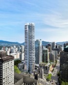
I for one am pleasantly encouraged by this one: it's different in a city that needs some different. I'm also pretty happy by the height: tall enough to stand out a little, but not so tall that it dominates the skyline.
Which, real talk, Shangri-la doesn't get enough credit for being a bit understated: even if it is a little boring from certain angles, it's always tasteful. This one is a bit garish for that much exposure.
|
I think this one WOULD be garish if done in colours other than black and white. But black and white are
sort of a classic combination, and lend this one a smart elegance .... much better than done in sea green and white, or pink and green.
For me, it has a rather classy look, like an elegant lady wearing a smart black, three-quarter length white gloves, and a string of pearls.


 Prev
Prev


 Personally, I would be pleasantly surprised if there was any action on the site within a year from now.


 Linear Mode
