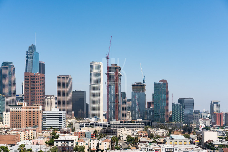
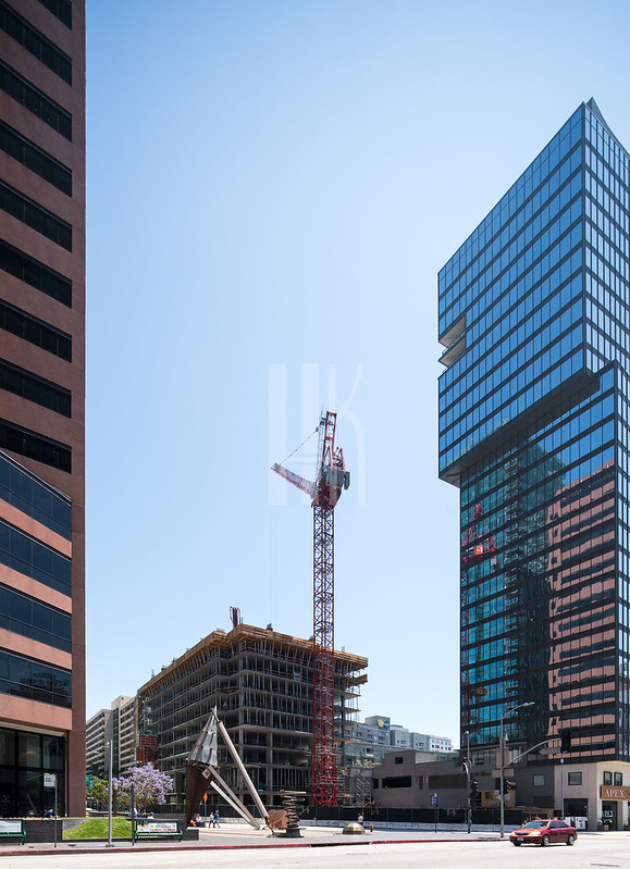
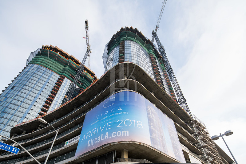
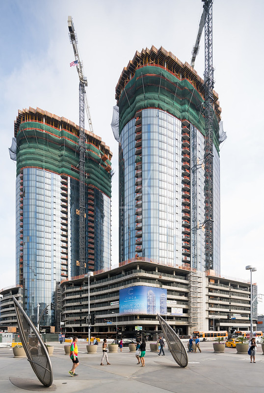
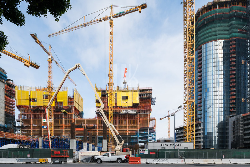
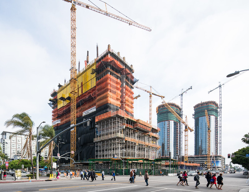
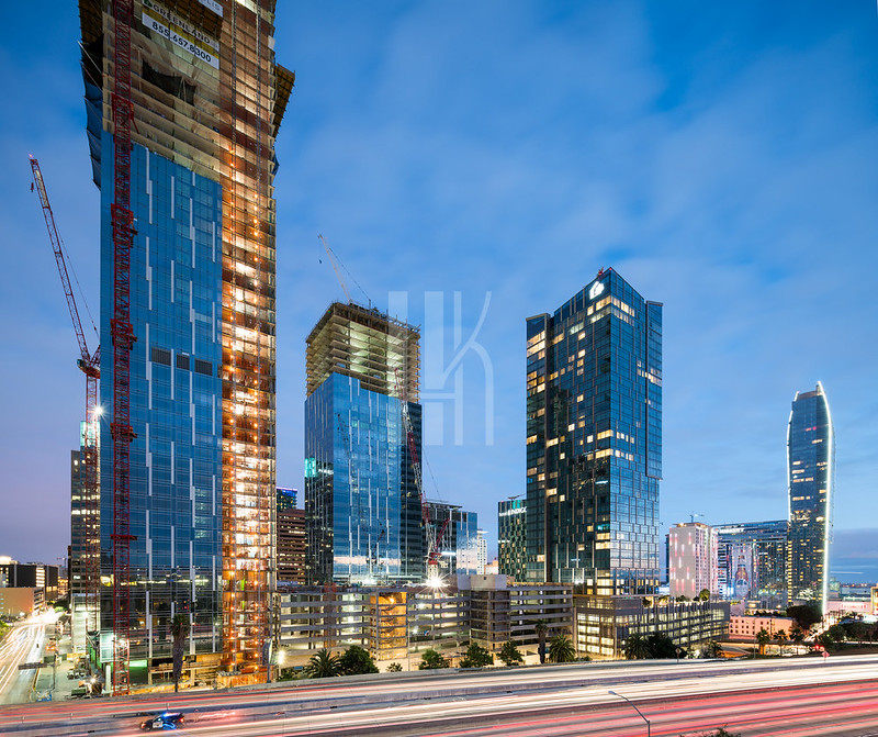
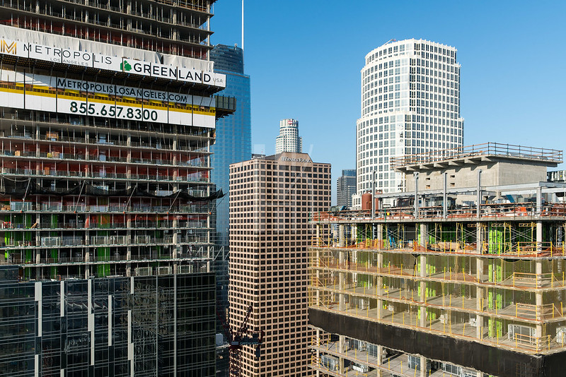
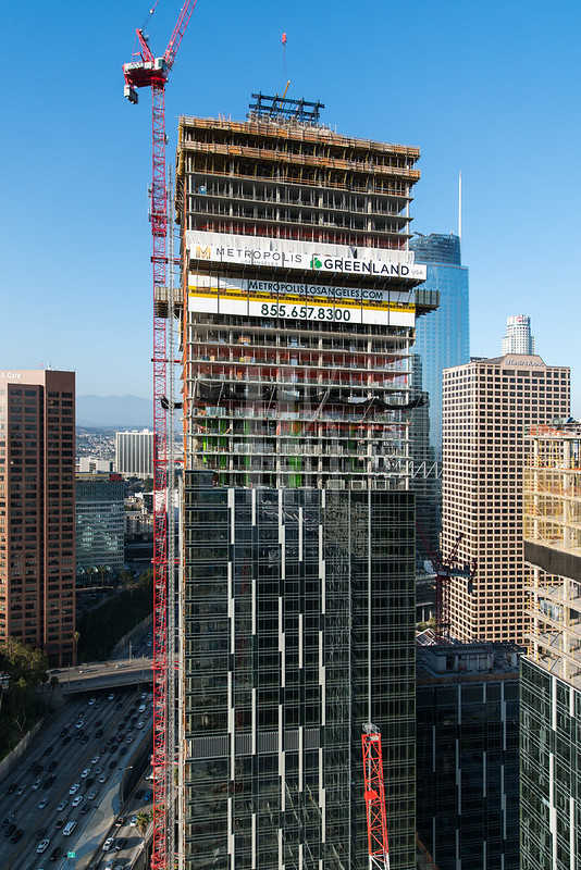
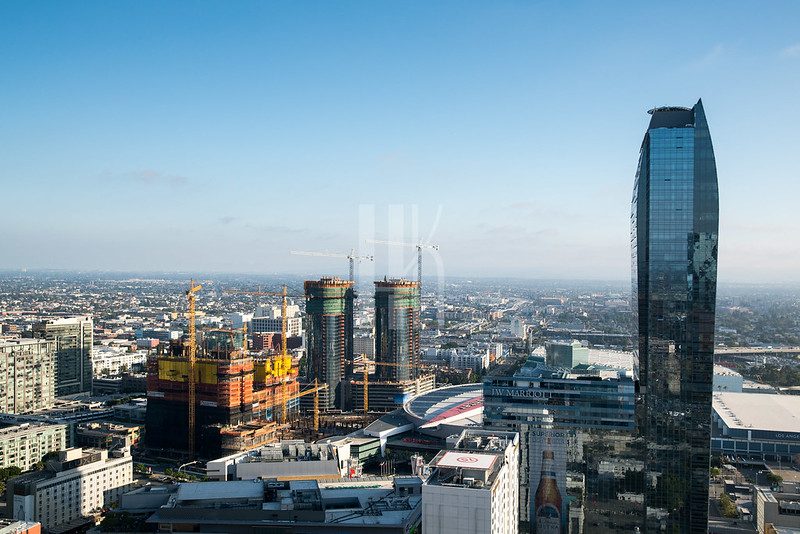
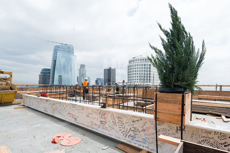
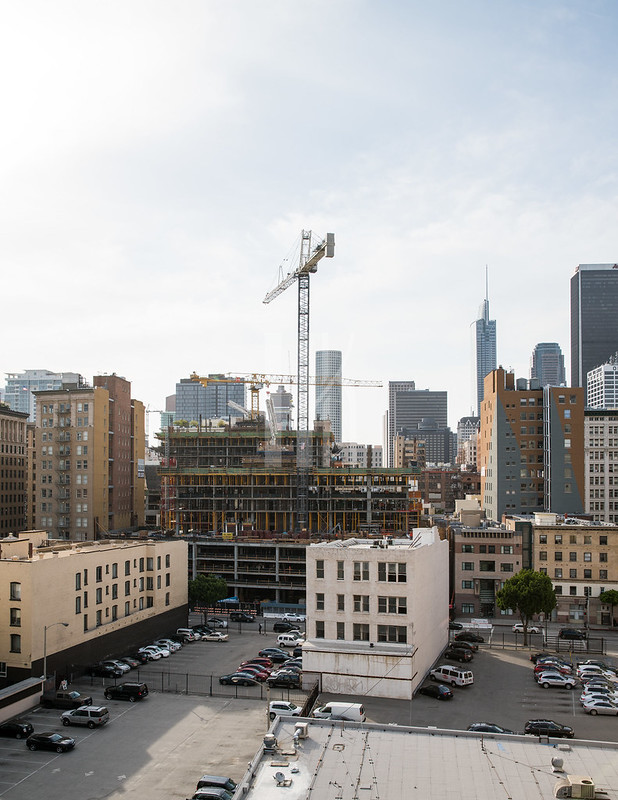
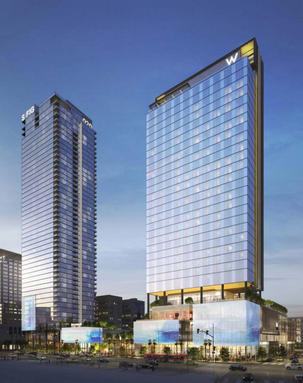
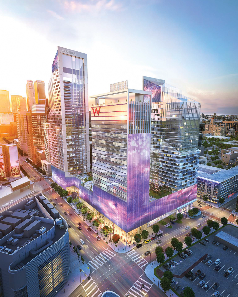
Slanted roofs aside, the previous design just had a better visual and compositional flow to it. The relative consistency of height and signage running the length of the podium, then up the SW tower created a visual relationship between the towers themselves, creating both horizontal, then vertical flow up the towers (which the slanted roofs most certainly accentuated). Gimmicky, yes, but it was cohesive as a whole.
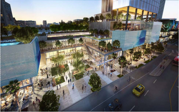
The updated design feels cobbled together with the central courtyard interrupting the Figueroa street wall, 4 different podium heights along Figueroa with no sense of organization or order, signage at 4 different heights without any apparent thought to the horizontal space relationships, and tow additional stacks of inset balconies at the top of the taller tower make for a total composition that looks like a child was playing with blocks and ran out of the room when someone turned the TV on. If they address these basic issues - which are surprisingly sophomoric, considering this is a Gensler design and they are always better than this - it will be a decent infill project. I'm sure this will be a work in progress (which we saw with Metropolis), and will end up more refined than what we see now.
__________________
"Then each time Fleetwood would be not so much overcome by remorse as bedazzled at having been shown the secret backlands of wealth, and how sooner or later it depended on some act of murder, seldom limited to once."
Against the Day, Thomas Pynchon
|


 Prev
Prev


 Linear Mode
