HomeDiagramsDatabaseMapsForum About
     

Go Back   SkyscraperPage Forum > Regional Sections > Canada


Reply

 
Thread Tools Display Modes
     
     
  #101  
Old Posted Jun 28, 2017, 5:01 PM
MolsonExport's Avatar
MolsonExport MolsonExport is online now
The Vomit Bag.
 
Join Date: Oct 2003
Location: Otisburgh
Posts: 44,905


anyone ever listen to this punk band (mid 80s)?

rovicorp
__________________
The whole problem with the world is that fools and fanatics are always so certain of themselves, and wiser people so full of doubts. (Bertrand Russell)
Reply With Quote
     
     
  #102  
Old Posted Jun 28, 2017, 5:01 PM
esquire's Avatar
esquire esquire is offline
Registered User
 
Join Date: Oct 2001
Posts: 37,483
Quote:
Originally Posted by MolsonExport View Post
As a kid, I always had a hard time making out the "B" in the above logo. it just looked like some weird ribbon shape to me, closer to an M than to a B.
Nice to know it wasn't just me. I thought the same thing when I was a kid.

Quebec had its own special variant on The Bay's logo:

Reply With Quote
     
     
  #103  
Old Posted Jun 28, 2017, 5:03 PM
TorontoDrew's Avatar
TorontoDrew TorontoDrew is offline
Registered User
 
Join Date: Nov 2014
Posts: 9,788
I don't know what the fuss is with Circle K, it's not like we are losing anything with the changing of names or ownership's. One crappy over priced convenience store replacing another. Same shit different pile.
Reply With Quote
     
     
  #104  
Old Posted Jun 28, 2017, 5:09 PM
MolsonExport's Avatar
MolsonExport MolsonExport is online now
The Vomit Bag.
 
Join Date: Oct 2003
Location: Otisburgh
Posts: 44,905
Creeping Americanization or Miltonization?
__________________
The whole problem with the world is that fools and fanatics are always so certain of themselves, and wiser people so full of doubts. (Bertrand Russell)
Reply With Quote
     
     
  #105  
Old Posted Jun 28, 2017, 6:18 PM
wg_flamip wg_flamip is offline
Registered User
 
Join Date: Mar 2014
Location: Toronto
Posts: 834
Some of my favourites.

Toronto Zoo:


The Ontario Science Centre:


Foodland Ontario:
Reply With Quote
     
     
  #106  
Old Posted Jun 28, 2017, 8:06 PM
lio45 lio45 is online now
Moderator
 
Join Date: Aug 2007
Location: Quebec
Posts: 42,192
Quote:
Originally Posted by wg_flamip View Post
The Ontario Science Centre:
That would also have been a great logo (with the center trillium) for an Ontario government TV broadcaster, back in the heyday of RBG cathode tube TV.

c.f. the Radio-Québec logo from the same era (already posted earlier in this thread)
Reply With Quote
     
     
  #107  
Old Posted Jun 28, 2017, 8:24 PM
Acajack's Avatar
Acajack Acajack is offline
Unapologetic Occidental
 
Join Date: Aug 2006
Location: Province 2, Canadian Empire
Posts: 68,143
Quote:
Originally Posted by lio45 View Post
That would also have been a great logo (with the center trillium) for an Ontario government TV broadcaster, back in the heyday of RBG cathode tube TV.

c.f. the Radio-Québec logo from the same era (already posted earlier in this thread)
Radio-Québec, predecessor to today's Télé-Québec.

Radio-Québec was the dumbest name ever. Here is why.

Radio-Canada was the French CBC. Started out as radio but eventually got TV as well. Stuck with the same corporate name for both TV and radio. Still does today.

At some point the Quebec government decides it wants a provincial educational TV network. Jusque là, ça va.

But they decide to follow the Radio-Canada naming convention, and name it Radio-Québec. Even if (I am almost positive), Radio-Québec was never a radio broadcaster.

Some years ago they changed the name to Télé-Québec.
__________________
The Last Word.
Reply With Quote
     
     
  #108  
Old Posted Jun 28, 2017, 8:37 PM
Laceoflight's Avatar
Laceoflight Laceoflight is offline
Montérégien
 
Join Date: Nov 2014
Location: Montréal, QC <> Paris, FR
Posts: 1,232
The unfortunate 3D municipal logos of Suburban Montréal :

The WORLD-FAMOUS logo of Laval !

(source : Ville de Laval)

The NOT-YET-FAMOUS word-art-esque logo of Mascouche !

(Source : Ville de Mascouche).

Pour citer Marc Labrèche dans Les Bobo :
« Trop de beauté ! »
Reply With Quote
     
     
  #109  
Old Posted Jun 28, 2017, 8:42 PM
MonkeyRonin's Avatar
MonkeyRonin MonkeyRonin is online now
¥ ¥ ¥
 
Join Date: Sep 2006
Location: Vancouver
Posts: 9,915
Suddenly I've been reminded of Markham's atrocious "get out the vote" municipal logo:

__________________
Reply With Quote
     
     
  #110  
Old Posted Jun 28, 2017, 8:44 PM
J.OT13's Avatar
J.OT13 J.OT13 is offline
Moderator
 
Join Date: Mar 2012
Location: Ottawa
Posts: 24,011
Most Senators logos;


Reply With Quote
     
     
  #111  
Old Posted Jun 28, 2017, 8:49 PM
MonkeyRonin's Avatar
MonkeyRonin MonkeyRonin is online now
¥ ¥ ¥
 
Join Date: Sep 2006
Location: Vancouver
Posts: 9,915
Quote:
Originally Posted by J.OT13 View Post

Looks like it should be a motor oil brand.
__________________
Reply With Quote
     
     
  #112  
Old Posted Jun 28, 2017, 9:35 PM
RoshanMcG RoshanMcG is offline
Registered User
 
Join Date: Mar 2014
Location: Halifax
Posts: 542
Former Halifax Regional Municipality logo vs. current Halifax logo:


Reply With Quote
     
     
  #113  
Old Posted Jun 28, 2017, 9:41 PM
esquire's Avatar
esquire esquire is offline
Registered User
 
Join Date: Oct 2001
Posts: 37,483
I love the 1967 Centennial logo... it was a great design for its era. However, the Canada 150 logo just looks like a cheap knockoff.
Reply With Quote
     
     
  #114  
Old Posted Jun 28, 2017, 9:43 PM
lio45 lio45 is online now
Moderator
 
Join Date: Aug 2007
Location: Quebec
Posts: 42,192
Quote:
Originally Posted by J.OT13 View Post
Quote:
Originally Posted by MonkeyRonin View Post
Looks like it should be a motor oil brand.
Reply With Quote
     
     
  #115  
Old Posted Jun 28, 2017, 9:46 PM
kwoldtimer kwoldtimer is offline
Registered User
 
Join Date: Jan 2008
Location: La vraie capitale
Posts: 23,607
Quote:
Originally Posted by Acajack View Post
Radio-Québec, predecessor to today's Télé-Québec.

Radio-Québec was the dumbest name ever. Here is why.

Radio-Canada was the French CBC. Started out as radio but eventually got TV as well. Stuck with the same corporate name for both TV and radio. Still does today.

At some point the Quebec government decides it wants a provincial educational TV network. Jusque là, ça va.

But they decide to follow the Radio-Canada naming convention, and name it Radio-Québec. Even if (I am almost positive), Radio-Québec was never a radio broadcaster.

Some years ago they changed the name to Télé-Québec.
I always thought it was just an abbreviation for "radiodiffusion", although that too would hearken back to radio.
Reply With Quote
     
     
  #116  
Old Posted Jun 28, 2017, 9:51 PM
kwoldtimer kwoldtimer is offline
Registered User
 
Join Date: Jan 2008
Location: La vraie capitale
Posts: 23,607
Quote:
Originally Posted by MolsonExport View Post
hate is too small a word to describe the intensity of my sheer displeasure at this renaming. Cheapens the image of our city far more than any amount gained by renaming rights.
Not to mention the disregard for local history.
Reply With Quote
     
     
  #117  
Old Posted Jun 28, 2017, 10:08 PM
SignalHillHiker's Avatar
SignalHillHiker SignalHillHiker is offline
I ♣ Baby Seals
 
Join Date: Jul 2012
Location: Sin Jaaawnz, Newf'nland
Posts: 34,722
A few of the nicer local ones. I love the provincial logo, mainly for the font. It's perfect - featuring our provincial flower, the carnivorous pitcher plant.


I also love the Royal Newfoundland Constabulary's logo, which I believe is quite old as its the oldest civil police force in North America. It's especially good on the mounted police who wear bobby hats with their smart black uniforms. It looks great on the horses' chests as well.


And a few of the worst.

I don't even know what Memorial University's logo is supposed to even be. An iceberg, perhaps? One of their mottos on signs around the city is equally infuriating, "Where people and ideas become..."


I absolutely hate our provincial flag, not just for political reasons. It's just disgusting to me, awful. I hate it. So of course I inevitably hate all of the thousands of logos here that feature it.


__________________
Note to self: "The plural of anecdote is not evidence."
Reply With Quote
     
     
  #118  
Old Posted Jun 29, 2017, 12:59 AM
Trevor3 Trevor3 is offline
Registered User
 
Join Date: May 2011
Posts: 1,002
Thought I'd chip in a couple. Here's our municipal wordmark with the town crest, and the nickname we're trying to give ourselves - "The Acadian Village" - I like it, it's quaint. The crest itself isn't the sharpest, but it looks good embroidered on a shirt and accurately represents our community, so I like it in a "it's ours and wouldn't be mistaken for someone else's" kind of way.


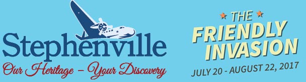
This is our tourism branding that's now on highway signs, brochures, and anything else aimed at visitors. The "Our Heritage Your Discovery" is meh, but the airplane/Stephenville thing is clean, so I like it. The Friendly Invasion is our summer celebration of town history, so a bunch of things themed in 1950s Americana. It's fun.


The Harmon Hustle road race, stylized after the US air force banner logo, but in the shape of a sneaker sole. Last years Ladies 10 km winner was from Texas, so it was sort of fitting.


I think it's kind of clever, see here:
Reply With Quote
     
     
  #119  
Old Posted Jun 29, 2017, 8:29 PM
GernB GernB is offline
Registered User
 
Join Date: Jun 2012
Location: Lethbridge AB
Posts: 863
Quote:
Originally Posted by Pinion View Post
Beside the well-known Canucks disasters, I couldn't believe how badly the Grizzlies blew it:


I used to be really into NHL and NBA but never wanted to wear Vancouver merchandise.
Waaaaay too busy. The colour scheme could have worked well, but the design is just overdone. It's like they couldn't decide which logo/wordmark/striping combo to use so used them all. Yeccchh!
Reply With Quote
     
     
  #120  
Old Posted Jun 29, 2017, 8:32 PM
LeftCoaster's Avatar
LeftCoaster LeftCoaster is offline
Moderator
 
Join Date: Nov 2005
Location: Toroncouver
Posts: 12,631
Wasn't that typical of 90s designs though?
Reply With Quote
     
     
This discussion thread continues

Use the page links to the lower-right to go to the next page for additional posts
 
 
Reply

Go Back   SkyscraperPage Forum > Regional Sections > Canada
Forum Jump


Forum Jump


All times are GMT. The time now is 2:09 PM.

     
SkyscraperPage.com - Archive - Privacy Statement - Top

Powered by vBulletin® Version 3.8.7
Copyright ©2000 - 2024, vBulletin Solutions, Inc.