HomeDiagramsDatabaseMapsForum About
     

Go Back   SkyscraperPage Forum > Regional Sections > Canada > Alberta & British Columbia > Vancouver > Downtown & City of Vancouver


    Telus Garden Residential Tower in the SkyscraperPage Database

Building Data Page   • Comparison Diagram   • Vancouver Skyscraper Diagram

Map Location

Reply

 
Thread Tools Display Modes
     
     
  #81  
Old Posted Nov 9, 2010, 6:52 PM
mr.x's Avatar
mr.x mr.x is offline
Registered User
 
Join Date: Dec 2003
Location: Stockholm
Posts: 12,805
^ Disappointing. Looks just like more of the uninspired/unoriginal same of what we already have in this city.


I, for one, absolutely loved the concept of the first few renderings posted.
Reply With Quote
     
     
  #82  
Old Posted Nov 9, 2010, 6:58 PM
Metro-One's Avatar
Metro-One Metro-One is offline
Registered User
 
Join Date: Sep 2008
Location: Japan
Posts: 16,832
I agree 100%

I love the original google earth concept posted on here, especially the office tower portion (very unique and stunning).

This more polished render is very boring and looks like every other proposal in Vancouver...
__________________
Bridging the Gap
Check out my Flickr: https://www.flickr.com/photos/306346...h/29495547810/ and Youtube channel https://www.youtube.com/channel/UCV0...lhxXFxuAey_q6Q
Reply With Quote
     
     
  #83  
Old Posted Nov 9, 2010, 7:13 PM
trofirhen trofirhen is offline
Registered User
 
Join Date: Oct 2008
Posts: 8,845
Question forsooth!! What now??

Quote:
Originally Posted by Prometheus View Post
Oh God. Why?
Quote:
Originally Posted by Yume-sama View Post
lol I refuse to believe that is it. It can't possibly conceivably be.....
Quote:
Originally Posted by Some guy View Post
I was thinking the same, from a few angles it looks like it is in the process of falling over.
Quote:
Originally Posted by mr.x View Post
I LOVE IT!


We finally have something RADICALLY different from the Vancouver-norm. If this really is the design, I'm almost certain that the up-to-date/higher quality renderings to be released later this week will be absolutely fabulous. It's BOLD, it has attitude and that's a variety this city severely lacks with its buildings.

If this gets shot down, it'll be yet another statement to architects that they should just stay within the Vancouver cookie-cutter/functional norm.

It seems as if there two camps of opinion here. I would tend to place myself in the first. I think this project should be legally reviewed before the pour one ounce of concrete, let alone the first hole in the ground. So.... Fast!
Reply With Quote
     
     
  #84  
Old Posted Nov 9, 2010, 7:17 PM
mr.x's Avatar
mr.x mr.x is offline
Registered User
 
Join Date: Dec 2003
Location: Stockholm
Posts: 12,805
I really don't get you people...you've/we've all be been asking for more original and unique designs, then one comes along and it gets ripped apart in favour of something that looks just like everything we already have?

I GIVE UP.
Reply With Quote
     
     
  #85  
Old Posted Nov 9, 2010, 7:23 PM
Metro-One's Avatar
Metro-One Metro-One is offline
Registered User
 
Join Date: Sep 2008
Location: Japan
Posts: 16,832
Again, i completely agree. In fact I love the office tower portion of the original. The stacked design gives it extra height and the exoskeleton gives it a much needed design aspect missing in Vancouver. It reminded me of some of the more interesting offices I have seen in Japan.

I fail to see anything new or bold in the updated render. Wow, they have a protruding box (never seen that before in Vancouver!) with a tree in it, stuck to the side of a larger rectangular cube, how inspiring!

In fact, the current Telus tower in Burnaby is far more interesting and inspiring than this run of the mill design.
__________________
Bridging the Gap
Check out my Flickr: https://www.flickr.com/photos/306346...h/29495547810/ and Youtube channel https://www.youtube.com/channel/UCV0...lhxXFxuAey_q6Q
Reply With Quote
     
     
  #86  
Old Posted Nov 9, 2010, 7:25 PM
mr.x's Avatar
mr.x mr.x is offline
Registered User
 
Join Date: Dec 2003
Location: Stockholm
Posts: 12,805
Quote:
Originally Posted by Metro-One View Post
Again, i completely agree. In fact I love the office tower portion of the original. The stacked design gives it extra height and the exoskeleton gives it a much needed design aspect missing in Vancouver.
It's a testament to how narrow-minded people are (or can be), and how creativity is constantly being crushed for the safe, unoriginal, cookie-cutter, and purely functional designs.
Reply With Quote
     
     
  #87  
Old Posted Nov 9, 2010, 7:31 PM
WarrenC12 WarrenC12 is offline
Registered User
 
Join Date: May 2007
Location: East OV!
Posts: 21,687
Quote:
Originally Posted by mr.x View Post
I really don't get you people...you've/we've all be been asking for more original and unique designs, then one comes along and it gets ripped apart in favour of something that looks just like everything we already have?

I GIVE UP.
Ditto!

I also don't understand quoting the entire picture in the very next post.
Reply With Quote
     
     
  #88  
Old Posted Nov 9, 2010, 7:40 PM
officedweller officedweller is offline
Registered User
 
Join Date: Jul 2001
Location: Vancouver
Posts: 38,350
Quote:
Originally Posted by phesto View Post
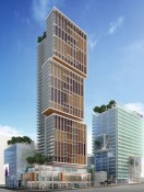
The actual proposal (at least one concept):

I like this much better than the Google rendering.

It also better incorporates the old block on Seymour Street (but they won't be allowed to overhang Seymour St. as shown). The protruding box is getting a bit stale. They show the alley closed. Presumably there is access for the Kingston (if it's still there).

I didn't mind the block upon block theme of the Google rendering, since it referenced the "pod" that sits atop the existing building on Seymour Street.

What I didn't like about the Google rendering is the exoskeleton. It looked too frail for a building of that size - i.e. because we know that it's not holding up the building (the internal structure is doing that) - but if you are creating the illusion that it provides a useful function, then it needs to be far, far beefier than shown on that render (think of the cross-bracing on the John Hancock Tower, Chicago; and the HSBC pic posted shows a much heavier industrial form). As presented in that Google render, it looked like decoration (ditto for the cross-braces on the VanCity Centre).
Reply With Quote
     
     
  #89  
Old Posted Nov 9, 2010, 7:46 PM
Yume-sama's Avatar
Yume-sama Yume-sama is offline
Registered User
 
Join Date: May 2007
Location: Vancouver / Calgary / Tokyo
Posts: 7,523
That's actually fairly nice and quite fitting~
__________________
Visit me on Flickr! Really! I'm lonely.
http://www.flickr.com/syume
Reply With Quote
     
     
  #90  
Old Posted Nov 9, 2010, 7:52 PM
Stingray2004's Avatar
Stingray2004 Stingray2004 is offline
Registered User
 
Join Date: Jan 2004
Location: White Rock, BC (Metro Vancouver)
Posts: 3,145
Second design is all right. The first thing that popped into my mind was a glorified version of 1500 West Georgia.
Reply With Quote
     
     
  #91  
Old Posted Nov 9, 2010, 7:54 PM
Metro-One's Avatar
Metro-One Metro-One is offline
Registered User
 
Join Date: Sep 2008
Location: Japan
Posts: 16,832
What is wrong with decoration elements such as the exoskeleton? That is one of the best features of the Van city building (or was, as the last time I checked the red exoskeleton bars I believe were removed)

Also, to those who are now praising this updated design, how is this bland box any better then the other bland designs that have been criticized on this forum lately? I fail to see how it is any more interesting than other office and condo proposals of late (if anything it is less interesting than the others).

For goodness sakes I coud have designed this, and i am no architect, hehe.

PS - Did anyone else notice the colour of the last render, looks a little sea foam green to me, you know a tone we have all been screaming for in the past decade............
__________________
Bridging the Gap
Check out my Flickr: https://www.flickr.com/photos/306346...h/29495547810/ and Youtube channel https://www.youtube.com/channel/UCV0...lhxXFxuAey_q6Q
Reply With Quote
     
     
  #92  
Old Posted Nov 9, 2010, 7:58 PM
Yume-sama's Avatar
Yume-sama Yume-sama is offline
Registered User
 
Join Date: May 2007
Location: Vancouver / Calgary / Tokyo
Posts: 7,523
I don't believe that could possibly be real either. The first would never be allowed (and probably for good reason, though perhaps a real render would be far less crude and appalling), and the second... well, it is not "something we've never seen before". They have no reason to speak in marketing lingo yet, if it is indeed just like every other tower
__________________
Visit me on Flickr! Really! I'm lonely.
http://www.flickr.com/syume
Reply With Quote
     
     
  #93  
Old Posted Nov 9, 2010, 8:00 PM
city-dweller's Avatar
city-dweller city-dweller is offline
Registered User
 
Join Date: Jul 2008
Location: Vancouver
Posts: 357
Bye Bye Whitespot?

I also notice the placement of the "tree box" on the main and residential buildings looks silly. Almost like they ask for trees on the buildings after the initial rendering. The one in the residential tower is poorly placed. That location has the most expensive suites and you want to take two out to put a tree in?!! Better ways to incorporate trees into the building.
Example 1:On Beach Ave. with a cantelevered extension on the top floor.
Example 2: Over looking Howe Street on-ramp to Granville Street Bridge. (can't remember actual building name) Has a tree in the building but not at the top. I am sure you can think of a few more.

The covered plaza off the main build should have fewer poles in design. People will walk into them. Multiple solutions availabe.

I would open up the Seymour street side to a few renters just like the BreadGarden at the CBC complex. That street is a flat wall. You could have interior access too.

Anyway, just a few thoughts.
Reply With Quote
     
     
  #94  
Old Posted Nov 9, 2010, 8:04 PM
mr.x's Avatar
mr.x mr.x is offline
Registered User
 
Join Date: Dec 2003
Location: Stockholm
Posts: 12,805
Quote:
Originally Posted by Metro-One View Post
What is wrong with decoration elements such as the exoskeleton? That is one of the best features of the Van city building (or was, as the last time I checked the red exoskeleton bars I believe were removed)

Also, to those who are now praising this updated design, how is this bland box any better then the other bland designs that have been criticized on this forum lately? I fail to see how it is any more interesting than other office and condo proposals of late (if anything it is less interesting than the others).

For goodness sakes I coud have designed this, and i am no architect, hehe.

PS - Did anyone else notice the colour of the last render, looks a little sea foam green to me, you know a tone we have all been screaming for in the past decade............

WE WANT ORIGINALITY! NORE MORE COOKIE CUTTERS! --> TOO MUCH ORIGINALITY AND CREATIVITY! STOP IT! IT'S TOO MUCH TO GRASP! --> OK, SCREW IT! LETS GO BACK TO OUR SAFE ZONE!


Quote:
It also better incorporates the old block on Seymour Street (but they won't be allowed to overhang Seymour St. as shown).
If the goal is to incorporate each new project into its surroundings, I really don't see how we'll ever breach the non-original bubble we have going on in this city. Obviously, it creates "good neighbourhoods" but how about having some that make actual architectural statements...inward designs, instead of outwards: bold and daring.

The 43-storey residential tower could be Fairmont Pacific Rim's big brother. And the 22-storey Telus office tower could be the father of Crossroads.
Reply With Quote
     
     
  #95  
Old Posted Nov 9, 2010, 8:05 PM
wrenegade's Avatar
wrenegade wrenegade is offline
ON3P Skis
 
Join Date: Sep 2008
Location: Lower Lonsdale, North Vancouver, BC
Posts: 2,593
The second design isn't groundbreaking by any means, and I hate the protruding box, but it is a much better design. It is much better for Telus (look at the massive floorplates on the first 6 storeys) and the interface with Georgia is fantastic. A huge setback and glass covered atrium? I like. I am also happy to see the alley disappear. There are a number of other sites across the city where I'd like to see this happen. The green glass though is.......bleh. The residential tower looks like everything else, but at least we can be happy that the office portion looks like curtain wall. It also integrates the existing Telus building (to remain?) much better than the first design. This was never going to be the tallest building so we don't have to worry about a ho-hum design in the skyline too much, but I wouldn't be surprised if this is one of the biggest buildings (the office portion) in the city when it's finished.
__________________
Flickr
Reply With Quote
     
     
  #96  
Old Posted Nov 9, 2010, 8:08 PM
Metro-One's Avatar
Metro-One Metro-One is offline
Registered User
 
Join Date: Sep 2008
Location: Japan
Posts: 16,832
I know exactly where I have seen this building before! Every office building ever built in Ottawa, but with a Vancouver protruding box + sea foam green special thrown in on the order!
__________________
Bridging the Gap
Check out my Flickr: https://www.flickr.com/photos/306346...h/29495547810/ and Youtube channel https://www.youtube.com/channel/UCV0...lhxXFxuAey_q6Q
Reply With Quote
     
     
  #97  
Old Posted Nov 9, 2010, 8:25 PM
dleung's Avatar
dleung dleung is offline
Registered User
 
Join Date: Nov 2009
Location: Toronto
Posts: 5,973
Quote:
Originally Posted by dleung
Fooled you all... I fabricated the first scheme entirely, without knowing anything about the proposal, and only going on what's possible through the view cones. Looks like I was spot on with the locations of the office and residential towers, as well as the addition to cover up the blank Georgia side of the existing telus building. =)

I agree the office tower glazing looks very 80's and the exosleketon looks weak and tacked on (i only spent 1 hour designing/modelling the thing, lol), but I personally think the residential tower is absolutely sexy. It seems like people have really little imagination and are unable to visualize nice glazing on a crappy render of an otherwise very interesting massing. Likewise, many people are too easily fooled by shiny renders of the otherwise dull box in the "real" proposal.

Well at least my efforts have prompted someone to spill the beans, hehe.
Reply With Quote
     
     
  #98  
Old Posted Nov 9, 2010, 8:31 PM
officedweller officedweller is offline
Registered User
 
Join Date: Jul 2001
Location: Vancouver
Posts: 38,350
We know amateur work when we see it!!

*****************

Yeah, I think that the green glass is to blend with the existing green spandrel panels on the Seymour block.

The glass colour could change - the William Farrell Building is still there in the render and it's blue glass and the render shows blue glass at grade on Seymour.

But that said - there isn't any green glass near the Telus site. The closest is the Rosedale on Robson Hotel.

Now if they install an underground passage under Seymour Street from that glass atrium to the Vancouver Centre Food Fair, that would be great! It would eventually tie into both Canada Line and Expo Line.
Reply With Quote
     
     
  #99  
Old Posted Nov 9, 2010, 8:31 PM
mr.x's Avatar
mr.x mr.x is offline
Registered User
 
Join Date: Dec 2003
Location: Stockholm
Posts: 12,805
Quote:
Originally Posted by dleung View Post
Fooled you all... I fabricated the first scheme entirely, without knowing anything about the proposal, and only going on what's possible through the view cones. Looks like I was spot on with the locations of the office and residential towers, as well as the addition to cover up the blank Georgia side of the existing telus building. =)

I agree the office tower glazing looks very 80's and the exosleketon looks weak and tacked on (i only spent 1 hour designing/modelling the thing, lol), but I personally think the residential tower is absolutely sexy. It seems like people have really little imagination and are unable to visualize nice glazing on a crappy render of an otherwise very interesting massing. Likewise, many people are too easily fooled by shiny renders of the otherwise dull box in the "real" proposal.
I couldn't have said it better myself.


Well done with the design, btw....too bad we'll just be adding yet another box or two to the skyline.
Reply With Quote
     
     
  #100  
Old Posted Nov 9, 2010, 8:31 PM
Metro-One's Avatar
Metro-One Metro-One is offline
Registered User
 
Join Date: Sep 2008
Location: Japan
Posts: 16,832
Dude, I would take your proposal any day over the true one. At least your design displayed experiment and originality. If you designed those in only an hour, then someone could design the true proposals in 15 minutes, haha!
__________________
Bridging the Gap
Check out my Flickr: https://www.flickr.com/photos/306346...h/29495547810/ and Youtube channel https://www.youtube.com/channel/UCV0...lhxXFxuAey_q6Q
Reply With Quote
     
     
This discussion thread continues

Use the page links to the lower-right to go to the next page for additional posts
 
 
Reply

Go Back   SkyscraperPage Forum > Regional Sections > Canada > Alberta & British Columbia > Vancouver > Downtown & City of Vancouver
Forum Jump


Forum Jump


All times are GMT. The time now is 2:31 AM.

     
SkyscraperPage.com - Archive - Privacy Statement - Top

Powered by vBulletin® Version 3.8.7
Copyright ©2000 - 2024, vBulletin Solutions, Inc.