Well, I guess I'll be the lone contrarian: I think this design looks cheap and kitschy. Legoretta is nothing but a corporatized version of
Luis Barragan and taking colors, forms and materials that are very much rooted in a specific place, ie, central Mexico, and plopping them down in a very different place with different light and climatic needs is just missing the point of the beauty of regional architecture.
End of rant.
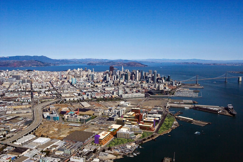
The one good thing about this design is that it really does do a good job of engaging the street. I'm glad they're including retail along Third Street and keeping the campus as open as possible.
Salesforce.com has posted a bunch more renderings on
Flickr. Here are a few:

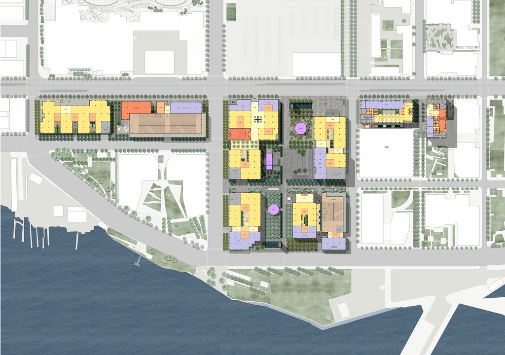
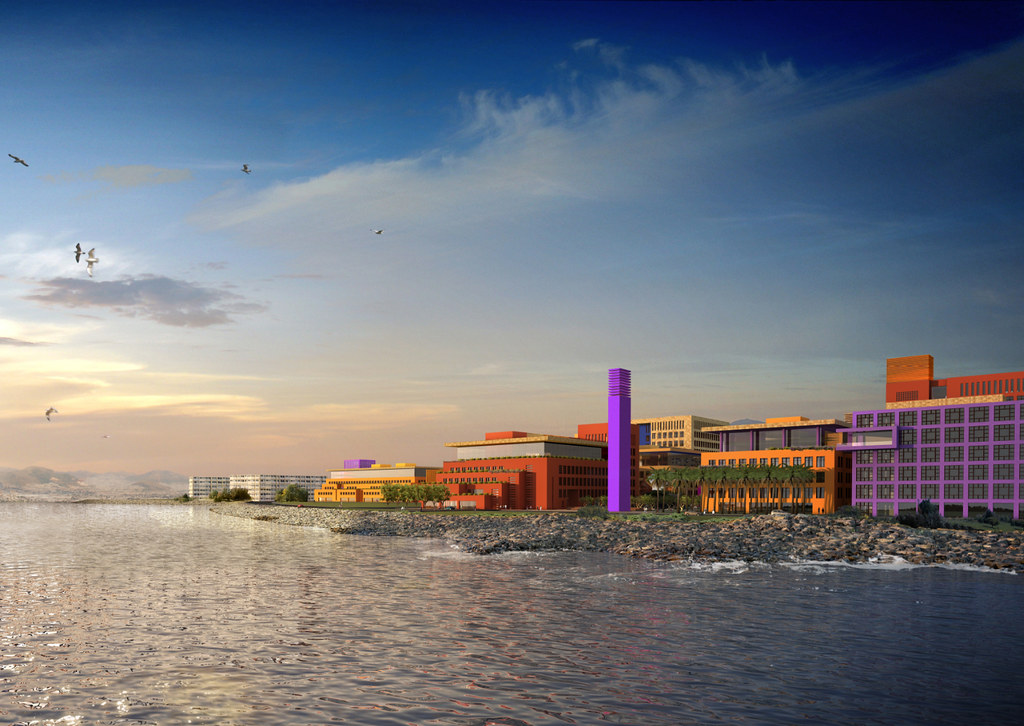
There are a lot more on Flickr along with much, much larger versions of these renderings if you want to get into the detail.


 Prev
Prev


 [/QUOTE]


 Linear Mode
