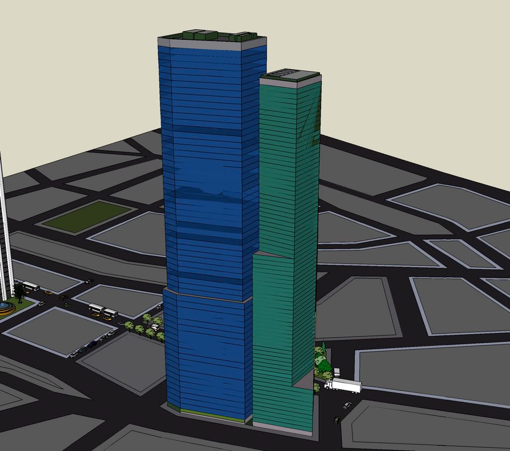
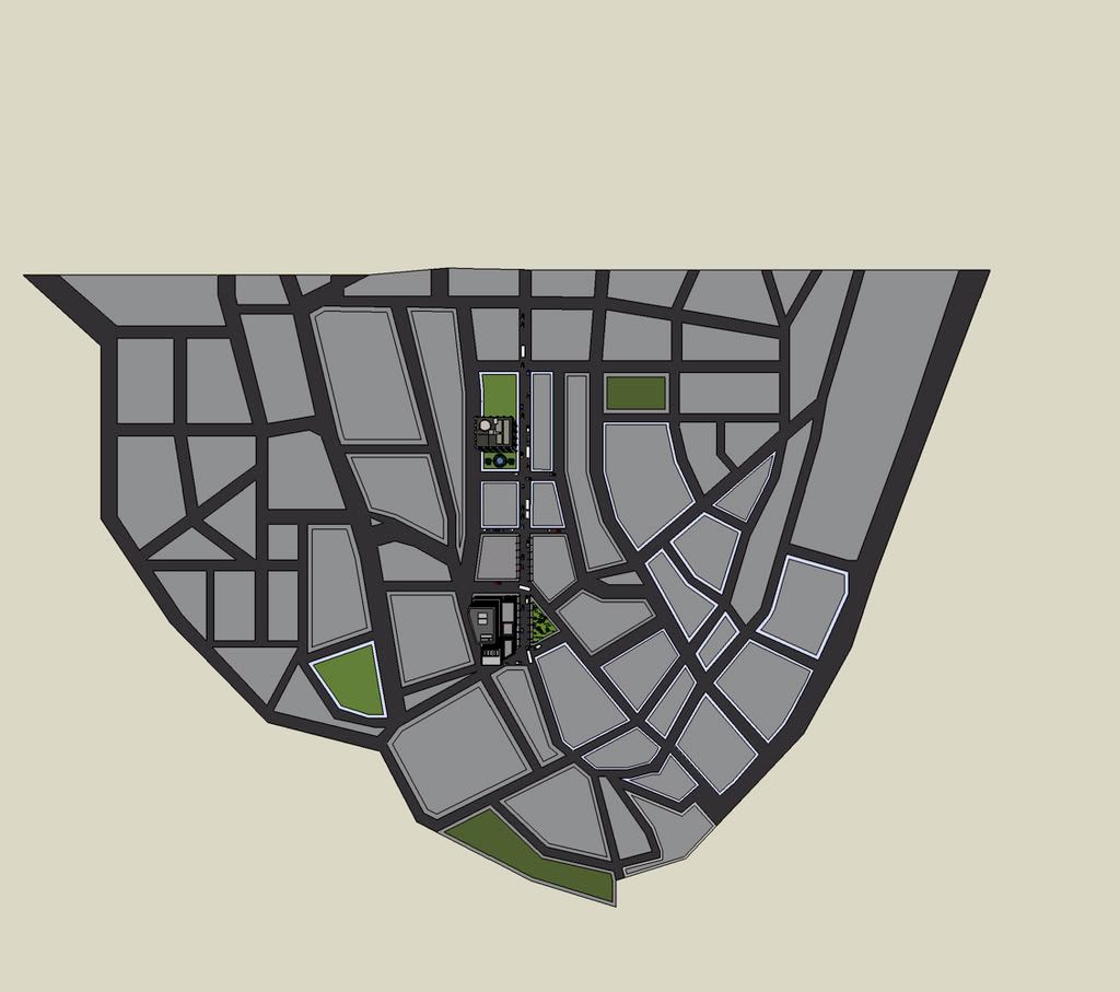
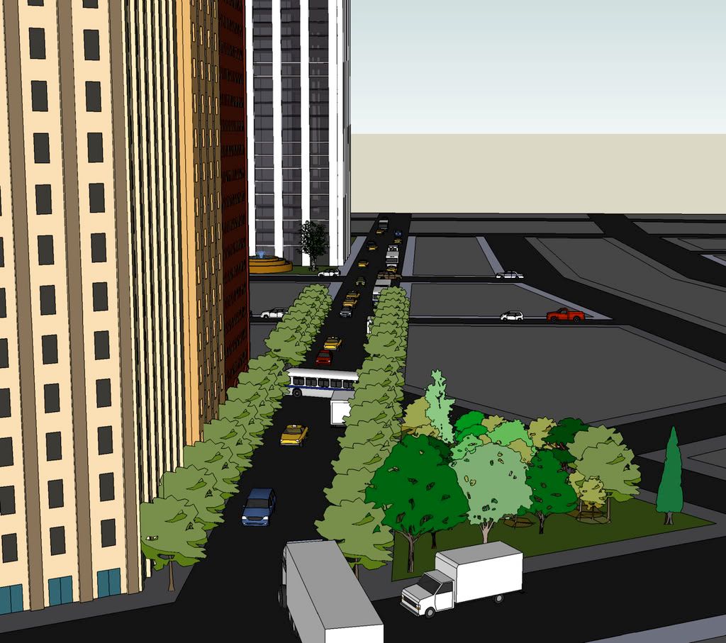
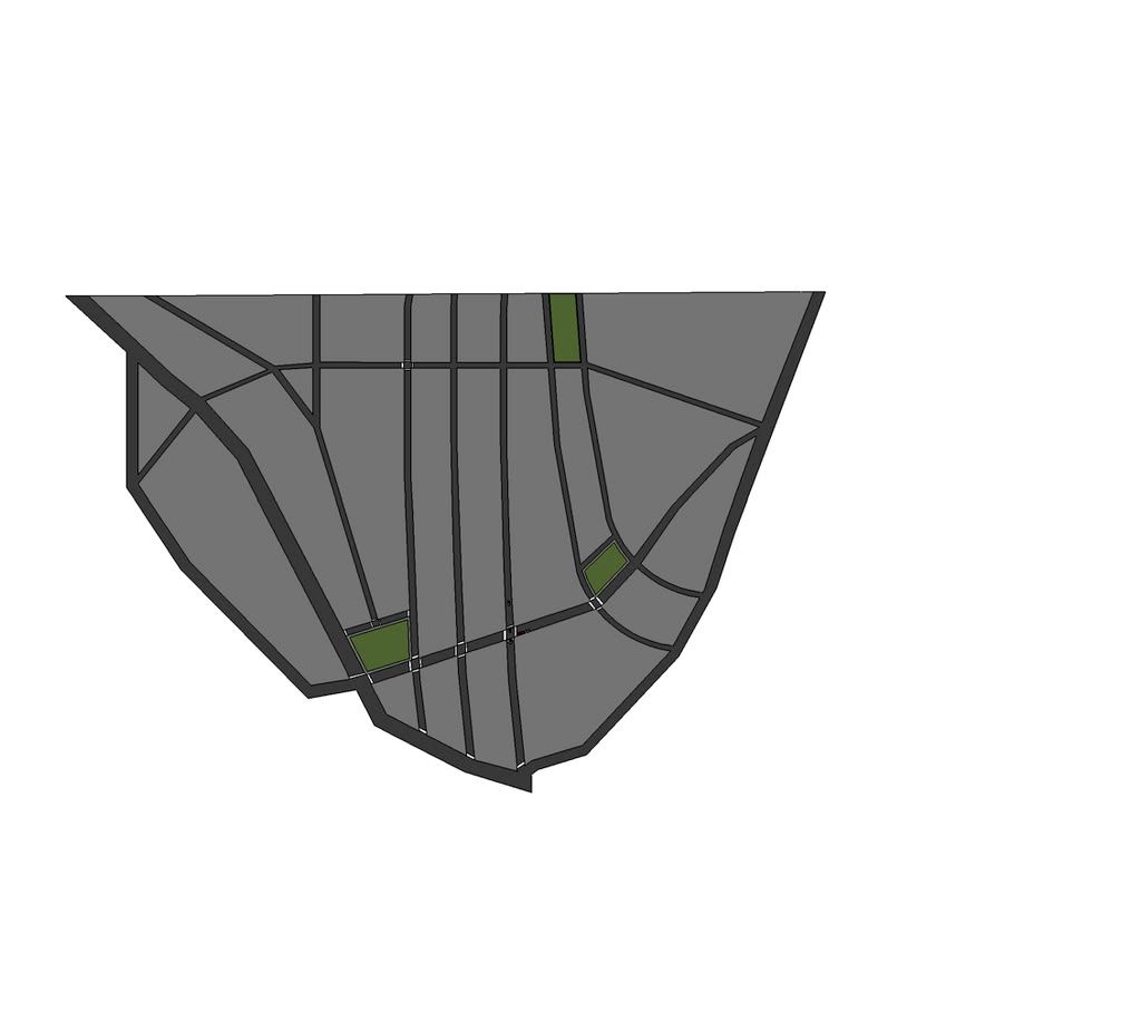
The grid is a little "ehhh", but the buildings seem nice and well thought out (especially that black & white one). Stay with it for sure. I think you got something.
__________________ "I'm going there, but I like it here wherever it is.."
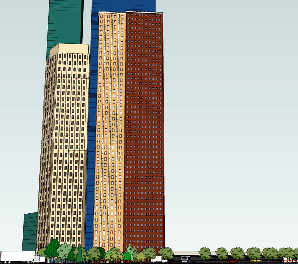
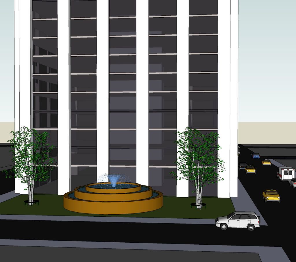
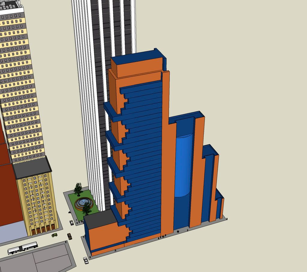
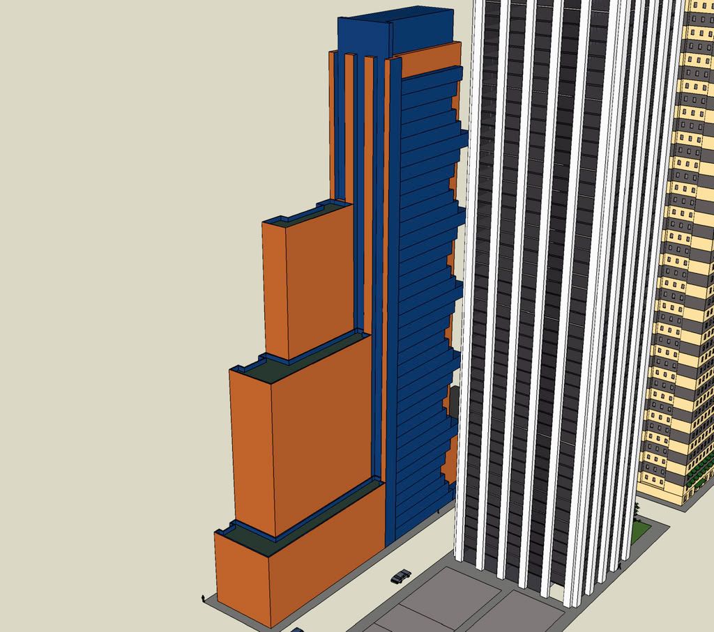
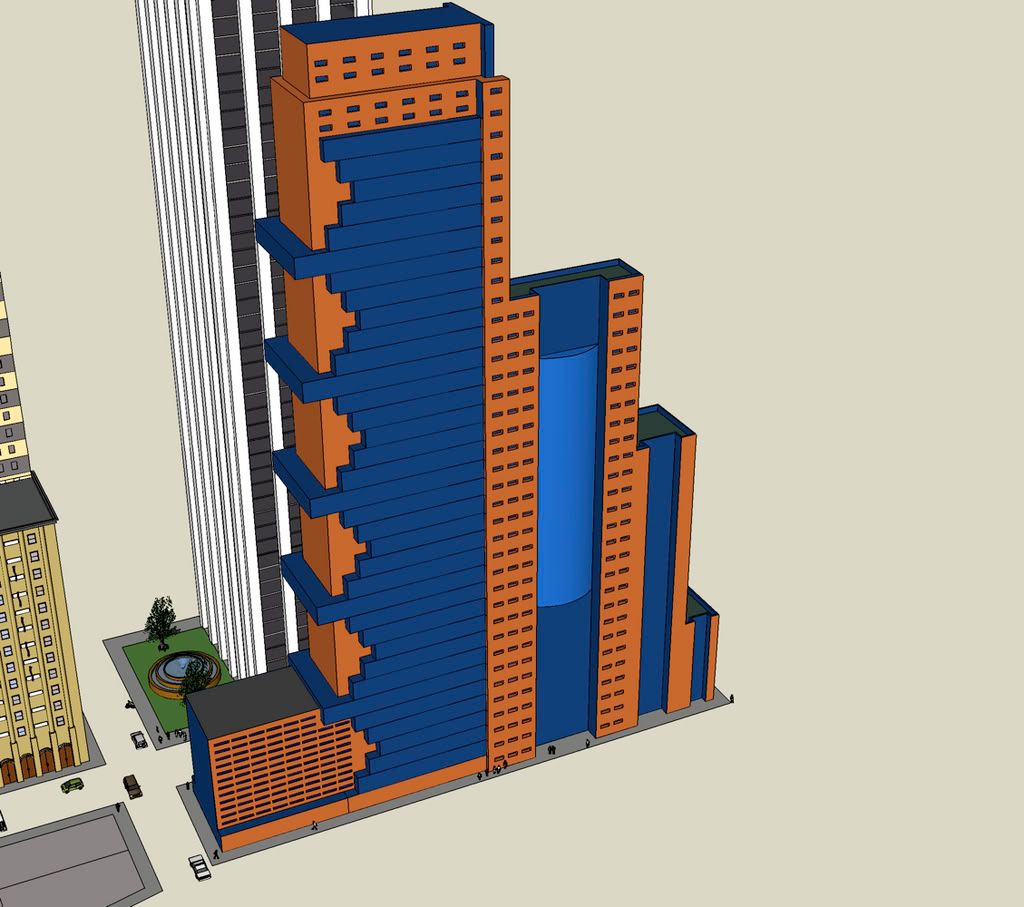
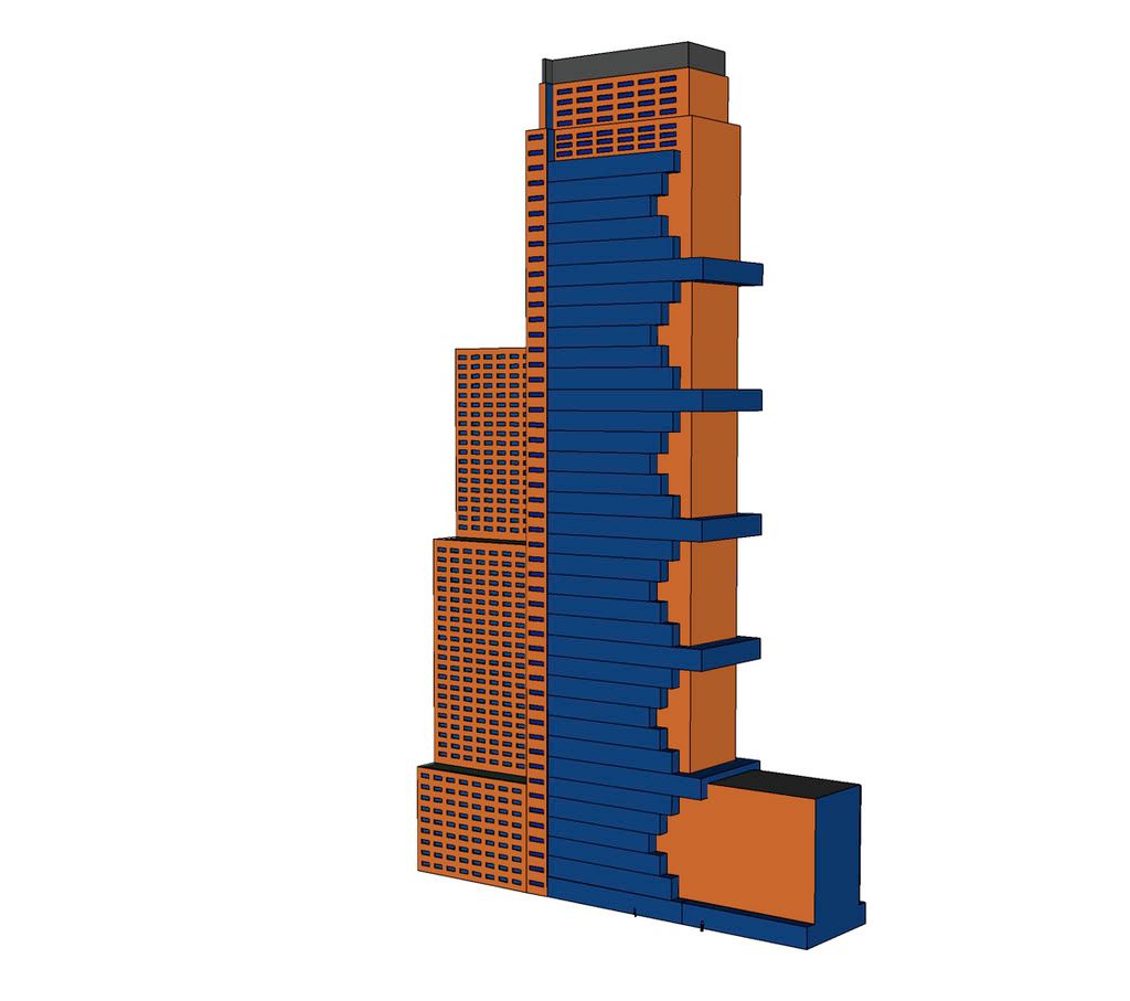
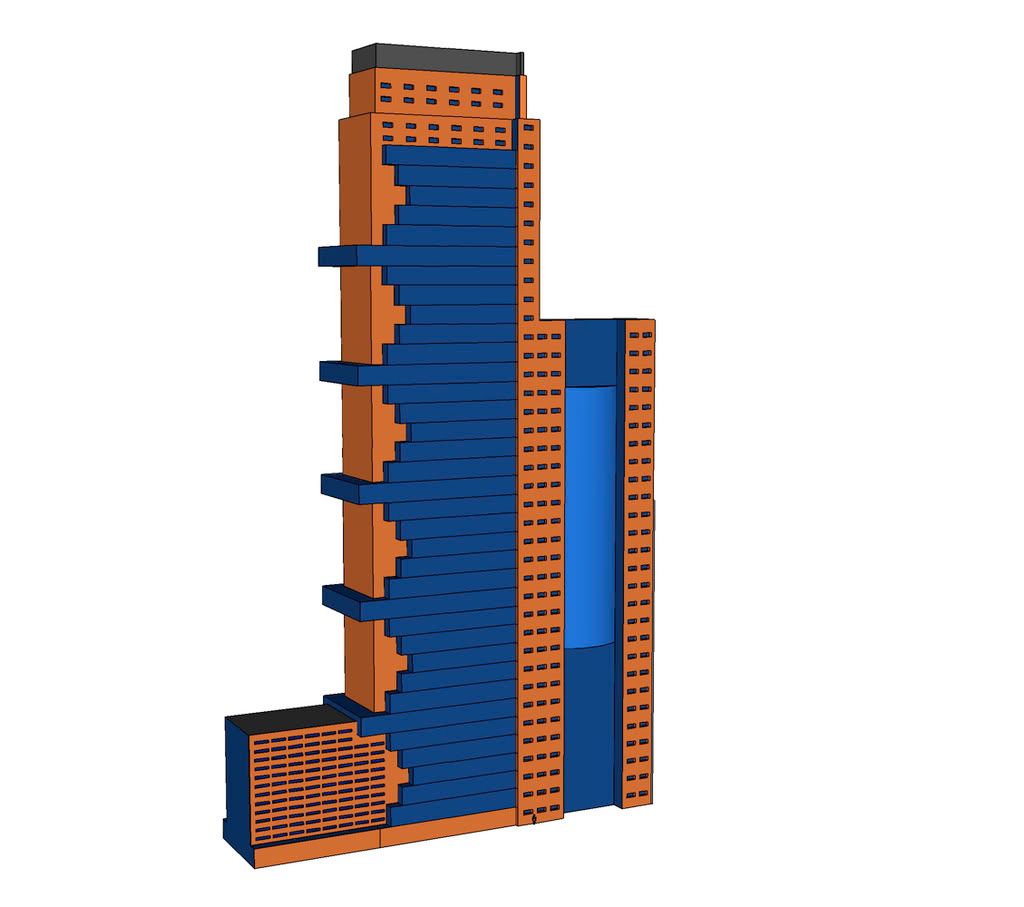
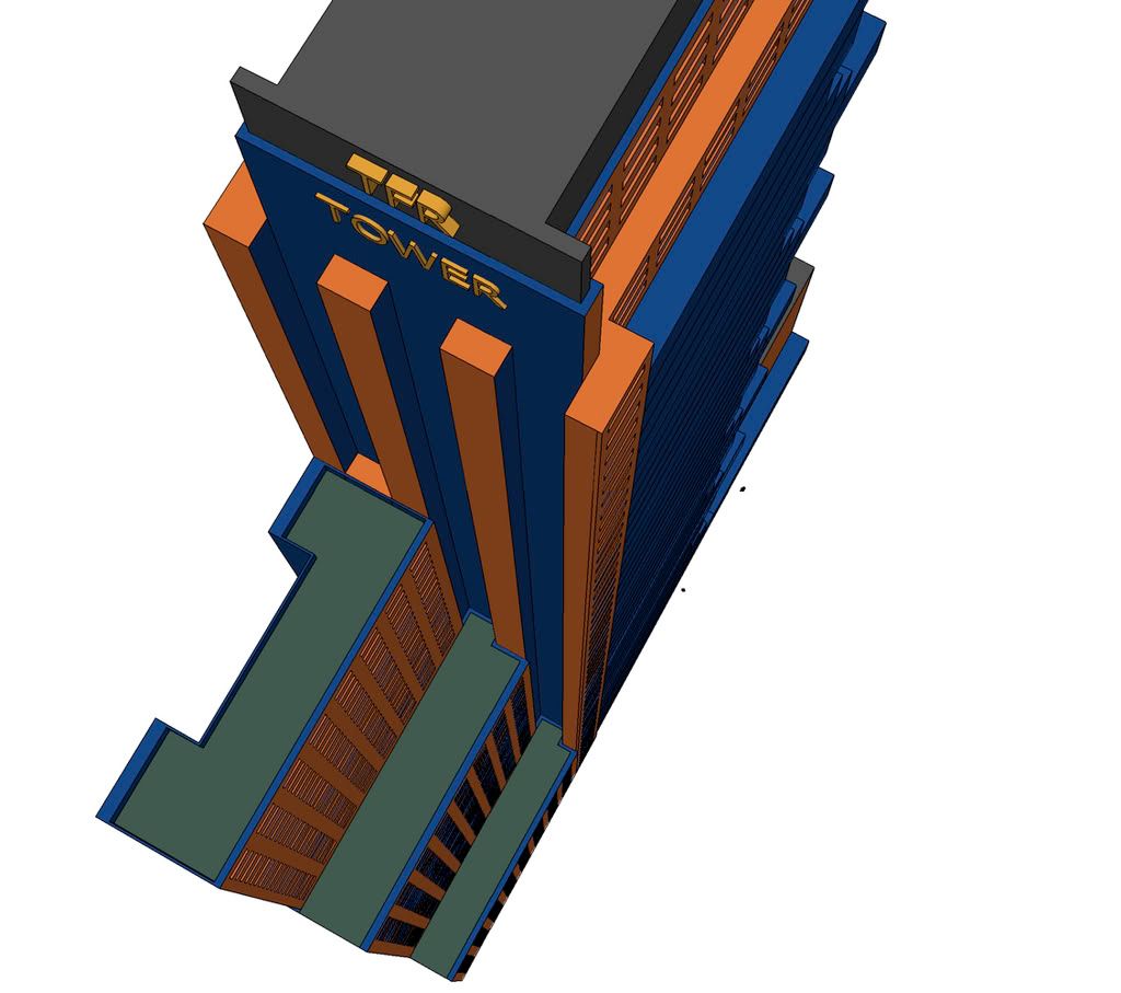
I love the white tower! its my favorite. In the first pic,the tall red and yellowtower,I think they should be shortend. they look slikesome residential building you see tacked onto skyscraper in NY,and I think there effect would be better shorter.the grid is a bit wild,but If its fonna e full of towers,dont worry about.
I love that your doing floor to floor!! Yay! So am I! Anyways I noticed that some of the sidewalks are colored the same or are painted the default colors. That happened with Mexico City. Some of the sidewalks would not close up and I had like half of the city blocks be the same face!! I hated that.
The layout is ehh like Dac said it might be best to change it or it will bring problems to your city later on. The white building is nice but what am I supposed to call it if you don't add info to your buildings!!
Also, the first three buildings with windows seem a little too tall or thin to be brick so I would suggest making them either shorter or fatter! It's just not realistic enough. Other than that they're fine. Hey I was just about to work on buildings with windows myself!! You beat me to it!!
Another also, make the base floor taller than the floors above it because usually tall towers have tall lobbies! This is best for the glass buildings because those are the ones that have big lobbies most of the time.
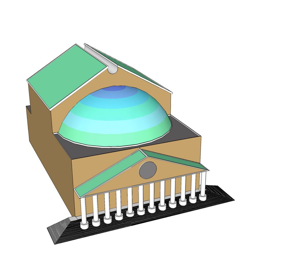
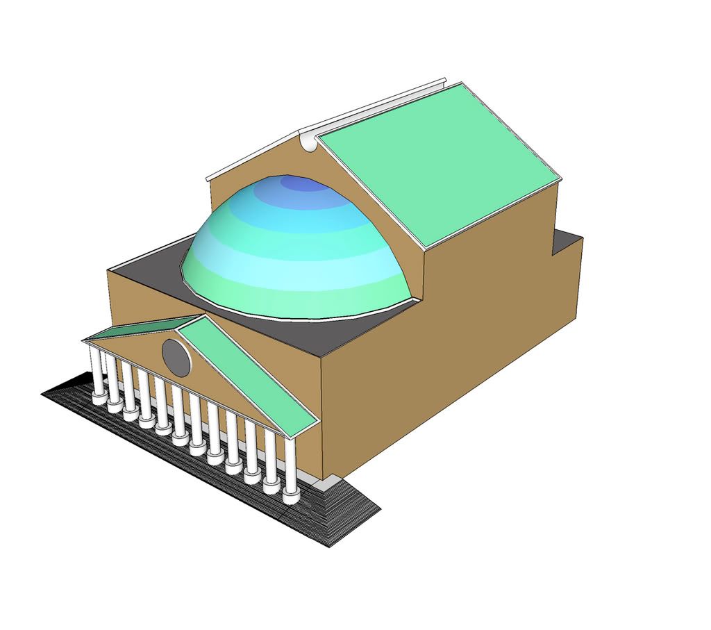
Finally, the last building is fine but maybe get rid of the 2 small steps at the end. Maybe change the colors, maybe because sometimes buildings with funky designs look good with funky colors! You wouldn't want a building the shape of the Burj al Arab painted beige would you?!?!?!!!!
Wow, I wrote quite a bit! Hope all these tips help you out!Sorry if I make you feel bad!! but it's so you get better an S.U. Oh, these tips mostly apply if you want your city to be realistic!!
Have fun!! and we'll keep track of your city!
__________________
...the greatness of victor is equally proportionate to the skill and obduracy of foe...
-Kostof-
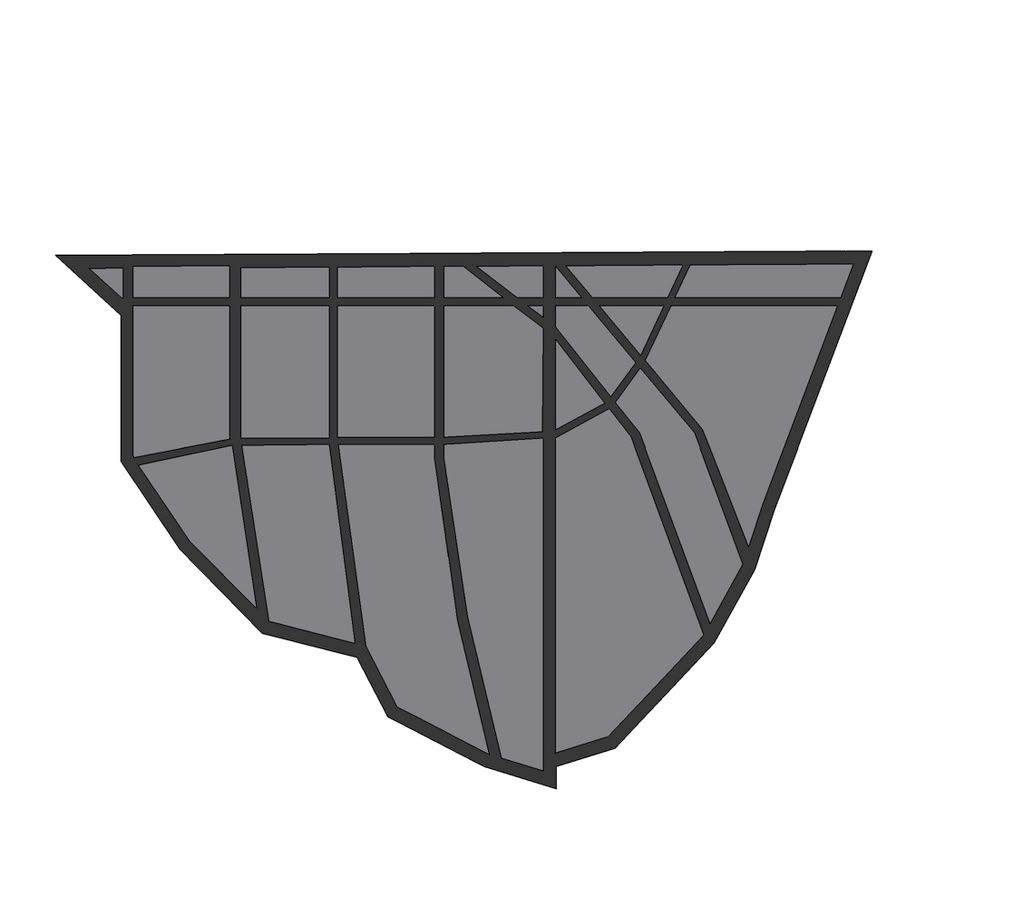
alright first off i started redoing the grid is this any better
obviously its not done but i didnt want to do the whole thing and have it turn out bad.
and then, from now on i will make sure to give the building's height, use, etc.
It's very detailed but this will slow you down later on! Maybe the streets that move up-down should be straight and the outside ones are O.K.
Tip: Don't get inspired too much from video games or people will notice a lot!! Then some of the designs will have to be (not really but it's best to) changed.
Also, the Opera House is nice but I don't like the changing colors, only because it's shape is of an old building but the colors are new and funky!!
It's best if old=old and new=new.
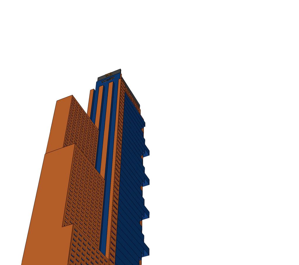
The TFR Tower came out great keep it up!
__________________
...the greatness of victor is equally proportionate to the skill and obduracy of foe...
-Kostof-


 Prev
Prev


 not really i just use multi copy


 Linear Mode
